
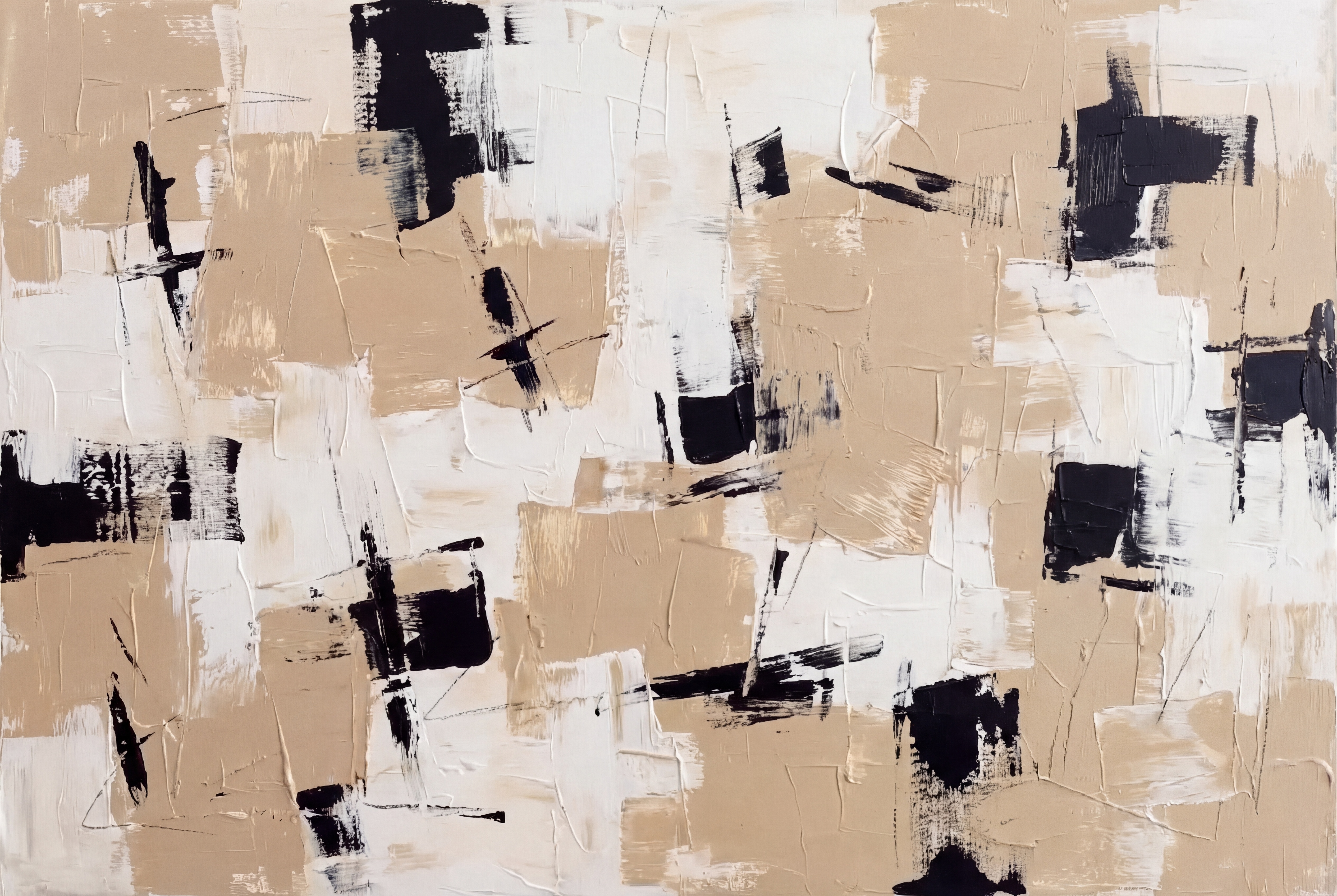
The Quiet Weight of Neutrals: Inside a Hand-Painted Abstract in Sand, Chalk, and Black
A hand-painted abstract built on three restrained tones — sand beige, chalk white, and dense black — layered with visible drag marks and palette-knife edges. It reads as a calm, grounded statement piece that suits living rooms, bedrooms, and home offices leaning soft modern, transitional, or Japandi.
Quick read
Restrained palette, generous texture, and a composition that holds a wall without raising its voice.
Product reference
Piece: Monochrome Neutral Abstract Still Ground - Wall Art by Fir Gallery
Format: Hand-painted
Size family: large
View the productAt first glance, this is a quiet painting that holds the wall longer than you'd expect. Broad, flat strokes of warm sand and chalk white move across the canvas in overlapping planes, while dense black marks cluster, break, and scatter. The palette stays inside three tones, but the surface doesn't read flat — drag marks, layered edges, and palette-knife ridges give it real material depth.
It's the kind of large abstract that earns attention slowly. Nothing shouts. The black passages carry weight without taking over, anchoring specific zones while the beige and off-white fields breathe around them.
What Makes the Piece Visually Distinct
The composition is irregular but contained. Marks interrupt each other rather than collide. A dark stroke crosses a pale ground, then releases back into open space. That rhythm — interruption, release, interruption — is what keeps your eye moving without the painting ever feeling busy.
Texture does most of the talking. In daylight, you read the warm sand tones and the softness of the white. Under lamplight, the ridges throw shadows, and the black marks gain a little more presence. It behaves differently at different hours, which is part of why it holds up as a focal piece rather than wallpaper.
How It Reads in a Room
Above a low, linear sofa, the horizontal energy settles in naturally. The piece holds the seating area without crowding the people sitting under it. Behind a headboard dressed in neutral linen or matte cotton, the contrast between black and beige reads as still and grounded rather than restless — useful in a bedroom, where you don't want anything visually loud at eye level.
In a home office, hung on the wall facing the desk, the composition offers enough activity to keep peripheral attention engaged without pulling focus from the screen. It's a working painting, not a distracting one.
Who It's For
This piece suits rooms already leaning soft modern, transitional, or Japandi. It coordinates cleanly with light oak shelving, taupe upholstery, and matte black metal frames — the materials that show up most often in those interiors. If your space runs colorful, maximalist, or high-contrast traditional, this won't be the right fit. It's built for restraint.
It also works best as a primary statement piece rather than part of a busy gallery wall. The texture and scale want room to breathe.
Realistic Expectations
A few things worth knowing before buying:
- Because it's hand-painted, brushwork, ridge depth, and stroke placement will vary slightly piece to piece. That's the point, not a flaw.
- The beige reads warmer in incandescent light and cooler in north-facing daylight. Sample your wall light before committing to placement.
- It needs a wide wall. On a narrow segment, the horizontal composition feels cramped.
How It Compares to Similar Wall Art
Compared with printed neutral abstracts, the difference is the surface. Prints flatten the drag marks and palette-knife edges that give this painting its weight. Compared with high-contrast black-and-white abstracts, the beige softens everything — less graphic, more architectural. And compared with pure minimalist canvases, there's more incident here: more marks, more rhythm, more to look at over time.
A Quick Styling Scenario
Picture a living room with a low oatmeal sofa, a light oak coffee table, and a black floor lamp. Hang this painting full-width above the sofa, leaving roughly six to eight inches between the frame edge and the sofa back. The beige picks up the upholstery, the black echoes the lamp, and the chalk white keeps the wall from feeling heavy. No other art needed on that wall.
Product Details
- Type: Hand-painted canvas, original brushwork and texture
- Size: Large format, suited to wide feature walls and full-width placements
- Palette: Warm sand beige, chalk and off-white, near-black
- Finish: Visible drag marks, layered edges, palette-knife ridges
- Best rooms: Living room above a low sofa, bedroom behind the headboard, home office facing the desk
- Style match: Soft modern, transitional, Japandi
- Pairs with: Light oak wood, taupe upholstery, matte black metal
For the full piece and current size options, see Monochrome Neutral Abstract Still Ground - Wall Art by Fir Gallery.