
A Quiet Kind of Statement: Inside Fir Gallery's Monochrome Abstract
Quiet Interval is a hand-painted abstract canvas built from broad ivory and linen brushstrokes, charcoal anchors, and loose graphite line work. It reads textured and physical up close, calm and architectural from across the room — a strong fit for soft modern, Japandi, and minimalist interiors where the wall needs presence without color noise.
Quick read
Textured neutrals, charcoal weight, and a drifting graphite line — composed but never quiet to the point of disappearing.
Product reference
Piece: Monochrome Textured Abstract Quiet Interval - Wall Art by Fir Gallery
Format: Hand-painted
Size family: medium
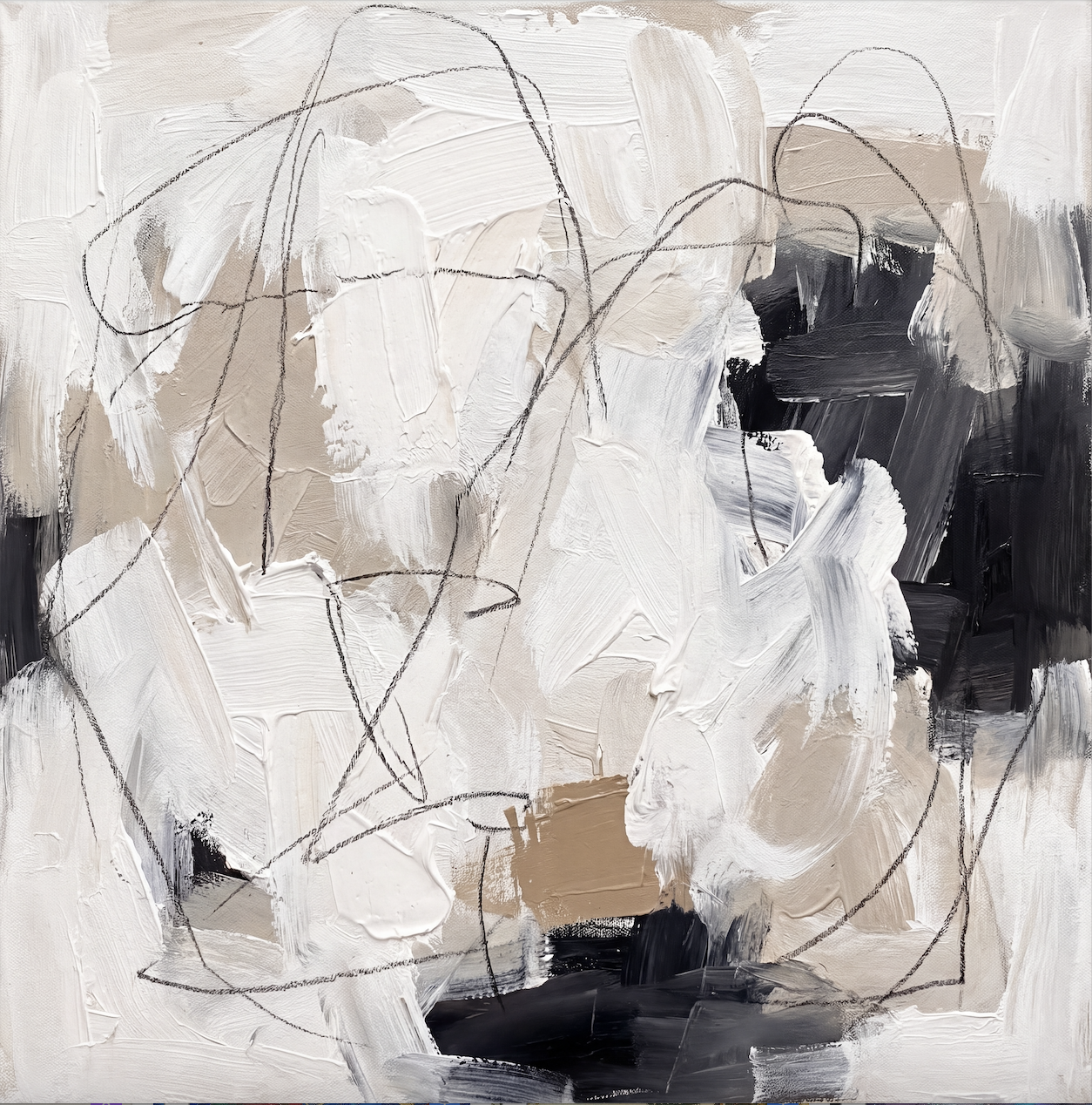
View the productQuiet Interval reads as a textured monochrome abstract before anything else. Broad strokes of white, chalk, and warm linen layer across the canvas, weighted by a cluster of near-black in the upper right and a darker pool near the lower center. Thin graphite lines loop above the paint like a second, looser pass — almost a sketch sitting on top of a finished thought. The surface is thick and physical, the kind of hand-painted work that catches sidelight and shifts slightly through the day.
What the Piece Actually Looks Like on a Wall
From a few feet away, the composition feels balanced and architectural. The dark passages anchor the upper right and lower middle, while the ivory mass breathes around them. A small tan rectangle holds quietly near the lower center — a grounding note that keeps the warm tones from drifting. Step closer and the texture takes over: ridges of paint, dry-brushed edges, and the loose graphite scribble that gives the piece its name.
It's a neutral abstract painting that behaves like a calm focal point. Strong enough to carry a wall on its own, restrained enough to share a room with other materials.
How It Reads in a Room
Above a low, linear sofa, the tonal range gives the wall visual weight without pulling attention away from the furniture. The charcoal mass adds gravity; the ivory brushwork keeps the space from feeling heavy. In a bedroom, hung behind a low-profile headboard against a warm white wall, the dark passages settle into the background and the looping lines lead the eye gently across the canvas — useful in a space meant to slow down.
In a home office, placed on the wall facing the desk, the internal movement gives you something to look at during pauses without introducing color distraction. It's the kind of piece that rewards repeated looking.
Who It's For
This canvas suits rooms leaning soft modern, Japandi, or minimalist — interiors where neutrals do most of the talking and texture matters more than color. It pairs naturally with light oak, warm white linen, soft taupe upholstery, and matte black hardware. If your room already has strong patterns, saturated art, or competing focal points, this isn't the piece to add to the mix. It works best when it's allowed to be the visual anchor.
Realistic Expectations
A few things worth knowing. Because it's hand-painted, the texture is real — you'll see paint ridges, brush direction, and graphite that wasn't drawn with a ruler. The palette is genuinely neutral, not cool gray; the linen and tan tones lean warm, which makes a difference next to bright-white walls versus warm whites. And while the composition is balanced, it isn't symmetrical. The dark weight sits off-center on purpose, which is part of why it feels modern rather than decorative.
Compared to Other Neutral Abstracts
Flat printed abstracts in similar palettes can look clean but tend to read graphic and slightly cold. A heavily textured plaster-style piece, on the other hand, can feel sculptural to the point of becoming the only thing in the room. Quiet Interval sits between those — physical enough to hold a wall, composed enough to live alongside furniture, lighting, and other quiet objects without competing.
Product Details
- Type: Hand-painted abstract canvas, original brushwork with graphite line detail
- Palette: Ivory, chalk white, warm linen, soft taupe, charcoal, near-black
- Finish: Built, textured surface with visible brush direction and paint ridges
- Size tag: Medium — works well as a single statement above a sofa, headboard, or console
- Best rooms: Living room above a low sofa, bedroom behind a low-profile headboard, home office facing the desk
- Pairs with: Light oak wood, warm white walls, linen and taupe upholstery, matte black or aged brass hardware
- Style direction: Soft modern, Japandi, contemporary minimalist
A Quick Styling Scenario
Picture a living room with a long, low oatmeal sofa, a light oak coffee table, and a single ceramic lamp on a side table. The wall behind the sofa is warm white and currently empty. Hung centered, Quiet Interval gives the wall structure — the charcoal weight balances the lamp, the ivory brushwork echoes the upholstery, and the graphite lines add just enough movement to keep the room from feeling static. Nothing else in the space needs to change.
For a calm, textured monochrome that earns its wall without overwhelming the room, take a closer look at Monochrome Textured Abstract Quiet Interval - Wall Art by Fir Gallery.