
A Quiet Landscape That Actually Changes How a Room Feels
Muted Landscape Abstract Soft Passage by Fir Gallery is a hand-painted canvas landscape built on tonal restraint — warm taupe, blush, chalky white, and grey-brown that recede into a pale overcast centre. It reads calm rather than decorative, and it suits living rooms, bedrooms, and dining rooms where the goal is atmosphere over statement.
Quick read
Soft Passage works best in rooms that already lean neutral — it reinforces a mood rather than creating one from scratch.
Product reference
Piece: Muted Landscape Abstract Soft Passage - Wall Art by Fir Gallery
Format: Hand-painted
Size family: medium
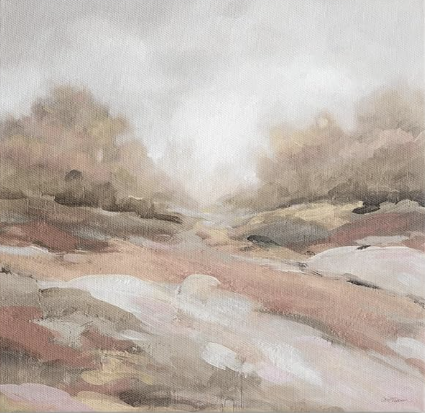
View the productAt first glance, Soft Passage looks like a landscape caught between weather and memory — a washed horizon where warm taupes, dusty rose, and grey-brown tones fold into each other without a hard edge in sight. It is the kind of painting that does not announce itself. It settles.
That quality is harder to find than it sounds. A lot of abstract landscape art either leans too decorative — colors that feel coordinated rather than felt — or too expressive, where texture and gesture compete with the room around them. This piece does neither. The palette holds a consistent quiet throughout, and the composition is built around recession rather than contrast.
What You Are Actually Looking At
The foreground is loosely layered: broad, unhurried strokes of blush and chalky white suggest uneven terrain without spelling it out. The middle distance compresses into darker, more saturated bands before dissolving upward into a pale, overcast sky that takes up roughly half the canvas. That generous negative space in the upper half is what gives the piece its sense of air. Without it, the same palette would read heavier and more enclosed.
Texture is present but restrained. The surface reads as softly built rather than heavily worked — there is dimensionality when light catches it, but it does not read as sculptural from across a room. In daylight, the blush tones come forward slightly. Under warmer lamp light in the evening, the taupe and grey-brown tones take over, and the whole piece reads closer to a warm neutral than a pink one.
How It Reads in an Actual Room
Above a low sofa on a warm white or greige wall, it anchors the seating area the way a good piece of furniture does — by giving the eye somewhere to land without pulling focus away from the room itself. It works particularly well in living rooms where the furniture is already doing the visual work: a stone or linen sofa, an oak coffee table, a jute rug. The painting does not compete with any of that.
In a bedroom hung behind the headboard, the tonal range settles into the space without disrupting calm. It is not a piece that demands to be looked at every morning. That is actually a compliment in this context.
A dining room with a long timber table and linen chairs would also carry it well — hung at eye level on the feature wall, it adds depth to the room without the graphic weight that a bolder abstract would bring.
Who This Piece Suits — and Who It Does Not
Buyers drawn to contemporary wabi-inspired interiors, soft modern spaces, and transitional rooms will find this genuinely useful. The dusty rose and taupe tones pair naturally with aged oak, natural linen, matte plaster, and warm white cabinetry.
It is not the right choice if you want contrast or color impact. The piece is built on harmony, not tension. If your room is already very neutral and you are hoping the art will add energy, this particular painting will add depth instead — which may or may not be what you are after. Worth being clear-eyed about that before buying.
It also suits people who have been looking at abstract landscapes that feel too busy or too aggressively textured. Soft Passage is the alternative to that.
A Realistic Styling Scenario
Picture a living room with a greige linen sofa, a low oak media console, and walls painted in a warm white with slight yellow undertone. The room has good natural light in the morning and shifts to lamp light by late afternoon. Soft Passage hung centered above the sofa at roughly 60 inches from the floor to the midpoint of the canvas — the painting pulls the whole wall together without introducing a new color story. The blush tones in the foreground echo the sofa upholstery just enough to feel intentional without being matched.
Product Details
- Type: Hand-painted canvas, not a print
- Size category: Medium — well-suited to sofa walls, headboard walls, and dining feature walls in standard-sized rooms
- Palette: Dusty rose, warm taupe, chalky white, grey-brown, pale overcast grey
- Texture: Softly built surface with visible brushwork; reads as dimensional in direct light
- Finish: Matte to satin — no high-gloss reflectivity
- Best wall colors: Warm white, greige, soft taupe, pale clay
- Room fit: Living room above sofa, bedroom above headboard, dining room at eye level on feature wall
- Interior styles: Contemporary wabi-inspired, soft modern, transitional
- Furniture pairings: Aged oak, natural linen upholstery, soft taupe textiles, matte plaster finishes
For rooms that need visual weight without visual noise, Muted Landscape Abstract Soft Passage - Wall Art by Fir Gallery is one of the more considered abstract landscape options available at this scale.