
Still Shore: A Muted Landscape Painting That Earns Its Wall Space
Not every wall needs a statement. Some rooms are better served by a piece that holds space quietly — one that adds depth without competing with furniture, light, or the people in the room. Still Shore does exactly that. It's a wide, cloud-heavy landscape in restrained earth tones, hand-painted with enough material texture to read as a real painting rather than a reproduction, and composed with enough open sky to make a room feel slightly larger and more settled than it did before.
Quick read
A hand-painted neutral landscape in taupe, umber, and cool grey — wide enough to anchor a sofa wall, quiet enough to disappear into a bedroom.
Product reference
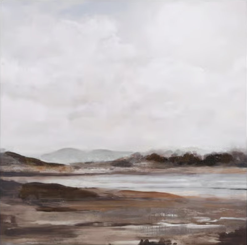
Piece: Muted Landscape Still Shore - Wall Art by Fir Gallery
Format: Hand-painted
Size family: medium
View the productAt first glance, Still Shore reads as almost monochromatic — a wide, flat landscape under a pale, cloud-laden sky, its palette held deliberately narrow. Taupe, umber, cool grey, washed white. The horizon sits low. A ridge of hills dissolves softly into mist, edged by dark tree forms that suggest depth without sharpening into detail. The foreground is broad and earthy, its surface broken by what looks like shallow pooling or wet sediment catching the same diffuse light as the sky above.
It's the kind of painting that takes a moment to settle into. Nothing is sharp. Nothing competes. That restraint is the point.
What Makes It Visually Distinct
Where a lot of neutral landscape art goes flat — printed, low-contrast, forgettable — this piece holds interest through texture and layering. Being hand-painted, the surface has a material quality that prints don't replicate: slightly varied brushwork in the sky, sediment-like buildup in the foreground, an overall sense that the tones were built up over time rather than applied in a single pass.
The composition is strongly horizontal, which matters for placement. It pulls the eye across the wall rather than up, making rooms feel wider and lower-ceilinged spaces feel more generous. The sky takes up roughly the upper half of the canvas, which keeps the whole thing feeling open and uncluttered even as the foreground adds some grounded weight.
How It Reads in a Room
The palette — taupe, grey, and earthy brown — is narrow enough to coordinate with almost any neutral interior without fighting it. Warm white linen sofas, raw oak shelving, soft stone tile, woven jute: all of these absorb the painting naturally. It doesn't need a perfectly matched room. It needs a room that isn't already doing too much.
In daylight, the cool greys in the sky read clearly and the landscape feels airy. Under warmer lamp light in the evening, the taupe and umber tones come forward and the piece feels more grounded and enclosing — which works well in a bedroom or a living room that shifts from daytime to evening use.
Where It Works Best
Above a low sofa in a living room, the wide horizontal format extends the visual line of the furniture and opens the wall without filling it aggressively. It suits a wide, unbroken wall better than a narrow or interrupted one — this isn't a piece that reads well when flanked by shelving or split by a window.
Behind a headboard, the open sky and muted tones are genuinely restful. There's enough detail to register as interesting rather than empty, but not enough contrast or movement to pull attention when you're trying to wind down.
In a home office placed opposite the desk, it functions almost like a view — something to rest your eyes on briefly without being drawn into it. The open horizon gives that sense of distance without requiring an actual window.
Who This Piece Is For — and Who It Isn't
This painting suits buyers who already own rooms with strong material character: warm wood, linen, tactile textiles, natural stone. It works in soft modern, Japandi, and rustic modern interiors. It fits less naturally in rooms with bold color, high-contrast palettes, or maximalist layering — not because it clashes, but because it simply won't be seen.
It's also worth being honest about what it isn't. It's not a focal point that commands a room. It's not graphic or structured. If you want something with immediate visual impact or a strong compositional center, this is the wrong direction. But if your room needs something to extend its calm rather than interrupt it, Still Shore does that convincingly.
A Quick Styling Note
One scenario worth picturing: a neutral living room with a low linen sofa, a raw oak coffee table, and soft taupe walls. The canvas centered above the sofa, hung low so the bottom edge sits roughly a foot above the cushions. No other art on that wall. The painting reads as a quiet horizon — a bit of implied distance in a room that otherwise stays close and interior. That's the setup where this piece does its best work.
Product Details
- Type: Hand-painted canvas — not a print or reproduction
- Size category: Medium — well-suited to sofa walls, headboard walls, and home-office feature walls
- Palette: Taupe, umber, cool grey, washed white — a narrow, coordinated neutral range
- Finish: Matte with natural brush texture; surface has material depth visible in person
- Best room fit: Living room, bedroom, home office
- Interior style match: Soft modern, Japandi, rustic modern
- Furniture coordination: Warm white linen, raw oak, soft taupe upholstery, stone and natural fiber surfaces
- Placement note: Strongest on a wide, unbroken wall; horizontal format reads best with low furniture beneath it
If your room is already doing a lot — interesting furniture, layered textiles, natural materials — this is the kind of piece that holds it all together without asking for attention in return. You can find the full details and available sizes for Muted Landscape Still Shore - Wall Art by Fir Gallery on the product page.