
Quiet Morning, Loud Bloom: Living With Recca Art's Pink Floral Abstract
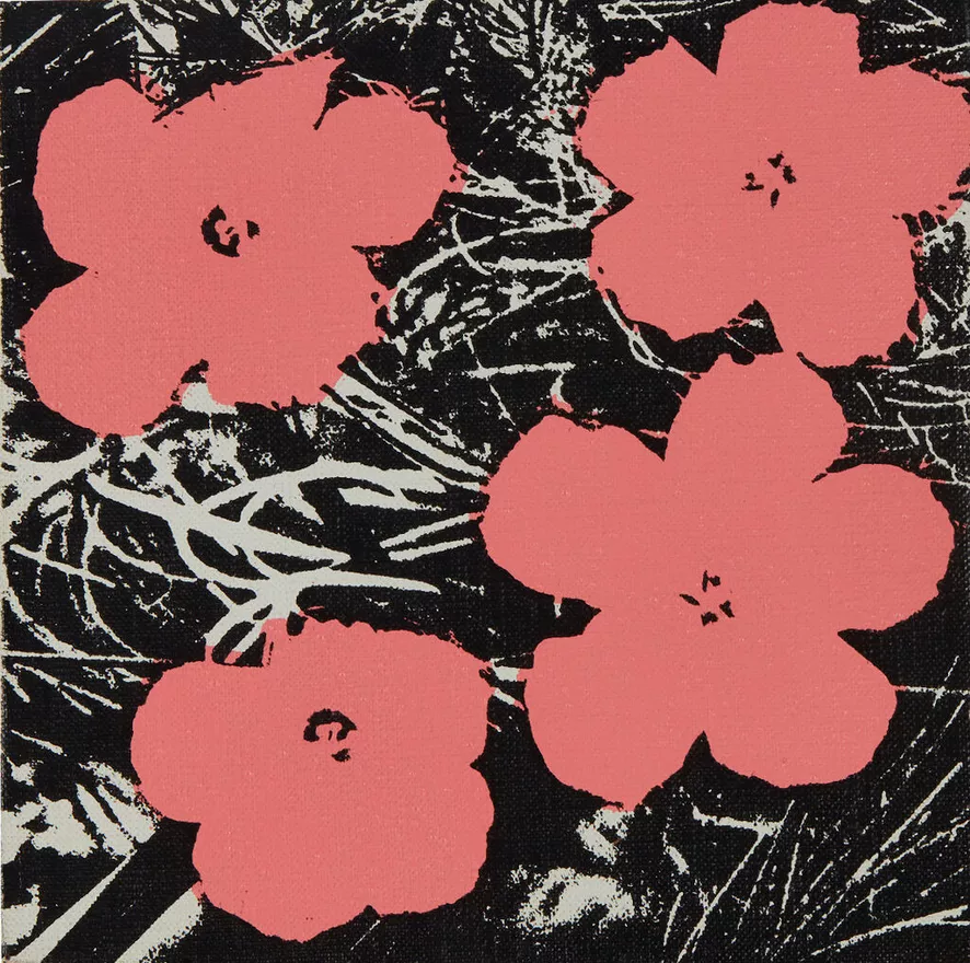
Recca Art's Quiet Morning pairs four simplified coral flowers with a scratchy black-and-white background that reads like compressed foliage. It feels graphic without going cold, and works best in soft modern, Scandinavian, or minimalist rooms where you want a single piece to set the mood without taking over the wall.
Quick read
Pop-art bones, botanical heart — a small print that punches above its size.
Product reference
Piece: Pink Floral Abstract Quiet Morning - Wall Art by Recca Art
Format: Print
Size family: small
View the productAt first glance, Quiet Morning looks like a contradiction that works. Four coral-pink flowers sit flat and confident across the surface, while behind them a tangle of black and white marks scratches and crosses like overgrown brush. The blooms are simple, almost cartoon-clean. The background is anything but. That tension is the whole point.
This is a small pop-art botanical print with a screen-printed feel — uneven ink, visible texture, and the kind of high-contrast composition that reads instantly from across a room. It belongs to the same visual family as graphic florals you'd associate with mid-century pop art, but the coral tone keeps it warm instead of clinical.
How It Reads in a Room
Hung on its own, Quiet Morning behaves like a focal point even at a smaller scale. The pink does the heavy lifting for warmth, while the black background grounds the wall and adds weight. In daylight, the linear marks come forward and you notice the woodblock-style texture. Under lamplight, the flowers glow a little softer and the piece settles into the room rather than shouting from it.
It's graphic, but it isn't loud. That's a useful distinction when you're comparing florals — a lot of pink wall art leans either sweet or overly decorative. This one leans modern.
Who It Suits
Quiet Morning fits buyers who want personality on the wall without committing to a maximalist look. It pairs cleanly with soft modern, Scandinavian, and minimalist interiors — rooms built around warm white linen, light oak, or cream upholstery, where a single piece of art is meant to carry the color story.
If your space already runs busy — patterned rugs, layered textiles, gallery shelves — this print may compete rather than complement. It rewards a calmer wall around it.
Placement Notes
- Bedroom: Above the headboard, the coral picks up warmth from bedding without crowding the room. It also works on the wall opposite a dresser as a single accent.
- Living room: Centered above a neutral sectional, it adds color that feels intentional rather than ornamental. On an accent wall near seating, it holds attention without overwhelming nearby pieces.
- Home office: Hung on the wall facing your desk or above a low credenza, the restrained palette keeps the eye engaged without distracting.
Because the piece is small, scale matters. Over a king bed or a long sectional, plan to pair it with a second element — a sconce, a shelf, or a companion print — so the wall doesn't feel under-dressed.
What People Often Get Wrong
Two assumptions are worth correcting. The pink isn't pastel — it's a saturated coral that holds its own against black, so don't expect a soft, nursery-leaning tone. And the background isn't quiet filler. The linear marks are an active part of the composition, which means the print reads more graphic and pop-art than romantic-botanical, even though the subject is flowers.
How It Compares
Against a framed canvas floral or a hand-painted abstract, Quiet Morning trades painterly depth for graphic clarity. It's closer in spirit to a screen print than a gallery oil. If you want texture you can feel and brushwork you can read up close, a hand-painted piece will serve you better. If you want a flat, confident statement that works at small scale and holds its shape from across the room, this is the stronger pick.
A Quick Styling Scenario
Picture a light oak nightstand, a cream linen headboard, a brass lamp, and a stack of books. The wall above is empty. Quiet Morning hung centered, slightly above eye level when seated, pulls the coral into the bedding and lets the black ground the whole corner. Nothing else on the wall — just the print doing its job.
Product Details
- Type: Wall art print
- Style: Pop-art, graphic botanical abstract
- Subject: Four coral-pink florals on a black-and-white linear background
- Size: Small format — best as a single accent or paired in a small grouping
- Finish: Screen-print-inspired surface texture with visible ink variation
- Color direction: Coral pink, black, and off-white
- Best rooms: Bedroom, living room, home office
- Pairs with: Warm white linen, light oak, cream upholstery, brass or matte black accents
For a closer look at the piece and the full size details, see Pink Floral Abstract Quiet Morning - Wall Art by Recca Art.