
The Rift That Grounds a Room: Purple Grey Abstract Canvas by Fir Gallery
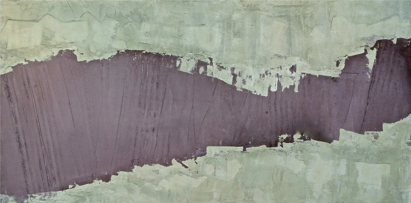
Purple Grey Abstract Rift is a hand-painted large-format canvas from Fir Gallery that pairs a broad sweep of deep plum pigment with a muted sage-green ground, all built up in dense, plaster-effect layers. The composition drifts horizontally across the canvas, with ragged, chalky edges where the two color zones meet. It suits contemporary, Japandi, and soft modern interiors, and works particularly well above a sofa, behind a headboard, or on a desk-facing wall in a home office.
Quick read
A hand-painted abstract canvas that functions more like a material surface than a picture — dense, horizontal, and quietly commanding.
Product reference
Piece: Purple Grey Abstract Rift - Wall Art by Fir Gallery
Format: Hand-painted
Size family: large
View the productAt first glance, Purple Grey Abstract Rift reads less like a painting and more like a cross-section of something geological. A wide horizontal band of deep plum occupies the middle of the canvas, flanked above and below by a muted sage-green ground that's been built up in uneven, plaster-like layers. Where the two zones meet, the edge fractures — chalky residue, broken transitions, pale bleed. Nothing about it is clean or resolved, and that's precisely why it holds attention.
What You're Actually Looking At
This is a hand-painted large-format abstract canvas. The surface texture is physical enough that light catches it differently depending on the angle — in direct daylight the plaster-like buildup in the sage fields becomes very readable, while the plum band flattens slightly and deepens. Under warm lamp light in the evening, the whole piece shifts toward something quieter and more tonal.
Vertical drag marks run through the dark pigment, giving the composition a sense of pressure and downward movement without resolving into any recognizable form. The mass widens toward the left and narrows gradually to the right, so the eye moves across the canvas rather than landing on a single focal point. It's a slow, deliberate composition — not restless, not decorative, just present.
How It Reads in a Room
Scale matters here. As a large piece, the horizontal emphasis does real work on a long wall. Above a wide, low sofa it provides the kind of grounding weight that pulls a seating arrangement into focus without competing with furniture color or pattern. The sage-green zones carry naturally with linen, stone, and soft plaster tones — the plum center connects with warm charcoal, aged bronze, and deep walnut without effort.
In a bedroom, centered behind a headboard on a wide wall, the horizontal drift reinforces the restful axis of the bed in a way that vertical compositions rarely do. It doesn't demand attention when you're in the room — it just settles the space. On the desk-facing wall of a home office, the layered surface texture gives the eye somewhere to land during pauses. That quality is underrated in work spaces.
Who It's Right For — and Who It Isn't
This piece suits rooms that are already leaning toward contemporary wabi-inspired, Japandi, or soft modern directions — spaces that treat material texture as a design element rather than something to minimize. If your room is built around clean white walls, high-contrast black accents, and glossy surfaces, the muted palette here may read as flat rather than refined.
It also works best as a focal-point piece on a single feature wall, not as one of several competing artworks. The composition is horizontal and expansive — it needs room to breathe. Grouping it with other framed art on the same wall tends to fragment the effect.
A Common Assumption Worth Correcting
Some buyers see "purple and grey" in the product name and expect something closer to a cool, graphic palette — the kind of abstract print that reads crisp at a distance. This piece is the opposite. The plum is warm and deep, the sage is earthy rather than bright, and the overall mood is grounded and slightly worn. Think aged plaster and dark pigment, not graphic design. If you're styling around cooler greys or blue-toned neutrals, the warmth here may read slightly off.
Compared to Other Abstract Wall Art Options
Against a standard canvas print in similar colors, the hand-painted surface is noticeably different — the texture catches light in a way that printed reproductions don't replicate. Against other large abstract paintings in the plum-and-neutral range, what distinguishes this piece is the horizontal rift structure: it's compositionally specific, not a generic abstract wash. That specificity makes it easier to place well, but it also means the room needs to meet it halfway.
Practical Details
- Type: Hand-painted canvas — not a print
- Size category: Large format
- Orientation: Horizontal / landscape
- Finish: Layered, plaster-effect textured surface
- Color palette: Deep warm plum, muted sage green, chalky off-white at the rift edges
- Best placement: Above a low wide sofa; centered behind a headboard; on the wall facing a desk
- Interior styles: Contemporary wabi-inspired, Japandi, soft modern
- Furniture pairings: Warm linen upholstery, dark walnut, soft sage plaster walls
- Rooms: Living room, bedroom, home office
For rooms that need horizontal weight without pattern noise, Purple Grey Abstract Rift - Wall Art by Fir Gallery does the work that most prints simply cannot.