

The Quiet Weight of Abstract Brown Terracotta Divide
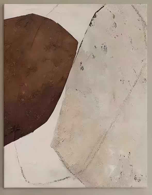
Abstract Brown Terracotta Divide is a hand-painted textured canvas that leans on two shapes: a dark umber mass on the left and a soft ivory field on the right. The piece feels grounded and slow, with visible ridges, faint scratched arcs, and a wabi-sabi sensibility. It suits living rooms, bedrooms, and foyers styled with walnut, linen, and warm whites.
Quick read
Two masses, one quiet divide — the composition doesn't ask for attention, it settles into the room.
Product reference
Abstract Brown Terracotta Divide opens with a simple visual idea: a dense brown shape on the left, a pale plaster-like field on the right, and a soft diagonal seam holding them together. It's a hand-painted canvas that reads as sculpted more than drawn, with ridges and matte patches that shift under changing light. The composition is quiet, but it isn't empty — the weight sits clearly on one side, and the eye keeps returning to the divide.
At first glance, most people register the color relationship before the texture. The umber deepens toward near-black at the base, while the ivory side moves through sand, bone, and soft cream. Then the surface takes over. Faint scratched arcs trace across the lighter field, and the built-up layers catch light unevenly, which is what gives the piece its wabi-sabi tone.
How It Reads in a Room
This is a grounded piece, not a graphic one. It doesn't punch — it anchors. Hung above a low console or a neutral sofa, the brown mass acts almost like a second piece of furniture, adding visual weight without adding clutter. The ivory field keeps the wall feeling open, so the overall effect is warm rather than heavy.
In lamplight, the texture becomes more pronounced. Ridges cast small shadows, and the umber warms up. In daylight, the palette flattens slightly and the composition reads more architectural. Either way, it holds its shape from across the room, which is what you want from a statement canvas that isn't meant to shout.
Who It's For
The natural fit is a home already leaning into contemporary wabi-inspired, Japandi, or warm minimalist directions — rooms with walnut or oak furniture, linen upholstery, and warm white or greige walls. If your palette runs cool gray, high-gloss, or heavily saturated, this piece will feel out of tune. It belongs in interiors where imperfect edges and raw texture are treated as intentional.
It also suits people who want a single focal piece rather than a gallery wall. The composition is complete on its own, and crowding it with smaller frames tends to dilute the divide that makes it work.
Realistic Expectations
A few things worth knowing before it goes on your wall. Because it's hand-painted with built-up texture, the surface is deliberately uneven — that's the point, not a flaw. The brown isn't a flat block; it shifts across the shape. The scratched lines are subtle and read more clearly up close than from across the room.
One common assumption: that a brown-and-cream palette will feel dated or heavy. In practice, the ivory field carries enough light variation to keep the piece feeling current, and the brown reads as earthen rather than dark-wood traditional.
How It Compares
Next to a flat print of a similar composition, the difference is immediate — the ridges, the matte patches, and the visible brushwork give it a physical presence a print can't replicate. Compared to more graphic abstract canvases with bold color blocks, this piece is slower and quieter. And compared to fully monochrome textured art, the two-tone divide gives it more structure and a clearer focal point.
A Quick Styling Scenario
Picture a living room with a low oak console against a warm white wall, a linen sofa in soft oatmeal, and a single ceramic lamp. Hung centered above the console, Abstract Brown Terracotta Divide gives the wall a grounded edge without competing with the furniture. Add a small stoneware vessel below it, and the palette closes cleanly — earthen, calm, and finished.
Product Details
- Type: Hand-painted textured canvas wall art
- Style: Abstract, wabi-sabi, 3D textured
- Palette: Umber, near-black, ivory, sand, bone
- Surface: Built-up layers with visible ridges, matte patches, and faint scratched linework
- Best rooms: Living room above a low console or sofa, bedroom opposite the bed or above a dresser, foyer accent wall near ambient lighting
- Pairs with: Walnut or oak furniture, natural linen upholstery, soft ivory textiles, warm white walls
- Interior directions: Contemporary wabi-inspired, Japandi, warm minimalist
For readers comparing warm, textured abstracts for a neutral room, take a closer look at Abstract Brown Terracotta Divide.