

Monochrome Woven Lines Quiet Intervals: A Study in Rhythm and Restraint
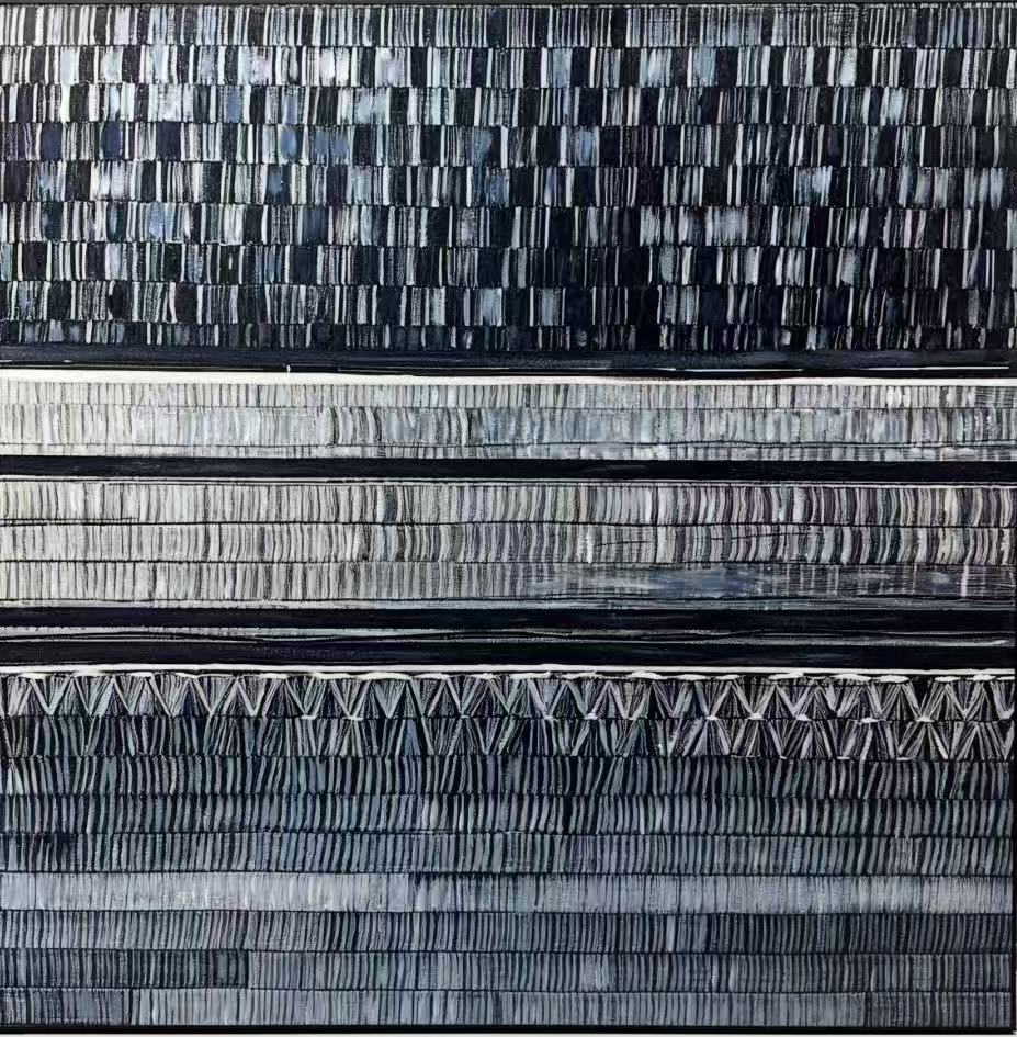
Monochrome Woven Lines Quiet Intervals is a hand-painted black, slate, and bone-white canvas built on repetition rather than color contrast. Dense vertical strokes stack into horizontal registers, giving the surface a woven, textile-like feel that reads calm from across the room and intricate up close. It suits living rooms, home offices, and foyers that lean minimalist, industrial, or wabi-inspired.
Quick read
Ordered but not rigid — a quiet painting with real texture under the light.
Product reference
Monochrome Woven Lines Quiet Intervals reads first as structure, then as texture. Horizontal bands of dense vertical strokes stack across the canvas, each register shifting slightly in rhythm — tighter charcoal marks near the top, looser chevron-like strokes toward the bottom. From a few steps back, it looks almost like woven cloth. Up close, you can see the hand of the brush.
The palette stays inside a narrow range of black, slate, and bone white, which is part of why the piece works so well in rooms that already have a lot going on in materials and furniture.
What makes this piece visually distinct
Most black and white textured canvas art relies on bold contrast or a single gestural mark. This painting takes the opposite route. It builds its impact through repetition, with thin pale seams between the bands that give the eye small places to rest. The composition feels ordered without being mechanical, and the surface catches light unevenly because every stroke was laid down by hand.
That gives it a quality closer to textile or raw linen than to a printed graphic — the kind of surface that rewards a second look.
How it feels in a room
In daylight, the piece reads graphic and architectural, with the stacked bands acting almost like horizontal shelves of pattern. Under lamplight, the texture softens and the painting becomes quieter, pulling more toward slate and warm charcoal. It behaves like a grounding element rather than a focal explosion, which is useful if your room already has strong furniture or a dark wall.
Think of it as a steady presence. It holds the wall without competing with a sofa, a long dining table, or an existing rug.
Who it suits
This painting fits homes that lean minimalist, industrial, or contemporary wabi-inspired. It pairs naturally with matte black metal, walnut wood, and charcoal upholstery, and it tends to look best in rooms where restraint is already part of the design language. If your interior leans traditional, colorful, or heavily ornamented, this piece will feel out of key.
Buyers who gravitate toward it usually want texture without color, and pattern without noise.
Realistic expectations and common assumptions
A few things worth knowing before you commit:
- It is a hand-painted canvas, so brush rhythm and texture will vary slightly across the surface. That is intentional, not a flaw.
- Because the palette is so narrow, the painting shifts noticeably with your lighting. Warm bulbs pull it toward brown-black; cooler daylight sharpens the contrast.
- It is not a soft, airy piece. The density of the strokes gives it visual weight, so give it a wall that can hold that presence.
- It is often mistaken for a print in photos. In person, the layered strokes and uneven light-catch are the whole point.
How it compares to similar wall art
Against a single large brushstroke abstract, this painting feels more disciplined and architectural. Against a geometric line drawing or a minimalist black-and-white print, it feels warmer and more handmade. If you have been weighing a modern minimalist wall art piece but want something with real surface and movement, this sits comfortably in between — graphic enough to anchor a wall, textured enough to feel like craft.
A quick styling scenario
Picture a living room with a low charcoal sectional, a walnut coffee table, and a flat-weave rug in oatmeal. The wall above the sofa is empty and slightly too wide for a single small canvas. Hang this painting centered above the sectional, bottom edge about eight to ten inches above the backrest. The horizontal bands echo the long line of the sofa, and the dark palette ties the walnut and charcoal together without introducing a new color story. No gallery arrangement needed — the painting carries the wall on its own.
Product details
- Type: Hand-painted canvas, original brushwork
- Style: Abstract, minimalist, wabi-inspired
- Palette: Black, slate grey, bone white — monochrome throughout
- Surface: Layered vertical strokes with a woven, textile-like finish; thin pale seams between bands
- Framing: Available unframed or with a simple framing option; the piece reads cleanly either way given the structured composition
- Best rooms: Living room above a low sectional, home office facing the desk, foyer or hallway end wall, dining room, bedroom with a restrained palette
- Pairs with: Matte black metal, walnut wood tones, charcoal upholstery, oatmeal and bone textiles
For readers comparing options in monochrome abstract wall art, this one earns its place by doing less, more carefully. You can see the full piece here: Monochrome Woven Lines Quiet Intervals.