

A Quiet Horizon: Living With the Abstract Coastal Landscape Quiet Shoreline
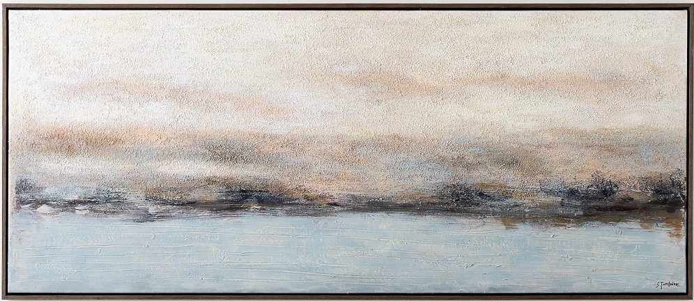
The Abstract Coastal Landscape Quiet Shoreline is a horizontal, hand-painted canvas that reads as atmosphere more than image — a pale sky, a still blue field, and a hazy dark band suggesting a distant shore. Its textured surface catches daylight differently through the day, and its restrained palette lets it settle into coastal, soft modern, and Japandi rooms without competing with the furniture.
Quick read
Not a picture of the coast — more like the memory of one.
Product reference
The Abstract Coastal Landscape Quiet Shoreline reads, at first glance, less like a picture and more like weather. A pale, weathered sky in cream, sand, and muted gold sits above a still field of soft blue water. Between them runs a thin, uneven band of umber and charcoal — a shoreline dissolving in haze rather than a drawn line. It's a hand-painted canvas built on plaster-like texture, and the surface is what carries the piece as much as the palette.
What Makes It Visually Distinct
Most abstract seascapes lean on drama: bold horizons, high contrast, obvious brushwork. This one moves the other way. The transitions are gradual, the palette restrained, and the tension collects along that single dark seam where sky meets water. The textured buildup gives it depth without adding noise — you notice it more in raking afternoon light than under a flat ceiling fixture.
It's a neutral abstract landscape in the truest sense: atmospheric rather than illustrative, quiet rather than graphic.
How It Feels in a Room
Hung above a low sofa, the horizontal format echoes the furniture line and lengthens the wall visually. In a bedroom above a headboard, the tones soften the space instead of anchoring it — useful in rooms where you don't want a heavy focal point looming over the bed. On a dining room end wall, especially opposite a window, the textured surface picks up shifting daylight and becomes subtly different from morning to evening.
The mood is calm and grounded. It doesn't push a style so much as support one.
Who It Suits
This piece fits interiors already built around quiet material contrast — light oak, warm white linen, pale plaster walls, soft taupe upholstery. It reads naturally in coastal, soft modern, and Japandi rooms, and it can also carry a transitional space that leans neutral. If your room already has bold color or busy pattern working the walls, this isn't the piece to add tension. If your room is quiet and you want it to feel intentionally quiet, it does that job well.
Realistic Expectations
A few things worth knowing before you commit:
- It's low contrast on purpose. From across a bright room, it will read as a soft horizontal wash, not a sharp image.
- The texture is a real part of the experience. Photos flatten it; in person, the plaster-like buildup is where the piece earns its presence.
- It works as a supporting focal point — strong enough to hold a wall, calm enough not to fight the room.
How It Compares to Nearby Options
Against a high-contrast ocean painting or a moody stormy seascape, this piece will feel understated — that's the tradeoff. Against a fully minimalist print or a flat color-block canvas, it feels warmer and more hand-worked, because it is. If you've been weighing textured abstract wall art versus a crisp photographic print of a coastline, this sits firmly on the painterly side: fewer literal cues, more atmosphere.
A Quick Styling Scenario
Picture a living room with a light oak coffee table, a warm white linen sofa, and pale plaster or off-white walls. Centered above the sofa, the canvas stretches the horizontal line of the seating without stacking visual weight. A single ceramic lamp on a side console, a low woven basket, and the wall is done — no gallery grid, no competing art. Late afternoon sun crosses the textured surface and the piece quietly shifts warmer.
Product Details
- Type: Hand-painted canvas, original brush and palette-knife work
- Style: Abstract coastal landscape / neutral seascape
- Finish: Plaster-like built-up texture, uneven surface that catches directional light
- Palette: Cream, sand, muted gold, pale blue, umber, charcoal
- Format: Horizontal, suited to wide focal walls
- Best placements: Above a low sofa; above a headboard, centered wide; on a dining room wall opposite windows or above a console
- Pairs with: Light oak, warm white linen, soft taupe upholstery, pale plaster walls
For rooms built on quiet contrast and natural materials, this is the kind of piece that holds a wall without asking for attention — see the full canvas at Abstract Coastal Landscape Quiet Shoreline.