

The Quiet Weight of Green: Living With Abstract Color Field Quiet Interval
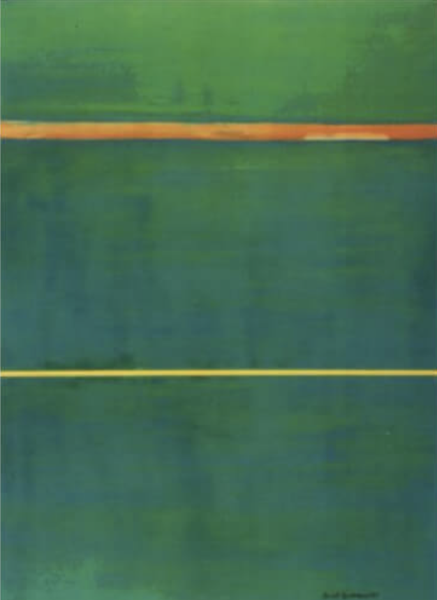
This is a hand-painted color field piece in three bands of green, cut by two thin horizontal lines — one burnt orange, one pale yellow. It reads slow, textured, and grounded, working best as a quiet focal point above a low sofa, a dining end wall, or a home office desk paired with walnut, brass, and deep upholstery.
Quick read
Restrained, layered, and slow to read — a color field painting that treats stillness as the subject.
Product reference
Abstract Color Field Quiet Interval opens with three broad bands of green stacked vertically, split by two slim horizontal lines — one burnt orange, one pale yellow. The upper green leans warm and sunlit; the two below drop into a cooler, teal-shadowed range. It's a hand-painted canvas, so the color doesn't sit flat. Layered brushwork gives each field a soft, breathing texture that shifts with the light in the room.
The orange line is the piece's small act of tension. Its edges wear thin and break in places, while the yellow line beneath holds a steadier path. There isn't much negative space to speak of. The composition works through weight and color temperature rather than empty room.
What Makes It Visually Distinct
Most green abstract canvas art leans either botanical or graphic. This one does neither. It sits in the color field tradition — closer in spirit to Rothko or Diebenkorn than to a modern print — where the subject is really the relationship between color, edge, and surface. The two dividing lines act like horizon markers. Once you notice them, the eye keeps returning.
The hand-painted surface matters here. A print of this composition would flatten quickly. The layered strokes are what give the greens their depth and keep the piece from reading as pure geometry.
How It Reads in a Room
The overall mood is grounded and restrained. It doesn't decorate a wall so much as settle it. In daylight, the warm upper green comes forward and the orange line feels lit from within. Under lamplight, the teal deepens and the whole canvas gets quieter and more architectural.
This is a focal-point piece, but a slow one. It won't compete with a bold sofa or a busy gallery wall — it prefers to hold a single wall on its own and let the room build around it.
Who It Suits
The palette lands cleanly in mid-century modern rooms, contemporary wabi-inspired spaces, and transitional interiors that lean warm. It pairs naturally with:
- Walnut and other warm woods
- Deep leather upholstery in cognac, oxblood, or espresso
- Brass or aged-bronze hardware
- Linen, boucle, and other matte textiles
If your room runs cool — chrome, white lacquer, high-contrast black and white — this piece will feel out of key. It wants a room built around saturated neutrals, not crisp minimalism.
A Real Styling Scenario
Picture a living room with a low walnut-legged sofa in olive or camel, a vintage rug with muted red tones, and a brass floor lamp arcing over one end. Hang Quiet Interval centered above the sofa, with roughly six to ten inches of breathing room between frame and cushion line. The orange line picks up the rug. The greens settle behind the sofa without flattening it. The wall stops feeling like background.
In a home office, the same piece behaves differently. Facing the desk, it becomes something to look up at between tasks — present, but not demanding. That's the tradeoff with color field work: it rewards time in the room more than a quick glance from the doorway.
Common Misreads
Two assumptions worth setting aside. The first is that a mostly-green painting will read as nature art. This one doesn't — it's abstract, architectural, and closer to a mood than a landscape. The second is that minimalist means small. Color field paintings almost always work better at generous scale. Undersized, the bands lose their weight and the two thin lines stop feeling deliberate.
Product Details
- Type: Hand-painted canvas, original brushwork
- Style: Abstract color field, minimalist
- Palette: Warm sunlit green, teal-shadowed green, burnt orange line, pale yellow line
- Surface: Layered, textured, matte — not a flat print finish
- Best rooms: Living room above a low sofa, dining room end wall, home office facing the desk
- Pairs well with: Walnut wood, deep leather, brass accents, warm saturated neutrals
- Framing: Works unframed for a modern edge, or with a slim walnut or natural oak float frame for a more transitional read
For readers weighing their options, spend a moment with Abstract Color Field Quiet Interval and picture it on the wall you actually live with.