

Abstract Divide Original: A Three-Panel Study in Texture, Stillness, and Contrast
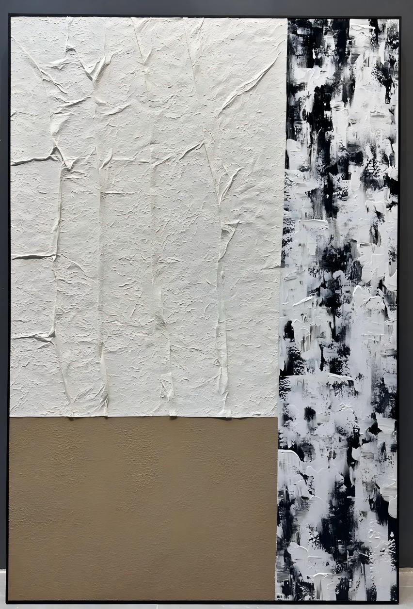
Abstract Divide Original reads as three distinct surfaces held together by a single vertical seam: a heavily built plaster panel, a flat taupe base, and a monochrome brushed section on the right. It brings depth and contrast to neutral rooms without pulling focus, making it a strong fit for contemporary, minimalist, and Japandi-leaning interiors.
Quick read
Order held through contrast, not symmetry.
Product reference
Abstract Divide Original is a hand-painted canvas that reads almost like three separate surfaces sharing one frame. A heavily built plaster panel sits at the top left, its ridges catching light unevenly. Below it, a smooth taupe field lands the eye. To the right, a tall column of black-and-white brushwork moves in short, layered strokes. The vertical seam between the two halves gives the piece its structure — firm, but never rigid.
What You See First
The plaster surface is the first thing most people notice. It behaves less like paint and more like folded paper pulled taut, and it shifts noticeably as daylight moves across the wall. Under lamplight in the evening, the ridges deepen and the composition feels heavier. In morning light, the taupe base reads softer and the monochrome side opens up. It's a piece that changes with the room rather than sitting flat against it.
How It Reads in a Room
This is a grounded, architectural piece — not a decorative one. It leans calm and considered, closer to a wabi-inspired or Japandi sensibility than anything ornamental. The palette stays inside a narrow neutral range: warm white, taupe, and black. That restraint is what lets the texture do the talking.
It works well as a quiet focal point. Above a low, linear sofa, the taupe block tends to align with the horizon of the furniture, which anchors the whole wall. On a dining room end wall, it gives the eye a place to rest between courses without competing with the table. In a home office, placed opposite the desk, it offers just enough variation to hold attention during a long call without becoming a distraction.
Who It's For
Abstract Divide Original suits rooms built around restraint — light oak tables, linen upholstery, matte black hardware, plaster or off-white walls. If your interior leans contemporary, minimalist, or Japandi, it slots in naturally. If your space is highly colorful or heavily patterned, this piece will feel out of step; it's designed to complete a quiet room, not liven up a loud one.
Realistic Expectations
Because this is a hand-painted, textured canvas, no two pieces are visually identical. The plaster ridges, brushstroke density, and edge behavior will vary slightly. That's part of the appeal, but worth knowing if you're expecting a print-perfect surface. The texture is genuinely three-dimensional, which means it casts small shadows — a feature on a well-lit wall, and something to consider on a wall that sits in deep shade.
How It Compares
Next to a flat monochrome abstract print, Abstract Divide Original has more physical presence and reads as a made object rather than an image. Compared to fully textured plaster wall art, it's more compositional — the taupe block and the brushed column give it rhythm and edges, so it doesn't blur into the wall the way an all-over texture piece can. If you've been comparing black and white textured wall art with neutral plaster wall art and can't decide, this piece essentially sits between the two.
A Quick Styling Scene
Picture a living room with a low oatmeal linen sofa, a light oak coffee table, and matte black floor lamp. The wall behind the sofa is off-white and mostly bare. Centered above the sofa, Abstract Divide Original brings vertical weight to the wall, the taupe field echoes the sofa tone, and the black brushwork ties back to the lamp. Nothing is matched; everything is in conversation.
Product Details
- Type: Hand-painted textured canvas wall art, single panel with a three-part composition
- Palette: Warm white plaster, taupe, black and white brushwork
- Finish: Raised plaster texture on the upper section, smooth matte taupe field, layered brushwork on the right column
- Style direction: Abstract, 3D textured, wabi-inspired
- Best rooms: Living room, dining room, home office, foyer, bedroom
- Placement notes: Above a low, linear sofa; on a dining room end wall; opposite a desk; on a wall with indirect natural or lamp light to bring out the texture
- Pairs well with: Light oak wood, warm white linen, matte black metal, plaster walls
For readers building a calm, layered neutral room and looking for a hand-painted piece with real surface presence, take a closer look at Abstract Divide Original.