

Forest Green, Held in Layers: A Quiet Study in Depth
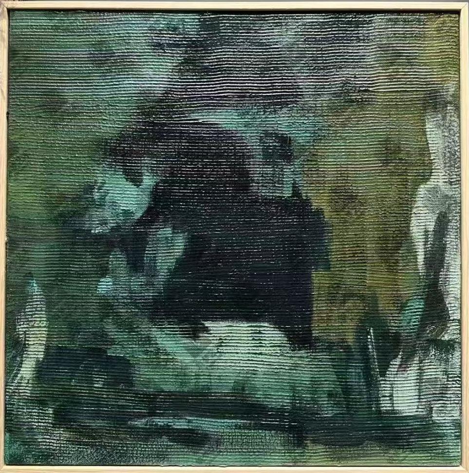
This textured green abstract centers a dense dark mass inside cooler mint and sage passages, with warm olive pressing in from the right and a pale, bleached-green base below. The horizontal ridged surface catches light in fine repeating lines, giving the canvas a tactile, almost geological presence that anchors a room without shouting.
Quick read
Moody, layered, and quietly architectural — a green abstract that holds a wall the way weathered stone holds a landscape.
Product reference
At first glance, Abstract Forest Green Depths looks less like a painting and more like a slice of terrain. Deep greens and blacks move horizontally across a ridged canvas, with a dense dark mass gathering weight near the center. Around it, cooler mint and sage passages soften the edges, while warm olive and gold press in from the right. The lower third settles into a pale, almost bleached green — a place for the eye to rest.
It's a quiet piece, but not a shy one. The texture does most of the talking.
What Kind of Wall Art This Actually Is
This is a hand-painted textured canvas in the moody abstract tradition — closer to a wabi-inspired, earthy study than a graphic modern print. The horizontal ridges catch light in fine repeating lines, so the surface shifts subtly through the day. In morning light it reads cooler and more mineral; under warm lamps in the evening, the olive and gold tones come forward and the greens deepen.
If you've been comparing dark green wall art online, the difference here is tactility. A flat print of a similar image would look designed. This one looks made.
How It Reads in a Room
The composition is weighted and centered, which means the canvas naturally anchors whatever sits beneath it. It doesn't need symmetry around it to feel resolved. Hung above a low sofa, it pulls the seating area together. Above a walnut console in a foyer, it reads almost architectural — a still, dark form that greets you as you pass.
Mood-wise, expect something calm and slightly serious. This isn't a bright, cheerful accent piece. It leans introspective, which is exactly why it works well in home offices and reading corners where you want a steady visual point rather than constant stimulation.
Who It Suits (and Who It Doesn't)
It belongs in rooms that favor earthy, restrained materials: dark walnut wood, matte black metal, deep clay upholstery, warm white or clay-toned walls. Contemporary wabi-inspired interiors, rustic modern spaces, and softer industrial rooms all give it the backdrop it needs.
It's a less natural fit for high-contrast coastal palettes, pastel nurseries, or bright mid-century rooms built around saturated primaries. The green here is forest and moss, not emerald or jewel — closer to the tones you'd find in bark, lichen, or wet stone.
Realistic Expectations
A few honest notes worth setting before it arrives:
- Because it's hand-painted, ridge patterns and pigment density will vary slightly from any single photograph.
- The dark center reads darker in low light — plan for a nearby lamp or picture light if the wall doesn't get much daylight.
- It performs best as a solo focal piece. Trying to build a gallery wall around it usually dilutes what makes it work.
A Quick Styling Scenario
Picture a living room with a low, deep-clay sofa, a walnut coffee table, and warm white walls. The canvas hangs centered above the sofa, roughly six to eight inches above the back cushions. A black metal floor lamp arcs in from the side. There's no other art on that wall — just the piece, the sofa, and maybe a ceramic vessel on the table. The room feels grounded, quiet, and a little bit like a gallery without trying to be one.
Product Details
- Type: Hand-painted canvas wall art, original texture built up in horizontal ridges
- Palette: Deep forest green, black, sage, mint, olive, and pale bleached green
- Style direction: Abstract, wabi-inspired, moody and earthy
- Best rooms: Living room, home office, foyer, dining room, bedroom
- Pairs with: Dark walnut wood, matte black metal, deep clay or olive upholstery, warm white or clay walls
- Placement notes: Above a low sofa, over a walnut console, on the wall facing a desk, or on an end wall near an entry
- Reads best as: A solo focal point rather than part of a gallery wall
For the full view, sizing, and finish details, see Abstract Forest Green Depths.