

The Quiet Drama of Abstract Gold Wave Crossing: A Diptych That Moves Across the Wall
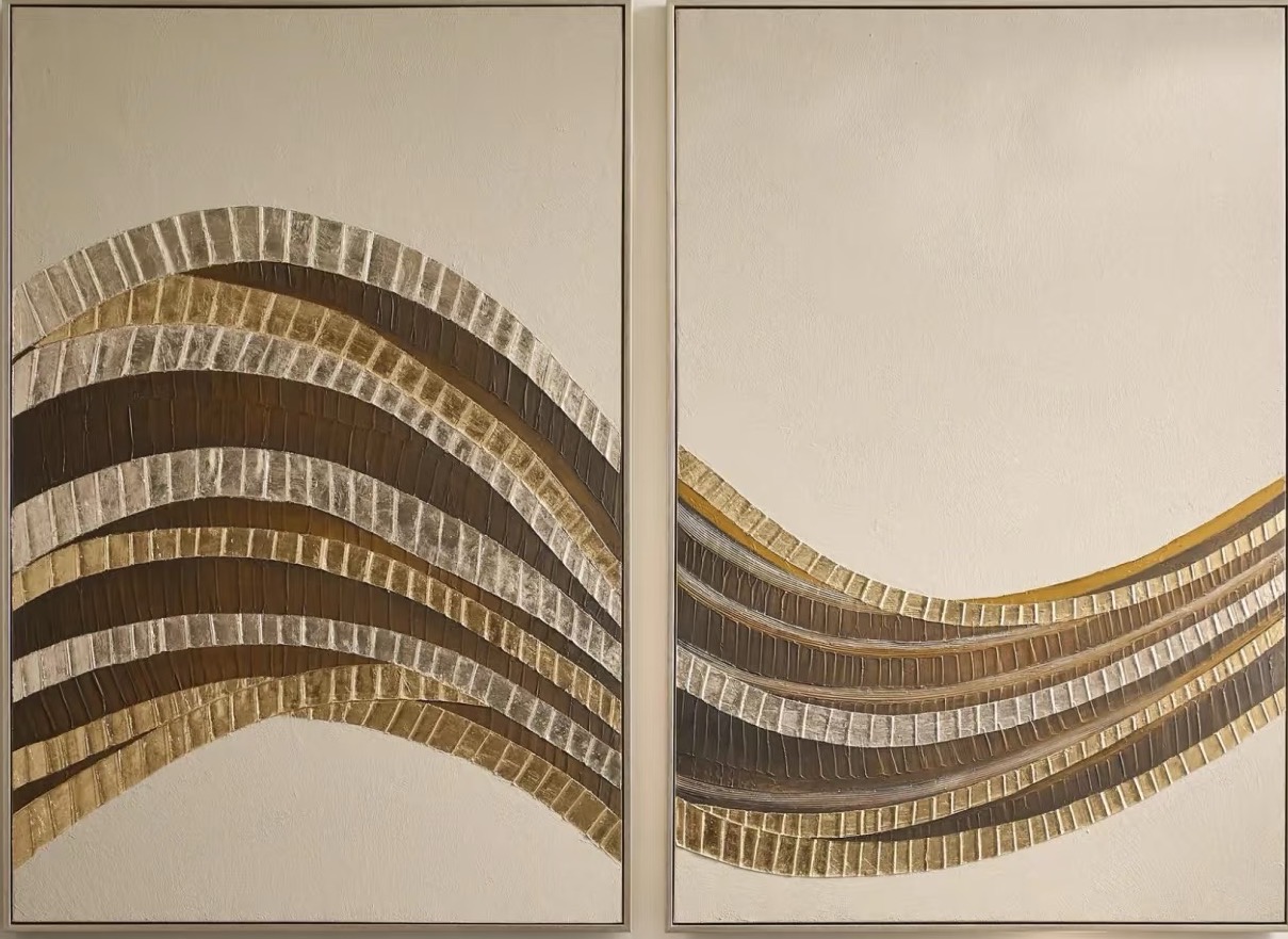
Abstract Gold Wave Crossing is a textured metallic diptych built around one continuous gestural wave. The ribbed bands of gold leaf, bronze, and pewter compress and release across two panels, giving a room horizontal movement without visual noise. It suits living rooms, foyers, and bedrooms with warm neutral walls and works especially well above a low console, wide sofa, or dresser.
Quick read
Two panels, one current — metallic ridges that catch the light and slow the room down.
Product reference
Abstract Gold Wave Crossing reads first as motion. Two panels hold a single arcing current — ribbed bands of gold leaf, bronze, and pewter that gather tightly on the left, dip through the middle, and open back up across the right. The gap between the panels isn't a break; it's part of the composition, the pause where the wave breathes before continuing.
Up close, the surface does most of the talking. Each band is raised and ruled, almost like sedimentary rock or the spine of a hand-bound book. The metallics shift under changing light — warmer and more brass-toned in daylight, deeper and more shadowed under a lamp. It's textured wall art that keeps rewarding a second look.
What Kind of Wall Art This Actually Is
This is a hand-painted diptych, not a print. The ridged bands are built up on the canvas surface, which is why the piece reads as sculptural from an angle and painterly head-on. The palette stays disciplined: brass, umber, aged silver, set against a chalky plaster-toned ground. Nothing in it competes with itself.
If you're comparing it against flatter abstract canvases or a large single-panel statement piece, the difference is physical. A print gives you image. This gives you surface, shadow, and a horizontal span that stretches across a wall the way a mantel or console does.
How It Behaves in a Room
The composition is calm but not passive. Because the wave runs horizontally, it visually widens whatever sits beneath it — a low sofa looks longer, a console feels more grounded, a dresser reads more architectural. The negative space on the right panel keeps the piece from feeling heavy, so it can hang in a smaller room without swallowing it.
Light matters here. In morning light, the gold leaf lifts and the pewter recedes. By evening, under warm lamps, the bronze deepens and the ridges cast finer shadows. It's the kind of artwork that changes character across the day without ever feeling loud.
Who It Suits
This one leans toward interiors that already have some warmth in them — soft modern rooms, wabi-inspired spaces, or lightly Art Deco setups where metallics feel intentional rather than decorative. It pairs naturally with brass hardware, light oak, aged bronze, and walls in warm white, greige, or taupe.
It's less suited to cool-toned, high-contrast interiors with a lot of black, chrome, or stark white. The metallics need warm neighbors to sit correctly.
A Realistic Placement
Picture a living room with a long low sofa in oatmeal linen, a light oak coffee table, and a brass floor lamp off to one side. The diptych goes centered above the sofa, panels spaced a few inches apart so the wave feels continuous. Nothing else on that wall. The room reads finished — not styled, finished — because the horizontal span of the piece matches the furniture line beneath it.
The same logic applies in a foyer facing the front door, or above a wide bedroom dresser in place of a headboard-adjacent piece.
Common Assumptions Worth Correcting
- It's not a gallery-wall piece. The diptych is the arrangement. Adding smaller frames around it dilutes the movement.
- The metallics aren't shiny. They're leafed and layered, closer to aged metal than mirror finish.
- The two panels aren't identical. They complete one gesture together, so they need to hang as a pair with consistent spacing.
Product Details
- Format: Two-panel diptych, hand-painted on canvas
- Surface: Raised, ribbed texture with gold leaf, bronze, and pewter layering
- Palette: Warm metallics on a chalky plaster-toned ground
- Best rooms: Living room, foyer, bedroom
- Ideal placement: Above a low console, centered over a wide sofa, along a long entry wall, or above a wide dresser
- Pairs with: Warm brass accents, light oak, aged bronze hardware
- Style direction: Contemporary wabi-inspired, soft modern, lightly Art Deco
For readers weighing a textured metallic statement piece against a flatter print or a busier abstract, the tradeoff here is clear: less image, more presence.
See the full piece and available sizing on Abstract Gold Wave Crossing.