
A Quiet Landscape in Plaster and Pigment: Inside the Abstract Green Textured Shore Still
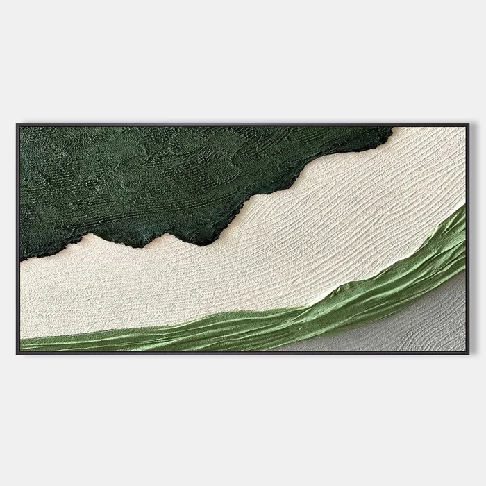
The Abstract Green Textured Shore Still by Fir Gallery is a horizontal, hand-painted canvas built around three bands: a rough forest-green slab pressed into a wide cream field, with a single fluid green stroke curving across a cooler grey base. It carries real material weight, fits naturally above a low sofa, a headboard, or a desk, and pairs cleanly with light oak, warm white linen, and matte black accents.
Quick read
A piece that behaves more like a landscape memory than a painting — quiet, weighted, and slow to read.
Product reference
Piece: Abstract Green Textured Shore Still - Wall Art by Fir Gallery
Format: Hand-painted
Size family: large
View the productThe Abstract Green Textured Shore Still reads, at first glance, like a horizon you've seen before but can't quite place. A dense slab of dark forest green sits across the upper field, its lower edge torn and irregular, pressed into a broad sweep of cream. Underneath, a single curving stroke of mid-green moves across a cooler grey ground, almost like a tideline. It's abstract, but the eye keeps trying to read it as landscape — and that tension is the whole point.
This is a hand-painted canvas, not a flat print, and the difference shows up immediately. The upper green has a plaster-like build that catches light in ridges and shadows. The cream center is smoother, quieter, and gives the composition somewhere to breathe. In person, the piece behaves more like a relief than a painting.
How It Reads in a Room
Hung at scale, the artwork feels grounded rather than loud. The dark green anchors the top of the wall and pulls the eye upward, while the cream expanse softens the weight so the piece never feels like it's pressing down on the furniture below it. In daylight, the texture sharpens and the green deepens. Under warm lamplight in the evening, the cream takes on a softer, almost clay-like tone and the surface looks more sculptural.
If you're choosing between a graphic statement piece and something more atmospheric, this one sits closer to atmospheric. It holds a focal point without demanding constant attention — useful in rooms where you actually live, not just pass through.
Who It Suits
The palette and texture fit comfortably inside Japandi, soft modern, and wabi-inspired interiors. It also works in contemporary rooms that lean organic — light oak, warm white linen, matte black hardware, a little ceramic, a little jute. It's less suited to high-gloss, high-contrast, or heavily ornamental spaces, where the quiet middle of the composition can get overwhelmed.
Buyers who tend to like this piece are usually deciding between a textured neutral abstract and a landscape painting. This one bridges both: the structure of a landscape, the restraint of an abstract.
A Real-World Styling Scenario
Picture a long living room with a low linen sofa in warm white, a light oak coffee table, and a matte black floor lamp arcing over one end. The wall above the sofa is wide and mostly empty. A large horizontal canvas like this fills that span in one move — no gallery wall math, no second piece needed. The dark green ties back to the lamp, the cream echoes the sofa, and the curved green stroke keeps the lower half from feeling static.
The same logic works above a bed with white or linen bedding, or on the wall facing a desk in a home office, where the layered bands give the eye something to rest on between tasks without pulling focus.
Realistic Expectations
Because the surface is built up by hand, no two pieces are visually identical. Ridge patterns, edge tears, and the exact curve of the lower stroke will vary slightly. That's part of the appeal, but worth knowing if you're expecting a print-perfect match to the photo. The palette skews cooler in north-facing rooms and warmer under incandescent or 2700K lighting — both look good, just different.
One common mistaken assumption: that a large textured abstract will overwhelm a small wall. In practice, this composition is mostly cream, so it tends to feel airier than the dimensions suggest. Undersizing is the more frequent regret.
Product Details
- Type: Hand-painted textured canvas, horizontal format
- Style: Abstract, wabi-sabi, minimalist, organic modern, 3D textured
- Palette: Forest green, cream, soft grey, mid-green accent
- Finish: Plaster-like raised texture on the upper field; smoother cream center; matte overall
- Sizing: Available in large-scale formats suited to long sofas, headboards, and feature walls
- Framing: Pairs naturally with matte black frames; also works unframed for a softer edge
- Best rooms: Living room above a low sofa, bedroom above a headboard, home office facing a desk
- Pairs well with: Light oak wood, warm white linen, matte black metal, ceramic and jute accents
For rooms that want grounding without heaviness, this is one of the easier large abstracts to live with. See the full piece and available sizes on Abstract Green Textured Shore Still - Wall Art by Fir Gallery.