

Quiet Interval: A Textured Neutral Abstract That Rewards Slow Looking
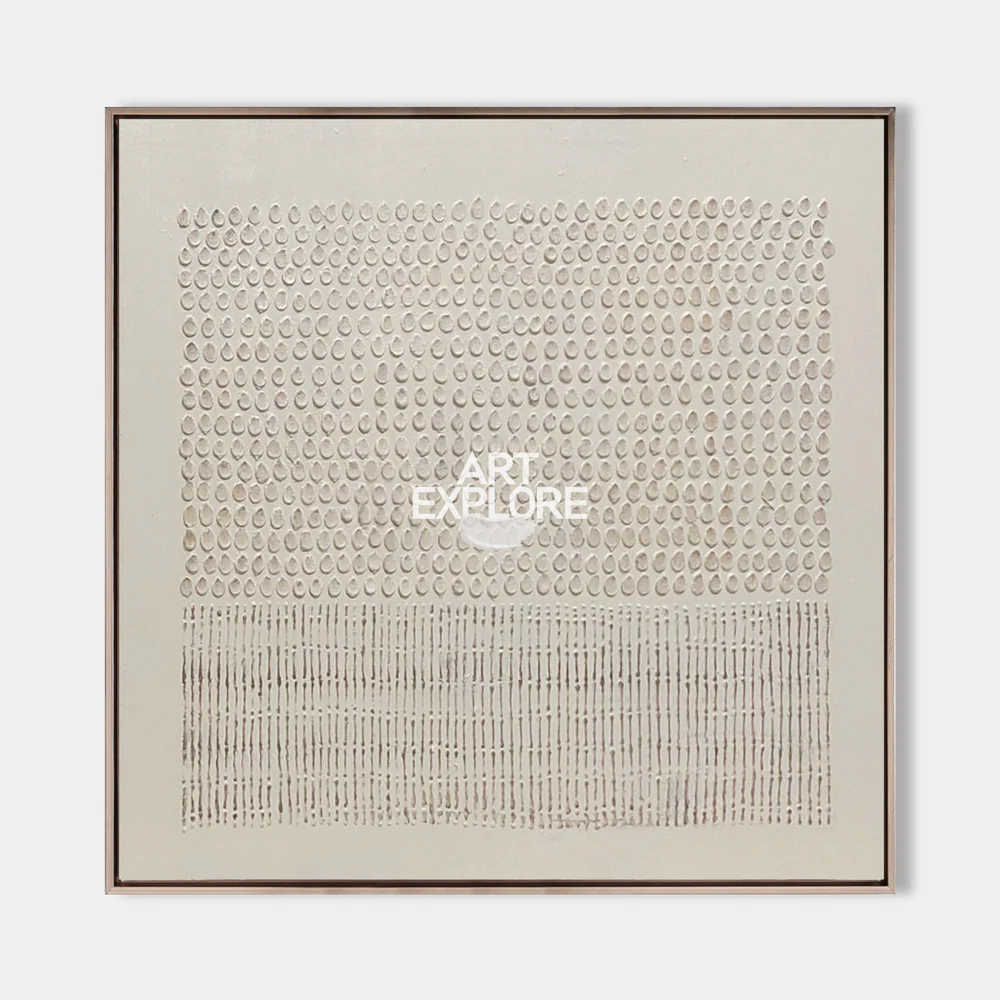
This large hand-painted canvas from Fir Gallery pairs rows of teardrop relief marks with a lower band of vertical strokes, creating a quiet, wabi-inspired composition. It reads as a textured focal wall piece for living rooms, bedrooms, and home offices leaning Japandi, minimalist, or contemporary neutral.
Quick read
Two zones, one palette, and enough surface depth to make the wall feel considered rather than decorated.
Product reference
Piece: Textured Neutral Abstract Quiet Interval
Format: Hand-painted
Size family: large
View the productQuiet Interval opens with pattern before it opens with color. The upper two-thirds of the canvas carry rows of small teardrop-shaped relief marks pressed into a pale ground, repeating with the steadiness of a counted rhythm. The lower third shifts into denser vertical strokes, tighter and more linear, giving the composition a woven, grounded base. Everything stays inside a narrow range of off-white and warm grey, so what you notice is surface, not palette.
It's a hand-painted piece, not a print, and that shows in the way the light moves across it. In daylight, the teardrop marks catch soft shadows and read almost like braille. Under lamplight, the surface softens and the whole canvas feels quieter, more like plaster than paint.
What kind of wall art this actually is
This is a 3D textured neutral abstract in the wabi-sabi and Japandi direction — closer to a relief object than a flat painting. The composition is geometric in structure but handmade in feel, with slight variations in each mark that keep it from looking machined. If you've been comparing textured canvas wall art, cream and grey minimalist art, or plaster-effect pieces, this one sits firmly in the tactile, low-contrast category.
It's built to be a focal point without behaving like one. There's no strong color moment, no obvious subject. The interest is entirely in rhythm, spacing, and how the surface interacts with light.
How it changes a room
Above a low, linear sofa, the horizontal banding lines up with a seated sightline, which gives the wall a settled quality — the room feels composed rather than styled. Behind a headboard, the restrained palette recedes into the bedding and wall tone, adding weight without pulling attention. On the wall facing a desk in a home office, the repeating pattern is calm enough to rest your eyes on between tasks without becoming visual background noise.
It pairs cleanly with light oak, warm white linen, soft taupe upholstery, and plaster or limewash walls. Against high-contrast interiors — glossy black, saturated jewel tones, heavy pattern — it can feel underpowered.
Who it's really for
Buyers who gravitate to this piece usually aren't shopping for a statement of color. They're looking for something that adds material presence to a quiet room. If your interior leans Japandi, contemporary wabi-inspired, or minimalist, and you already have texture in your rugs, upholstery, or ceramics, this canvas extends that language onto the wall.
It's less suited to rooms that need a visual anchor with bold contrast, or to gallery walls where individual pieces have to compete. This one wants space around it.
A common misread
Photos can flatten it. On screen, the surface can look almost uniform, and buyers sometimes assume the piece is subtle to the point of being plain. In person, the relief work is the entire experience — the teardrop marks have real depth, and the shift between the upper field and lower vertical band becomes much more architectural than a photograph suggests.
A quick styling scenario
Picture a living room with a low oak-legged sofa in oatmeal linen, a jute rug, a travertine coffee table, and warm off-white walls. Quiet Interval hangs centered above the sofa, with about eight to ten inches of breathing room above the backrest. A small ceramic lamp on a side console throws warm light across the canvas in the evening, and the teardrop marks start to cast faint shadows. The room reads finished — not decorated.
Product details
- Type: Hand-painted textured canvas, framed
- Style: Abstract, 3D textured, wabi-sabi, minimalist
- Palette: Off-white and warm grey, narrow tonal range
- Surface: Relief teardrop marks in the upper field; vertical linear strokes in the lower band; plaster-like finish
- Size direction: Available in large formats suited to sofa walls, headboard walls, and desk-facing walls
- Best rooms: Living room, bedroom, home office
- Pairs with: Light oak, warm white linen, soft taupe upholstery, plaster or limewash walls
- Works best as: A quiet focal point in a low-contrast, texture-forward interior
For readers building a calmer, more tactile wall moment at home, explore Textured Neutral Abstract Quiet Interval.