

Quiet Horizon: A Hand-Painted Abstract That Softens the Whole Room
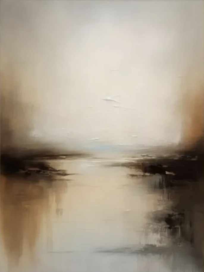
Abstract Landscape Quiet Horizon is a textured, hand-painted canvas that reads as a soft horizon line between a pale, atmospheric sky and a darker, reflective lower band. The palette stays in warm neutrals — cream, taupe, amber, walnut — with heavier strokes near the center that give the surface real physical presence. It suits calm, layered interiors like Japandi, wabi-inspired, and modern minimalist spaces, and holds up as a focal point above a sofa, console, or bed without visually crowding the room.
Quick read
A slow, layered abstraction — closer to a mood than a scene.
Product reference
Quiet Horizon opens with a soft, uneven horizon line — a pale ivory sky pressing down onto a darker, reflective band where amber, umber, and near-black settle into the corners. It doesn't read as a specific place. It reads as a mood: overcast light, still water, the last hour before dusk. That restraint is the whole point.
This is a hand-painted abstract landscape built around texture and tonal weight rather than imagery. Thick strokes near the center catch light unevenly and give the canvas a plaster-like density, while the upper field stays airy and washed. The tension lives in that seam where the dark masses meet the pale water line, then dissolves upward into open space.
How It Reads in a Room
On the wall, Quiet Horizon behaves like a quiet anchor. It has enough depth to hold a large blank wall on its own, but the palette is soft enough that it never competes with the furniture in front of it. In daylight, the ivory and taupe passages open up and feel almost weightless. Under warm lamplight in the evening, the walnut and amber tones deepen, and the textured center picks up shadow — the painting shifts from airy to grounded without changing character.
It's a focal point, but a slow one. You notice the composition first, then the surface, then the small pooled darkness in the lower corners. That layered read is what separates it from a flat neutral print.
Who It's For
This piece fits interiors leaning toward Japandi, contemporary wabi-inspired, and warm minimalism. If your room already runs on light oak, walnut, linen, bouclé, or aged brass, the palette drops in without adjustment. It's also a strong option for anyone tired of high-contrast black-and-white abstracts and looking for something with more warmth and hand-made presence.
It's less suited to bold, saturated, or highly graphic rooms. Placed next to jewel tones or hard modern color blocking, its subtlety can get overpowered.
Common Assumptions Worth Correcting
- "Neutral means safe and forgettable." The texture and tonal shifts here do a lot of quiet work — this is closer to a tonal painting than a beige placeholder.
- "It needs a heavy frame." Unframed or a slim natural-wood float frame usually reads best. A thick ornate frame fights the softness of the composition.
- "Bigger is always better above a sofa." Scale it to roughly two-thirds the width of the furniture below. Oversizing a soft piece like this can make the wall feel top-heavy.
How It Compares
Against a high-contrast black-and-white abstract, Quiet Horizon feels warmer, slower, and easier to live with day to day. Against a literal landscape print, it gives you the same sense of horizon and atmosphere without locking the room into a specific place or season. Compared with a flat minimalist print, the hand-painted texture reads with far more depth in person — especially in raking light.
A Real Placement
Picture a living room with a low linen sofa, a light oak coffee table, and a floor lamp with a warm bulb. Centered above the sofa, Quiet Horizon extends the room's existing neutrals and gives the wall a horizon line to rest on. In the evening, with the lamp on, the dark lower band grounds the seating area while the ivory sky keeps the ceiling feeling tall. Nothing shouts. The room just feels finished.
Product Details
- Type: Hand-painted canvas wall art, original brushwork with visible texture
- Style: Abstract landscape, minimalist, wabi-inspired
- Palette: Warm ivory, taupe, cream, amber, umber, walnut, with near-black passages in the lower corners
- Finish: Layered, plaster-like center strokes; soft atmospheric wash above
- Best rooms: Living room (above a low sofa), bedroom (behind the headboard), foyer (above a console at eye level), dining room, home office
- Pairs well with: Light oak, walnut, warm taupe upholstery, linen, bouclé, aged brass accents
- Framing note: Reads best unframed or with a slim natural-wood float frame
For calm, textured, warm-neutral wall art that carries a room without dominating it, take a closer look at Abstract Landscape Quiet Horizon.