

Quiet Blocks: A Neutral Patchwork That Anchors Without Shouting
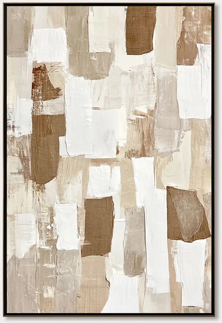
This hand-painted abstract reads as an irregular grid of torn-edge blocks in cream, taupe, and warm brown, with a single rust patch offering quiet contrast. It works as a calm focal point above a sofa, headboard, or dining wall, and slips easily into Japandi, wabi-inspired, and rustic modern rooms built around oak, linen, and boucle.
Quick read
A patchwork of quiet color, held together by texture and restraint.
Product reference
At first glance, Abstract Patchwork Neutral Quiet Blocks looks like a wall of stitched-together canvas swatches — rectangles of ivory, sand, taupe, and warm umber overlapping in an uneven grid. Some blocks are brushed smooth in chalky white, others left coarse with visible woven grain. The edges aren't clean; they're torn, giving the whole surface a collaged, hand-assembled quality that a print simply can't imitate.
A single deep rust patch sits toward the left, quiet but deliberate. That one warmer note is what keeps the composition from drifting into pure beige territory.
What kind of wall art this actually is
This is a hand-painted neutral abstract on textured canvas, built around composition and surface rather than imagery. There's no landscape to read, no figure to focus on — just a rhythm of blocks, weights, and tones. That makes it a quiet focal piece: strong enough to hold a main wall, calm enough that it doesn't compete with a sofa, a dining table, or a bed.
If you've been comparing minimalist line art, moody abstracts, and textured neutral canvases, this one sits firmly in the textured-neutral category — closer in spirit to plaster art and wabi-inspired work than to graphic modern abstracts.
How it reads in a room
The palette does most of the work. Warm neutrals soften the wall behind it, and the torn edges add a handmade softness that keeps modern rooms from feeling too sharp. In daylight, the woven grain and brush marks come forward, and you notice the shifts between chalky white and raw canvas. Under lamplight, the piece warms up — the umber and rust deepen, and the whole composition feels more grounded.
It behaves like a supporting anchor more than a statement. You'll notice it, but it won't hijack the room.
Who it's for
This piece suits people building rooms around natural materials: warm oak, rattan, linen, boucle, stoneware, unbleached textiles. It fits comfortably inside:
- Japandi interiors that lean on restraint and texture
- Contemporary wabi-inspired spaces with plaster walls and raw wood
- Rustic modern rooms where warmth matters more than polish
It's a weaker match for high-contrast, high-gloss, or heavily saturated interiors. If your room already leans cool gray, black, and chrome, this palette will feel disconnected.
Realistic expectations
Because it's hand-painted, no two canvases are identical. Brushwork, torn edges, and the density of texture will vary slightly — that's part of the appeal, not a flaw. The colors read warm in person: think latte, oat, mushroom, and a rust that's closer to terracotta than red. Buyers expecting cool ivory or bright white should look elsewhere.
One common mistaken assumption: that a neutral abstract is automatically a safe filler. This one has real visual weight up close. It rewards a spot where people can actually see the texture — above a low sofa, behind a dining banquette, or in a reading nook where you pass it slowly.
A quick styling scenario
Picture a living room with a low oatmeal sofa, a warm oak coffee table, and a jute rug. The wall behind the sofa is bare plaster or soft white. Hung centered and low — bottom edge roughly 8 to 10 inches above the sofa back — the patchwork pulls the whole seating group together. Add a rattan floor lamp on one side and a stoneware vase on the console, and the room reads intentional without looking styled.
Product details
- Type: Hand-painted abstract on textured canvas
- Palette: Ivory, sand, taupe, warm brown, with a single rust accent
- Surface: Mixed — smooth chalky passages next to coarse, visibly woven areas; torn rather than cut edges
- Composition: Irregular grid of overlapping rectangles, evenly weighted across the canvas
- Best rooms: Living room above a low linear sofa, dining room on the wall facing the table, bedroom above the headboard, foyer, or home office
- Pairs with: Warm oak, rattan, linen, boucle, unbleached cotton
- Interior directions: Japandi, wabi-inspired contemporary, rustic modern
It's the kind of piece that settles a room rather than performs in it — a quiet anchor built from texture, restraint, and warm neutral color. See the full canvas and available options for Abstract Patchwork Neutral Quiet Blocks.