

Abstract Quiet Divide: A Textured Wall Piece That Reads Like Excavated Plaster
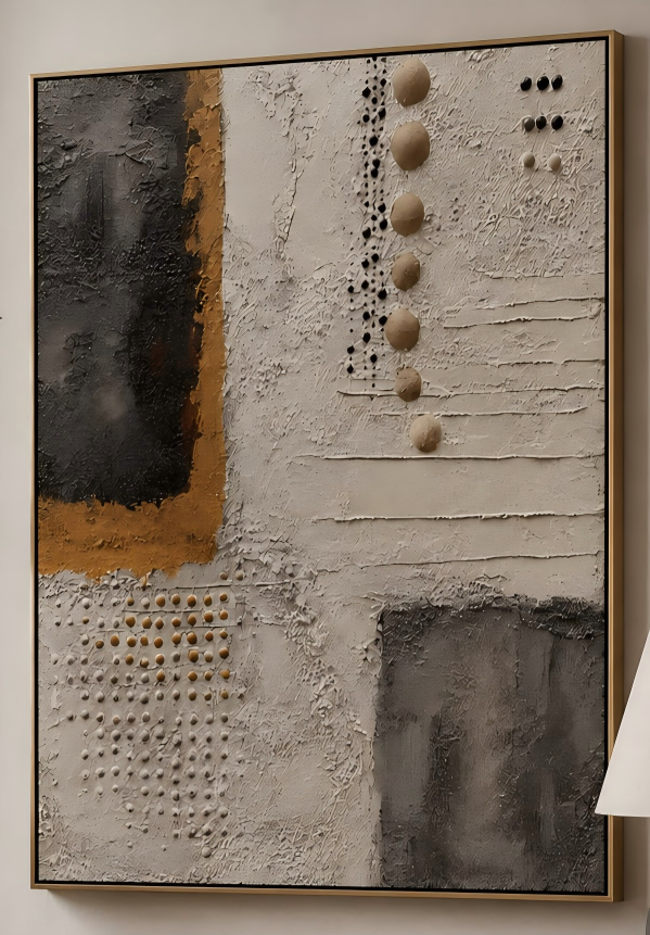
Abstract Quiet Divide is a hand-painted textured canvas built around a charcoal block, a band of burnished ochre, and rows of small dimensional discs set into warm greige plaster tones. It reads as quietly architectural rather than decorative, and settles into contemporary, wabi-inspired, and Japandi rooms where restraint matters more than ornament.
Quick read
Weight on the left, light on the right — a wall piece that feels excavated instead of painted.
Product reference
At first glance, Abstract Quiet Divide doesn't look painted so much as uncovered. A dense charcoal block anchors the upper left, its edge softened by a band of burnished ochre that bleeds into raw plaster tones. The rest of the canvas unfolds in warm greige, built up in troweled ridges and dry, horizontal lines that catch light unevenly. A vertical column of small dimensional discs runs down the center, echoed by a quiet grid of ochre beads in the lower corner and a second grey mass settling on the lower right.
The composition holds a loose diagonal symmetry — weight on the upper left, echoed but not repeated on the lower right — with wide, unhurried negative space between. It's a textured abstract canvas that behaves more like a surface than a picture.
How the piece reads in a room
This is a calm, grounded work, not a graphic or high-contrast one. From across the room, you notice the two dark masses first, then the ochre band, then the rhythm of dots and beads as you move closer. That layered read is part of the point: it holds attention without demanding it.
Under daylight, the plaster-like surface shifts noticeably — ridges shadow, ochre warms, greige goes almost bone. Under lamplight, the whole piece deepens and the dimensional discs pick up small highlights. If you've been comparing flat printed abstracts with hand-painted textured canvas art, this is where the difference becomes obvious.
Who it suits
Abstract Quiet Divide leans toward interiors that favor restraint: contemporary wabi-inspired rooms, Japandi layouts, and softer industrial spaces with walnut, linen, and matte black. It pairs naturally with warm wood tones, soft taupe upholstery, and unfussy metal fixtures.
It's a strong fit if you want:
- A focal piece that stays quiet rather than loud
- Texture and dimension instead of bold color
- A neutral palette that still feels intentional, not beige-by-default
- A composition that works off-center, without needing symmetrical styling around it
It's probably not the right call if you're looking for saturated color, hard geometric contrast, or a piece that reads clearly from thirty feet away.
Common assumptions worth adjusting
Neutral doesn't mean flat here. Buyers sometimes expect a beige textured canvas to disappear into the wall, but the charcoal masses and ochre accents give this one real visual weight. It anchors a wall rather than blending into it.
The other assumption worth checking: this isn't a matched-pair piece. Its internal balance is diagonal, so it prefers standing alone over being flanked by a mirrored artwork. A single wall, uncrowded, is where it looks best.
Comparing it to nearby options
Against a large printed abstract, Abstract Quiet Divide trades sharpness for surface. Against a monochrome plaster panel, it trades minimalism for a real focal moment — the charcoal and ochre give the eye somewhere to land. Against a colorful modern abstract, it trades statement energy for longevity in a room you actually live in day to day.
A quick styling scenario
Picture a living room with a low, linear sofa in warm taupe, a walnut coffee table, and a matte black floor lamp. Hang Abstract Quiet Divide centered above the sofa, roughly six to eight inches above the back cushion. You don't need side sconces or a gallery arrangement — the diagonal weight of the composition does the balancing on its own. In a foyer, the same piece over a narrow console greets movement through the space; in a home office, hung on the wall facing the desk, it gives the eye a quiet place to rest between tasks.
Product details
- Type: Hand-painted textured canvas wall art
- Style: Abstract, 3D textured, wabi-sabi influenced
- Palette: Charcoal, burnished ochre, warm greige, raw plaster tones
- Surface: Built-up plaster-like texture with troweled lines, dimensional discs, and small bead detail
- Best rooms: Living room, foyer, home office
- Pairs well with: Warm walnut wood, soft taupe upholstery, matte black metal, linen
- Placement notes: Above a low sofa, centered over a console, or on the wall facing a desk; works best as a single focal piece rather than part of a symmetrical pair
For rooms that reward slow looking, explore Abstract Quiet Divide.