

Abstract Sage Block Divide: A Quiet Study in Weight and Warmth
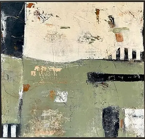
Abstract Sage Block Divide is a hand-painted canvas that reads as much like a wall surface as a painting. A sage lower field meets an ivory upper half in a clear horizontal split, with a dark block on the left, a striped passage on the right, and a long black bar cutting through the green. It suits living rooms, dining rooms, and home offices leaning contemporary wabi, Japandi, or transitional.
Quick read
Built up, not painted on — a textured sage-and-ivory composition that behaves like a quiet architectural surface.
Product reference
Abstract Sage Block Divide reads first as a surface, then as a painting. A muted sage field takes the lower half of the canvas, meeting a warm ivory expanse above in a deliberate horizontal split. Rust, olive, and charcoal fragments come through the worked ground, and a plaster-like texture catches light unevenly across the piece. It looks built up rather than brushed on.
What gives it structure is the interplay of blocks: a dark form pressing in from the upper left, a small striped passage of black and white on the right, and a long black bar running through the sage. The composition sits still without feeling static — dense in places, open in others.
What kind of wall art this is
This is a hand-painted, textured abstract canvas in the wabi-inspired direction — closer to a plastered wall fragment than a graphic print. It leans quiet and architectural rather than expressive or gestural. The palette stays in the sage green, ivory, and warm neutral family, with just enough rust and black to give the eye somewhere to travel.
If you've been comparing sage green abstract paintings or neutral color block art, the difference here is tactile. The surface has physical depth, which is why it holds up in daylight and softens under lamplight instead of flattening out.
How it reads in a room
The piece behaves like a focal point without demanding one. Above a low sectional, the sage and ivory settle against linen or greige upholstery and let the seating stay the main event. On a dining room end wall, it gives the eye a place to rest between courses. In a home office across from the desk, it offers enough visual incident to look at without pulling focus from work.
Because the composition is horizontally organized, it sits naturally above long furniture — sofas, consoles, sideboards, low beds. It's less suited to narrow vertical walls or tight stairwell runs, where the horizontal weight gets cropped visually.
Who it suits
Rooms leaning contemporary wabi, Japandi, or transitional are the natural fit. It pairs cleanly with white oak or bleached wood, warm linen, ceramic lamps, and walls in soft white or warm greige. It also works in more traditional rooms that want one modern anchor, since the palette is quiet enough not to clash with existing wood tones or upholstery.
Buyers who want a bold, high-contrast statement piece will probably find it too restrained. This one is for people who like art that holds a wall without rearranging the room around it.
A realistic styling scenario
Picture a living room with a low oatmeal sectional, a white oak coffee table, and a jute rug. The wall behind the sofa is a soft warm white. Hung centered, roughly six to eight inches above the back cushions, the canvas grounds the seating area — the sage picks up any greenery on the shelves, and the ivory half keeps the wall from feeling heavy. Swap in a linen armchair and a ceramic table lamp, and the room reads finished without looking styled.
Product details
- Type: Hand-painted canvas, not a print
- Style: Abstract, wabi-inspired, textured
- Palette: Sage green, warm ivory, charcoal, rust, olive accents
- Surface: Plaster-like build-up with uneven light catch
- Composition: Horizontal divide with block and bar accents
- Best rooms: Living room, dining room, home office, foyer, bedroom
- Best placement: Above a sofa, sideboard, console, or low bed
- Pairs with: White oak, linen, greige textiles, warm white walls
Because it's hand-painted, expect natural variation in brushwork and texture from piece to piece — part of what keeps it from looking mass-produced.
For a closer look at the full palette, texture, and scale, see Abstract Sage Block Divide.