

A Quiet Study in Weight and Light: Inside Abstract Sculptural Faces Quiet Divide
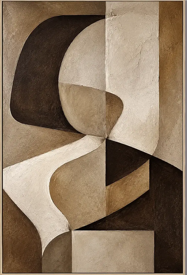
Abstract Sculptural Faces Quiet Divide is a textured, hand-painted canvas that behaves more like a low-relief sculpture than a traditional painting. Its ivory, taupe, and umber palette grounds a room without pulling focus, making it a strong fit for living rooms, foyers, and home offices leaning contemporary wabi, Japandi, or mid-century modern.
Quick read
Carved-looking planes, warm neutrals, and a composition that quietly holds the wall.
Product reference
At first glance, this piece doesn't quite behave like a painting. The ivory, taupe, and deep umber shapes press into one another with the weight of carved plaster, and the surface shifts between smooth matte passages and ridged, tool-marked texture. The suggestion of a profile hovers in the composition without ever fully resolving — which is part of what keeps it interesting on a wall you'll pass every day.
What the Artwork Actually Is
Abstract Sculptural Faces Quiet Divide is a hand-painted canvas built around interlocking planes of warm neutrals. Curved edges meet sharp folds, and the tension sits mostly in the upper left where a pale curve pushes against a dark ground. From there, the eye travels down into lighter, calmer panels. It reads as sculptural abstract wall art rather than a flat graphic — closer in spirit to a bas-relief than to a print.
How It Reads in a Room
The palette is grounded and quiet, so it tends to settle into a space instead of competing with it. In daylight, the texture becomes the main event; raking light across the surface deepens every ridge and fold. Under lamplight in the evening, the piece softens and the umber passages feel heavier, almost architectural. That shift is one of the reasons it works well in rooms you use at different times of day.
It leans focal, not supporting. Hung alone above a low console or sofa, it holds the wall without needing a gallery arrangement around it. Flanking it with smaller art usually dilutes the effect.
Who It Suits
This piece fits homes moving toward contemporary wabi, Japandi, or mid-century modern. If your furniture leans walnut or white oak, with warm white linen upholstery and soft clay or oatmeal walls, the palette extends naturally into the room. It's less at home in cool, high-contrast interiors or glossy modern spaces where the matte, hand-worked surface can feel out of key.
Buyers who tend to love it are the ones already thinking in terms of texture — bouclé, raw linen, unglazed ceramics, oiled wood. Buyers who want a bright color pop or a crisp graphic print usually land somewhere else.
Realistic Expectations
A few things worth knowing before it ships:
- Because it's hand-painted, the texture is physical. Expect visible brushwork, tool marks, and slight variation from the product photo.
- The palette is warm neutral, not stark white. On a cool gray wall, the ivory will read creamier than you might expect.
- It's dense. Negative space is minimal, so give it breathing room on the wall rather than crowding it with shelves or sconces.
How It Compares to Similar Wall Art
Against a flat neutral abstract print, this piece feels heavier and more made. Against a true plaster relief, it's lighter, easier to hang, and more affordable to ship. Compared to a bold black-and-white graphic abstract, it's quieter and more livable — better suited to rooms where you want atmosphere rather than a statement you have to engage with every time you walk in.
A Quick Styling Scenario
Picture a living room with a low walnut console, a warm white linen sofa at an angle, and clay-toned walls. The painting hangs centered above the console at roughly 57 to 60 inches on center. A single ceramic vessel and a stack of books sit below. In the morning, the texture catches the window light. By evening, a nearby table lamp pulls the umber forward and the whole wall feels grounded. Nothing else on that wall — the piece carries it.
Product Details
- Type: Hand-painted canvas wall art with sculptural, built-up texture
- Palette: Ivory, taupe, warm beige, deep umber
- Finish: Mix of smooth matte and ridged, tool-marked passages
- Style direction: Abstract, organic modern, sculptural
- Best rooms: Living room, foyer, home office, dining room, bedroom
- Interior fit: Contemporary wabi, Japandi, mid-century modern
- Placement notes: Above a low console or sofa, on an entry wall facing the door, or across from a desk at seated eye level
- Pairs well with: Walnut or white oak furniture, warm white linen, soft clay walls
For the full view, texture close-ups, and current size options, see Abstract Sculptural Faces Quiet Divide.