
Above the Surf: How Aerial Ocean Wave Summer Drift Reads on a Wall
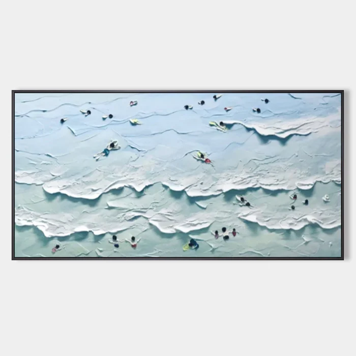
This is a horizontally composed, hand-painted aerial seascape from Fir Gallery. The palette stays cool and airy, the surface is heavily textured, and tiny coral, yellow, and deep-blue swimmers carry your eye across the canvas rather than locking it to one point. It works as a calm focal piece above a sofa, headboard, or long foyer wall in coastal, soft modern, and transitional interiors.
Quick read
An aerial seascape that behaves like weather — moving across the wall in soft bands instead of demanding a single focal point.
Product reference
Piece: Aerial Ocean Wave Summer Drift - Wall Art by Fir Gallery
Format: Hand-painted
Size family: large
View the productSeen from above, the water moves in soft horizontal bands — pale aqua, washed green, broken by the white foam of rolling surf. Aerial Ocean Wave Summer Drift is a hand-painted, heavily textured seascape that takes the bird's-eye view of a swimming beach and translates it into something almost weather-like on the wall. Tiny figures in coral, yellow, and deep blue drift through the composition, giving scale without becoming the subject.
The first thing most people notice is the surface. Ridges of impasto catch light the way actual surf does, which means the painting reads differently in morning daylight than it does under a warm lamp at night. It has physical presence, but the palette stays quiet — there is no high-contrast drama here.
How It Reads in a Room
The composition is built on long horizontal rhythms, so it settles naturally above linear furniture. Hung over a low sofa, the bands of water echo the line of the seat back and stretch the room visually. Above a headboard, the same horizontality makes the wall feel wider and the bedroom feel calmer. In a foyer, mounted on a long end wall, the aerial perspective adds depth where most entries feel flat.
This is a focal piece, but it is a soft focal piece. It anchors a wall without shouting. If you want something graphic and instantly readable from the doorway, this is not that painting. If you want a large work that rewards a second look and shifts subtly across the day, it fits.
Who It Suits
The cool aqua-and-cream palette pairs cleanly with warm white linen, light oak, and sand-toned upholstery — the typical building blocks of coastal, soft modern, and transitional rooms. It is not a literal beach print, so it avoids the souvenir-shop feeling that derails a lot of seascape wall art. The aerial angle and abstract handling keep it closer to a contemporary painting than to a postcard.
It works best for buyers who already lean toward neutral palettes and natural materials, and who want a textured canvas that adds dimension without adding color noise. Rooms with heavy saturated tones or strong traditional patterns will fight it.
Common Misreads
Two things tend to surprise people. The painting looks flatter in photos than it does in person — the impasto only fully reads once light grazes the surface. And the swimmers are smaller than expected. They are not the subject; they are the scale device that makes the water feel vast.
It is also worth knowing this piece needs room to breathe. Crammed between tall furniture or competing art, the horizontal sweep gets cut short and the composition loses its calm.
A Quick Styling Scenario
Picture a living room with a long, low slipcovered sofa in warm white, a light oak coffee table, and a jute rug. The wall above the sofa is bare and slightly too wide for a standard 36-inch print. A large horizontal canvas in soft aqua and cream fills that span without darkening the room. Add a pair of ceramic table lamps with linen shades, and the impasto picks up their glow at night — the wall quietly shifts mood after sundown.
Product Details
- Type: Hand-painted canvas, original textured artwork
- Style: Abstract aerial seascape with figurative accents
- Palette: Pale aqua, blue-green, white foam, with flecks of coral, yellow, and deep blue
- Finish: Heavy impasto texture, matte surface, 3D relief that reads across a room
- Scale: Available in large format, built for wide horizontal walls
- Best placements: Above a low linear sofa, centered over a headboard, or on a long foyer end wall opposite a console
- Pairs with: Warm white linen, light oak, sand upholstery; coastal, soft modern, and transitional interiors
How It Compares
Against flat printed beach canvases, this piece trades crispness for dimension — you give up sharp photographic detail and gain a surface that interacts with light. Against more graphic abstract paintings, it gives up bold silhouette and gains atmosphere. If your shortlist includes both a high-contrast abstract and a calm textured seascape, the deciding question is whether you want the wall to make a statement or set a tone.
For a softer, more atmospheric statement piece in a coastal-leaning home, take a closer look at Aerial Ocean Wave Summer Drift - Wall Art by Fir Gallery.