
The Quiet Weight of a Diptych: Blue Black Abstract Held Form on the Wall
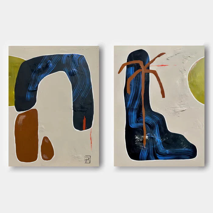
Blue Black Abstract Held Form is a hand-painted diptych built around two heavy, fluid black shapes streaked with deep blue. The off-white grounds carry a plaster-like texture, and quiet olive and brown gestures connect the panels across the wall. It reads as a calm, grounded focal point rather than a loud statement, which makes it a strong fit for living rooms, dining walls, and home offices leaning into soft modern or warm contemporary directions.
Quick read
Two panels, one conversation — weight, line, and breathing room held in balance.
Product reference
Piece: Blue Black Abstract Held Form - Wall Art by Fir Gallery
Format: Hand-painted
Size family: large
View the productThe first thing you notice about Blue Black Abstract Held Form is the weight. Two large, fluid black shapes — each streaked through with tight ribbons of deep blue — sit firmly on warm off-white grounds, and the brushwork inside them gives the dark mass a kind of slow movement. It's a diptych, so the eye reads it as one extended composition: not symmetrical, but in conversation.
Up close, the surfaces feel worked. The ground has a plaster-like texture that catches daylight differently than it does under a warm lamp, and the dark forms hold their brush rhythm rather than flattening into a silhouette. Olive shapes sit in opposing corners across the pair. Brown gestures, rounded on the left and looser on the right, keep the lower halves grounded. A thin red line appears twice — narrow, deliberate, the kind of detail you catch on the second look.
How It Reads in a Room
This is a calm piece with presence. It isn't decorative in the soft, pretty sense, and it isn't loud graphic art either. The composition leans architectural — heavy forms, generous negative space, restrained color. On a wide wall, it behaves like a quiet anchor. The room slows down around it.
In daylight, the texture of the ground does most of the talking, and the blue striations inside the black forms shift from navy to ink depending on the angle. Under lamplight in the evening, the dark masses settle and the warm cream becomes more apparent, which is part of why the piece works well in rooms that get used at different times of day.
Who It Suits
If your interior leans soft modern, warm contemporary, or wabi-inspired — think matte plaster walls, walnut, linen, terracotta, ceramics — this piece slots in without renegotiating the room. It also holds its own against more eclectic, bohemian rooms where the palette is already earth-leaning.
It's less suited to high-gloss, cool-toned, or strictly minimalist spaces. The texture and the warm cream ground want company that respects them. Pair it with hard chrome and cold white walls and the warmth in the piece can feel orphaned.
What People Sometimes Get Wrong
Two assumptions come up with diptychs like this one. The first is that more panels equal more drama. In practice, the opposite is true here — the split format actually softens the impact, because the eye gets a breath between the two forms. The second is that abstract art with dark masses will shrink a room. The generous off-white ground does the opposite. It opens the wall up rather than closing it in.
A Real Styling Scenario
Picture a long, low sofa in oatmeal linen against a warm white wall. Walnut side tables, a jute rug, a ceramic lamp with a linen shade. Hang the two panels centered above the sofa with a few inches of breathing room between them. The horizontal spread of the diptych fills the wall the way a single large canvas often can't, and the olive and brown notes pick up the wood and ceramics without matching them too literally.
Product Details
- Format: Diptych (set of two panels), hand-painted on canvas
- Size category: Large — designed for wide walls and full-room focal points
- Surface: Plaster-like textured ground with visible brushwork in the dark forms
- Palette: Deep blue, black, warm cream, olive, brown, with two narrow red accents
- Best placement: Above a long sofa, behind a rectangular dining table, or on the wall facing a home-office desk
- Pairs well with: Warm white linen, dark walnut wood, matte terracotta, woven textures
- Reads as: Grounded, textured, quietly architectural — a focal piece without loudness
For a closer look at the panels, full sizing, and additional room views, see Blue Black Abstract Held Form - Wall Art by Fir Gallery.