

A Quiet Drift: Living With a Navy-and-Neutral Abstract
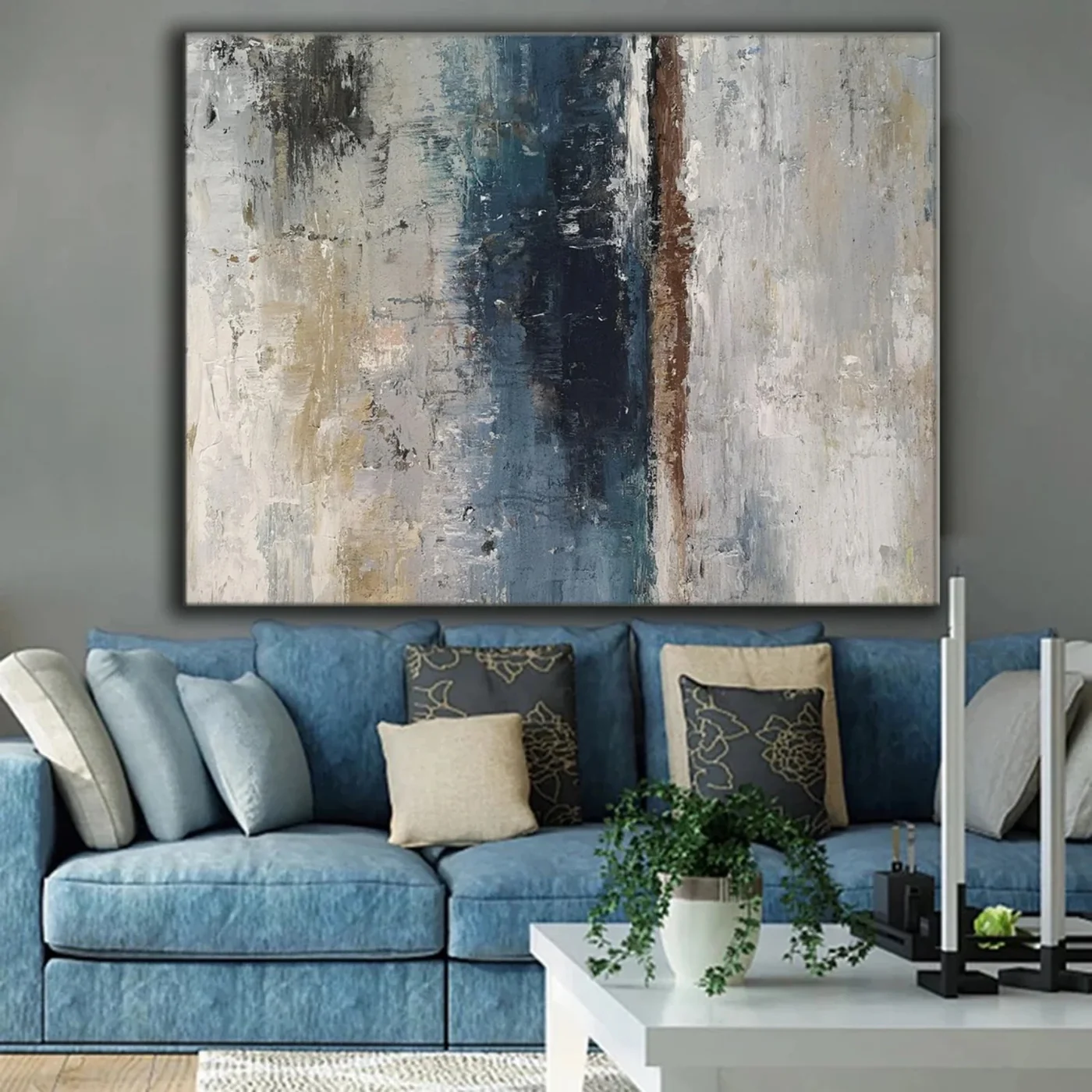
This large-scale abstract centers a deep navy and slate column against ivory, ash, and taupe, with a narrow rust-brown seam offsetting the composition. Its heavy impasto texture reads as a real painted surface rather than a flat print, which is why it holds a room the way it does above sofas, headboards, and desks in soft modern and transitional interiors.
Quick read
Weight in the middle, quiet at the edges — a painting that settles a room instead of shouting across it.
Product reference
The first thing you notice about Blue Grey Abstract Quiet Drift is the vertical pull. A column of deep navy and slate runs down the center of the canvas, flanked by broad passes of ivory, ash, and muted taupe. Just to the right of that dark axis, a narrow rust-brown seam breaks the symmetry — small, but enough to keep your eye moving instead of locking in place.
It reads as a painted object, not a printed image. The surface is built up in impasto strokes and scraped-back pigment, so light catches it differently through the day. In morning sun the neutrals warm up; under lamplight the navy deepens and the texture becomes more obvious.
How It Feels in a Room
This is a grounding piece, not a decorative flourish. The dark vertical mass gives the composition weight, while the lighter surrounding field keeps it from feeling heavy or closed off. Hung well, it settles a space — the kind of abstract that quiets a room rather than competing with it.
It leans calm and architectural. If you're drawn to soft modern, transitional, or wabi-inspired interiors, the palette and surface will feel familiar. If you want saturated color or graphic contrast, this isn't that painting.
Where It Works Best
Above a low, wide sofa, the horizontal format anchors the seating area cleanly. It's especially good with dusty blue upholstery or grey walls, where the navy column echoes the room's cooler tones and the ivory sections lift the whole arrangement.
Behind a low-profile headboard, the dark central band acts like a visual anchor — useful in bedrooms where the bed floats on a wide neutral wall. In a home office, hanging it opposite the desk gives you something to look at that has enough variation to hold attention without pulling focus from work.
It pairs naturally with light oak flooring, steel-framed furniture, warm white walls, and linen upholstery in blue or bone tones.
Common Assumptions Worth Checking
Neutral abstracts are sometimes assumed to be quiet or safe by default. This one isn't shy — the navy column carries real weight, and the texture is pronounced enough to change how the wall reads from across the room. Plan for it as a focal piece, not a background element.
It's also worth knowing that hand-painted texture doesn't photograph the way it looks in person. Expect more depth, more tonal variation, and more surface interest on the wall than a product image can show.
How It Compares
Against a flat printed canvas in similar colors, this piece has noticeably more presence — the impasto and scraped layers give it a sculptural quality you feel from a few feet away. Against a bolder, more gestural abstract, it's calmer and easier to live with long-term. It's a middle-ground choice: expressive enough to matter, restrained enough to keep the room composed.
A Real Styling Scenario
Picture a living room with a dusty blue linen sofa, a light oak coffee table, and warm white walls. The painting hangs centered above the sofa, its width matching roughly two-thirds of the sofa's length. The navy column lines up with the negative space between two cushions, the rust seam picks up a leather strap on a nearby chair, and the ivory sections soften the wall behind. The room reads finished — not decorated.
Product Details
- Type: Hand-painted abstract on canvas
- Size: Large-scale format, sized to anchor a sofa, headboard, or wide feature wall
- Palette: Navy, slate, ivory, ash, muted taupe, with a narrow rust-brown accent
- Surface: Heavy impasto and scraped-back pigment; visible brush and knife texture
- Best rooms: Living room, bedroom, home office
- Style fit: Soft modern, transitional, contemporary wabi-inspired
- Pairs with: Dusty blue linen, light oak, warm white upholstery, steel-framed furniture
For a closer look at scale, texture, and available options, see Blue Grey Abstract Quiet Drift.