

The Slow Pull of Color: Living With an Abstract Statement Canvas
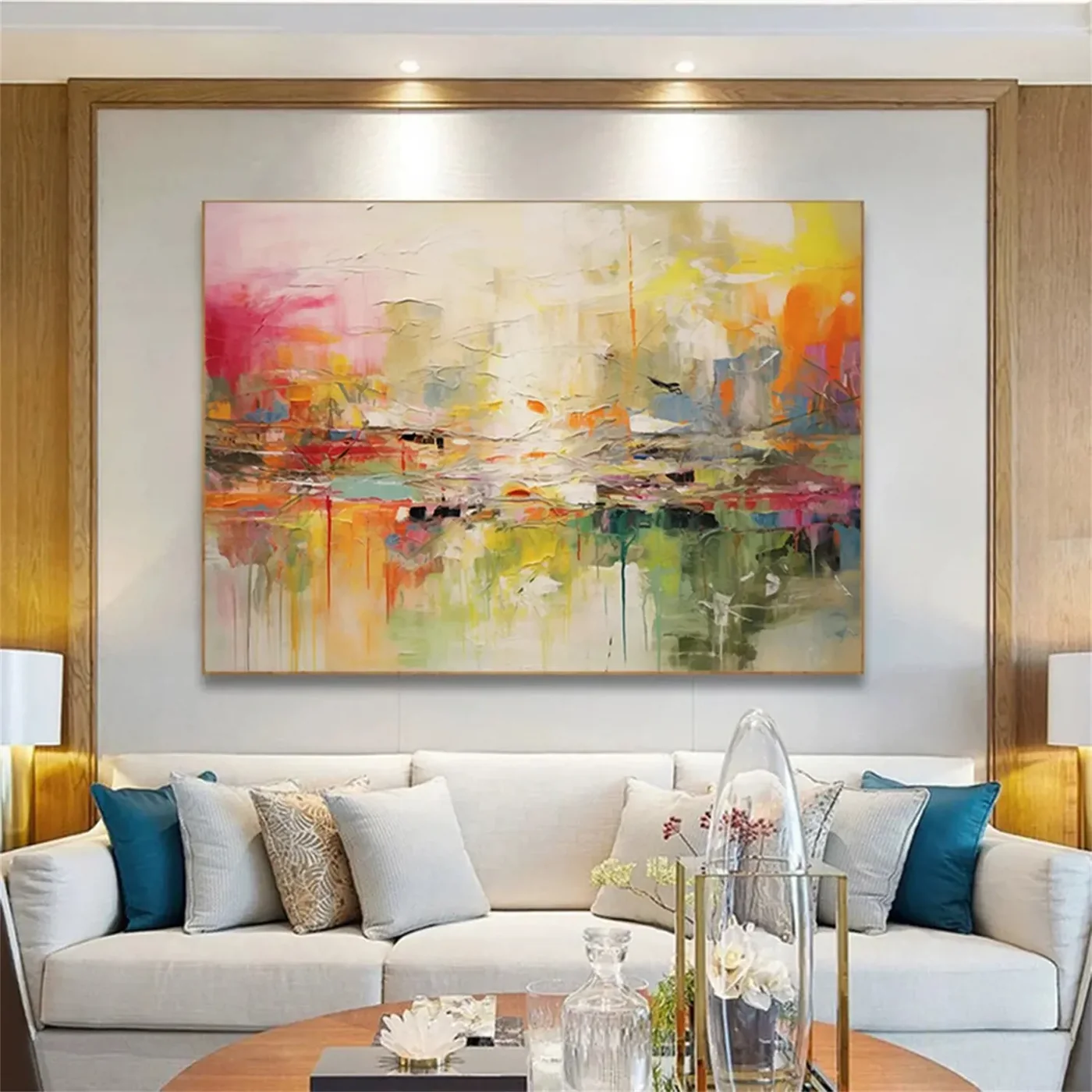
This wide, layered abstract centers on a dense band of pink, orange, yellow, and green pigment that fades into airy washes above and dripped verticals below. It reads as expressive but grounded — bold enough to anchor a room, warm enough to sit comfortably with cream upholstery, oak wood, and soft modern interiors.
Quick read
A horizontal field of color that moves like weather across the wall.
Product reference
The first thing you notice about Colorful Abstract Slow Interval is the horizon line of color running through the middle of the canvas. Pink pushes in from the left, yellow and orange break across the upper right, and a green-grey base pools along the bottom edge in slow vertical drips. It behaves less like a picture and more like a long exhale of pigment across the wall.
It's a large hand-painted abstract on canvas, built with palette-knife ridges, impasto passages, and thinned washes that let the weave breathe. From across the room it reads as a warm, atmospheric field. Step closer and the surface turns into something more physical — layered, worked, and clearly made by hand.
How the piece reads in a room
The composition is horizontal and weighted through the center, which means it settles a wall instead of pulling the eye to one corner. The upper half stays light and almost hazy; the lower half carries the saturation and the drip work. That balance is what keeps a piece this colorful from feeling loud.
In daylight, the pinks and yellows lift and the whole canvas feels airy. Under lamplight in the evening, the warmer mid-tones — rust, ochre, muted rose — take over and the painting reads more grounded. It's the kind of abstract that changes character across the day without ever feeling unstable.
Who it's for
This one suits people who want a real focal point but don't want a hard-edged, graphic, or moody piece. It leans expressive and painterly rather than minimalist. If your room is built around warm white walls, light oak, cream linen, or soft taupe upholstery, the palette will slot in without a fight. It also holds up in more bohemian or transitional spaces where layered texture is already part of the story.
It's less ideal for very cool, monochrome, or industrial interiors where warm color would feel like an interruption rather than a continuation.
What to expect — and what not to
Because it's hand-painted, texture varies across the surface. Some areas sit almost flat; others have visible knife ridges and dried drip trails. That's the point, not a flaw. Colors will read slightly differently depending on wall paint, bulb temperature, and how much natural light the room gets.
A common mistake is hanging a piece like this too high. Large abstracts want to sit close to the furniture line — roughly 6 to 10 inches above a sofa back or headboard — so the artwork and the seating read as one grouping instead of two floating elements.
How it compares to similar wall art
Next to a clean, tonal abstract print, this canvas feels more alive and more chromatic. Next to a graffiti-leaning or pop-art piece, it feels calmer and more painterly. If you've been weighing a textured neutral abstract but worried it would feel flat, this is the warmer, more colorful counterpart — still sophisticated, just with more range.
A quick styling scenario
Picture a living room with a long, low cream sofa, a light oak coffee table, and warm white walls. Center the canvas above the sofa so the horizontal band of color echoes the seating line. Add two lamps with warm bulbs on either side, a taupe throw, and a single ceramic vessel on the table. The room reads collected and modern without needing another piece of art on the adjacent walls.
Product details
- Type: Hand-painted abstract on canvas
- Format: Large horizontal statement piece
- Palette: Pink, orange, yellow, green, grey, with white pause areas and warm mid-tones anchoring the composition
- Surface: Mixed — impasto ridges, palette-knife marks, thin washes, and dripped verticals
- Style direction: Abstract, organic modern, lightly expressive with 3D texture
- Best rooms: Living room above a wide sofa, dining room facing the table or above a sideboard, bedroom above a king headboard
- Pairs well with: Warm white walls, light oak furniture, cream or soft taupe upholstery
For the full view, sizing, and finish details, see Colorful Abstract Slow Interval.