

The Quiet Weight of Espresso and Slate: A Textured Canvas That Anchors a Room
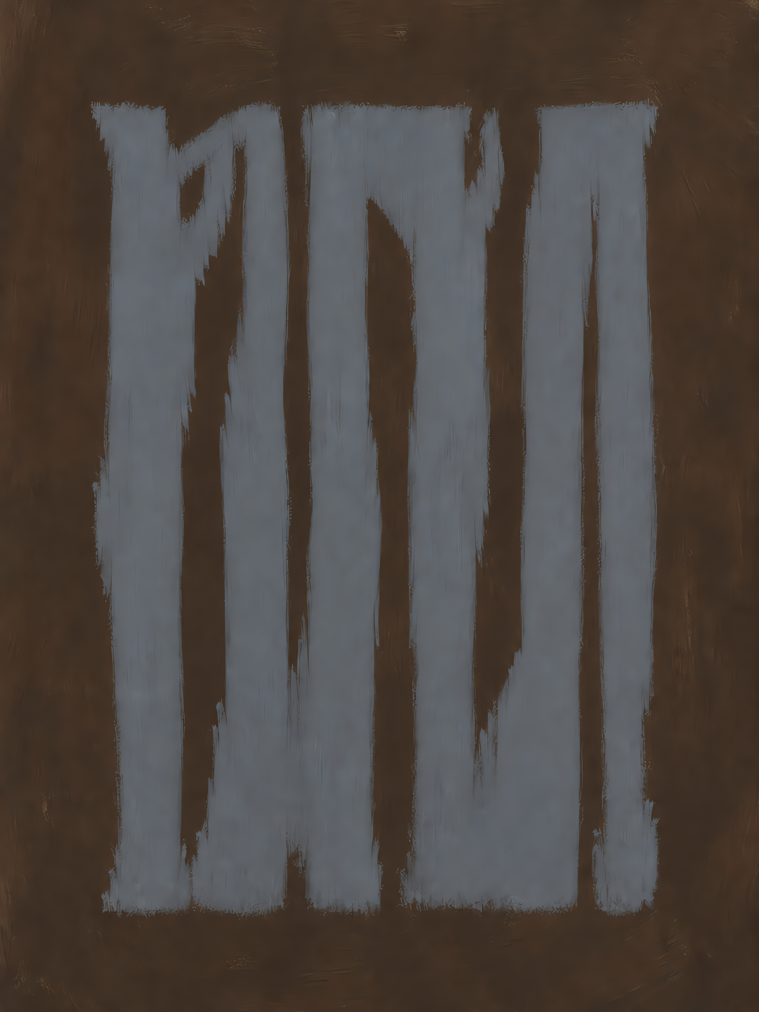
The Dark Espresso & Slate Blue Abstract Textured Canvas is a hand-painted statement piece that blends warm chocolate depth with cool slate verticals. Its palette-knife texture gives it real presence in person, making it a strong anchor above sofas, headboards, or console tables in rustic modern, wabi sabi, and contemporary interiors.
Quick read
Moody, tactile, and quietly architectural—warm ground, cool light.
Product reference
At first glance, the Dark Espresso & Slate Blue Abstract Textured Canvas reads almost like weathered wood seen through fog. Tall, uneven slate blue strokes rise across a deep chocolate ground, and the palette-knife texture catches light in a way that makes the surface feel closer to plaster or bark than paint. It's abstract, but it isn't loud. The rhythm is vertical, the mood is grounded, and the contrast between warm and cool does most of the work.
What Makes This Piece Visually Distinct
This is a hand-painted abstract canvas built on two ideas: a warm, saturated espresso background and a cooler slate blue foreground broken into rough vertical bands. The strokes aren't clean stripes. They fray at the edges, lean slightly, and leave the brown ground peeking through, which gives the composition a wabi sabi quality—imperfect, tactile, honest.
Because the palette stays tonal rather than colorful, the piece behaves more like a textured surface than a picture. That's part of why it works as a focal point without dominating a room.
How It Feels in a Room
In daylight, the blue reads softer and more gray, and the brown looks warmer, closer to walnut. Under lamplight in the evening, the contrast deepens. The espresso goes richer, the slate cools down, and the texture starts to show shadow lines along the knife strokes. It's a piece that shifts with the room's lighting rather than staying flat.
The overall mood is calm but weighted. It doesn't feel decorative in a light, breezy way—it feels grounded, a little moody, and slightly architectural.
Who It's For
This canvas suits interiors that lean rustic modern, wabi sabi, or contemporary with warm neutrals. It pairs naturally with walnut wood, aged leather, soft taupe upholstery, and linen textures. If your space runs bright white, high-gloss, or heavily colorful, this piece will feel out of key. If your space already has warm woods, matte finishes, and quiet contrast, it slots in easily.
It's a strong fit for buyers who want abstract wall art with real presence but don't want a bright, graphic statement piece.
Realistic Expectations
Because it's hand-painted, small variations in stroke edges, texture depth, and paint ridges are part of the character rather than flaws. The slate blue is genuinely muted—closer to a foggy denim than a bright navy—and the background is a true dark brown, not black. Buyers expecting a high-contrast, crisp graphic look should size that up honestly before ordering.
One common misread: assuming vertical stripe art will feel busy. In person, this composition reads quieter than photos suggest, because the tonal range is narrow and the texture softens the edges.
How It Compares to Similar Wall Art
Against a flat printed abstract, this canvas wins on texture and depth—you can see the knife work up close. Against a lighter neutral abstract, it trades airiness for weight and mood. Against a bold colorful statement piece, it's the calmer choice that still commands the wall. If you're deciding between a framed print and a hand-painted textured canvas at similar scale, the hand-painted option tends to feel more like a real object in the room rather than a picture on the wall.
A Short Styling Scenario
Picture a living room with a low walnut-frame sofa, a taupe linen throw, and a matte black floor lamp. The wall behind is a warm off-white. Hung centered above the sofa, this canvas pulls the wood tones up into the wall and adds the cool slate note the room was missing. Swap in a jute rug and a small ceramic vase in unglazed clay, and the whole space clicks into a rustic modern reading without adding another loud element.
Product Details
- Type: Hand-painted abstract canvas, studio-exclusive design
- Technique: Palette-knife layering with visible brush and knife texture
- Palette: Dark espresso brown ground with slate blue vertical strokes
- Style direction: Abstract, minimalist, wabi sabi, rustic modern
- Finish: Matte, tactile surface with natural ridges
- Best placements: Above a low sofa on a main focal wall; behind a bed centered over the headboard with neutral linen bedding; on the wall facing a home office desk, ideally opposite a window for balanced light
- Pairs well with: Warm walnut wood, aged leather, soft taupe upholstery, linen and jute textures
- Room fit: Living room, bedroom, home office, entryway, moody dining area
Sizes and framing options may vary by listing, so check the product page for the current configuration before ordering.
If your room is asking for something quieter than a bold graphic but heavier than a soft neutral, take a closer look at the Dark Espresso & Slate Blue Abstract Textured Canvas.