

A Quiet Grid of Silver: Inside the Dusty Mauve & Metallic Silver Textured Canvas
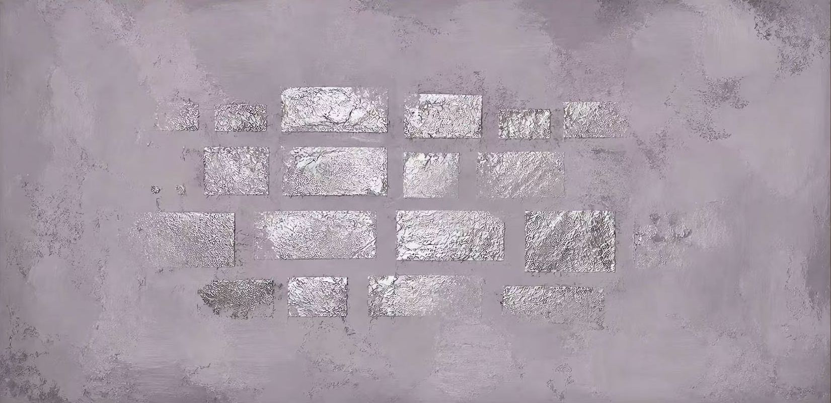
The Dusty Mauve & Metallic Silver 3D Textured Canvas Wall Art pairs a soft lavender-grey field with a hand-painted grid of foil-like silver rectangles. The result is quiet but architectural: a wide horizontal piece that gives modern, wabi-inspired rooms a focal point without adding visual noise. It reads well above low sofas, headboards, and long credenzas, shifting gently between daylight and lamplight.
Quick read
A textured mauve field, a loose grid of silver, and enough restraint to let the wall breathe.
Product reference
Piece: Dusty Mauve & Metallic Silver 3D Textured Canvas Wall Art
Format: Hand-painted
View the productThe first thing you notice is the light. A loose grid of hand-painted metallic silver blocks sits across a wide, dusty mauve-grey field, and as the room's lighting shifts, those silver panels turn on and off like small windows. It's a calm painting with a reflective heartbeat — enough presence to anchor a wall, not so much that it takes over the room.
The canvas is built in an expansive horizontal format, which gives the composition room to breathe. The silver rectangles aren't lined up in a rigid pattern; they stagger and shift, closer to a brick rhythm than a spreadsheet. That looseness is what keeps the piece from feeling graphic or cold.
What Makes This Piece Visually Distinct
Two things separate this canvas from the usual neutral abstract. The first is the ground: a heavily textured, hand-worked mauve-grey that reads warmer than a true gray and softer than a true lavender. The second is the surface of the silver blocks themselves — crinkled, foil-like, and hand-applied, so each panel catches light differently.
Up close, the piece feels tactile and wabi-inspired. From across the room, it reads as a quiet metallic mosaic. That dual-read is what makes it work in modern, minimalist interiors where most wall art either disappears or shouts.
How It Feels in a Room
This is a supporting focal point rather than a loud statement. It gives a wall structure and shimmer without introducing a strong color story, which makes it unusually flexible. In daylight, the silver reads cooler and more architectural. Under warm lamplight, the whole canvas softens and the mauve base comes forward.
It pairs naturally with soft taupe upholstery, light oak, brushed silver hardware, and linen textures. If your room already leans tonal — creams, greiges, muted plaster tones — this piece will feel like it belongs there, not like it was added on.
Who It Suits
Buyers drawn to contemporary wabi-inspired, soft modern, or minimalist interiors tend to respond to this one. It's a good fit if you're trying to avoid two common pitfalls: a huge black-and-white abstract that dominates the room, or a bland neutral print that adds nothing. The metallic detail gives you presence; the muted palette keeps it livable.
It's less suited to high-contrast, maximalist, or heavily saturated rooms. Against a jewel-tone wall or busy gallery arrangement, the subtlety gets lost.
A Realistic Styling Scenario
Picture a long, low sofa in warm oatmeal linen against a soft plaster-toned wall. The canvas hangs centered above it, its horizontal sweep echoing the sofa's line. A ceramic lamp on one side, a small stack of art books on the console nearby. During the day, the silver reads architectural. At night, with a warm bulb, the whole wall glows quietly. Nothing competes; everything relates.
The same logic works behind a neutral upholstered headboard, or above a low credenza in a home office facing the desk.
What to Expect — and What Not To
Because it's hand-painted, no two canvases are identical. The silver blocks will vary slightly in crinkle, edge, and reflectivity. That's part of the character, not a flaw. Expect a piece that changes throughout the day rather than one that looks static and printed.
Don't expect a mirror-bright metallic. The silver is luminous but muted, closer to brushed foil than chrome. And don't expect the mauve to read pink — it lands firmly in the grey-lavender family.
Product Details
- Type: Hand-painted canvas wall art, studio-exclusive to Mipiece
- Format: Expansive panoramic horizontal orientation
- Palette: Dusty mauve-grey ground with hand-painted metallic silver blocks
- Surface: Heavy 3D texture on the base; crinkled, foil-like finish on the silver panels
- Style direction: Abstract, wabi-inspired, minimalist, soft modern
- Best placements: Above a low linear sofa, behind a neutral headboard, or centered above a credenza in a home office
- Pairs well with: Soft taupe upholstery, light oak, brushed silver metal, linen textiles
For a full look at scale, texture, and finish, see the Dusty Mauve & Metallic Silver 3D Textured Canvas Wall Art.