

The Quiet Discipline of Minimalist Dotted Pattern Interval
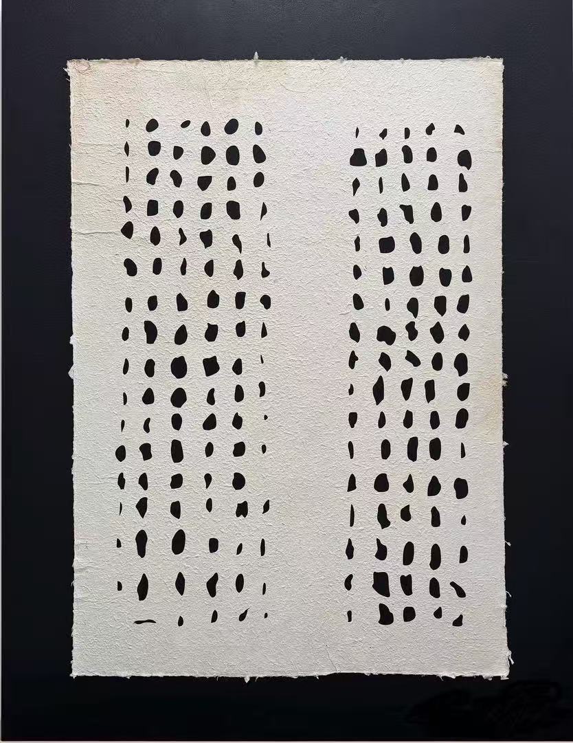
Minimalist Dotted Pattern Interval is a hand-painted work built on textured paper, with two columns of irregular dark dots separated by a wide, quiet center. It reads as graphic from across the room and tactile up close, making it a natural fit for foyers, living rooms, and home offices that lean minimalist, Japandi, or wabi-inspired.
Quick read
Two columns of hand-formed marks, a wide quiet center, and a paper surface you can almost feel from across the room.
Product reference
Minimalist Dotted Pattern Interval opens with something deceptively simple: two vertical columns of dark, hand-formed dots running down a sheet of fibrous, ivory-toned paper. The marks aren't uniform. Some sit heavier, some thin out, and the spacing shifts row by row. That small irregularity is what keeps the piece from feeling like a printed grid and closer to something drawn by hand in a single sitting.
From across a room, it reads as a clean graphic pattern — two dark bands framing a quiet center. Step closer and the surface takes over. The paper has visible grain and fiber, the edges of each dot soften into the ground, and the whole piece begins to feel tactile before it reads as image.
What kind of wall art this actually is
This is hand-painted minimalist wall art in the wabi-inspired tradition — restrained palette, handmade surface, and a composition that leans on rhythm rather than subject. There's no figure, no landscape, no clear focal object. The interest lives in repetition, spacing, and the small imperfections between marks.
That makes it a good fit for buyers who are tired of loud abstract prints but don't want something purely decorative or generic. It carries presence without noise.
How it changes a room
The piece has a grounding effect. In a foyer, it gives a narrow wall structure without crowding it. Above a low console or sideboard in the living room, the two columns echo the horizontal line of the furniture and add a vertical counterweight. In a home office facing the desk, the steady rhythm becomes something the eye can rest on between tasks — quiet, but not empty.
It behaves differently under changing light. Daylight brings out the paper's fiber and the softness of the dot edges. Warm lamplight flattens the texture slightly and pushes the graphic pattern forward. Neither version feels like a compromise; they're just two ways the same piece reads.
Who it suits, and who it doesn't
It suits interiors that favor restraint — minimalist, Japandi, contemporary wabi-inspired rooms with light oak, matte black metal, or warm linen. It pairs quietly with plaster walls, unpainted wood, and neutral upholstery. If your space already leans into color, ornament, or maximalist layering, this piece will feel underdressed rather than complementary.
A common mistaken assumption: that a black and white piece is automatically a safe filler. This one isn't filler. It has a defined silhouette and a strong internal rhythm, so it wants a wall where it can breathe, not one where it competes with framed photos, shelves, or busy wallpaper.
How it compares to nearby options
Against a large abstract canvas, this piece is quieter and more graphic — closer to a drawing than a painting. Against a framed line-art print, it feels more tactile and less illustrative, because the paper surface itself is part of the work. If you've been looking at monochrome abstract pattern art or handmade paper wall art and finding most options either too decorative or too flat, this sits in the middle: patterned, but hand-formed; minimal, but not sterile.
A short styling scenario
Picture a foyer with a slim oak console, a small ceramic bowl, and a linen runner. The wall above is bare plaster. Centered on that wall, the piece gives the entry a defined focal point without turning it into a gallery moment. Swap the console for a matte black metal bench and the mood shifts — sharper, more architectural — but the artwork still holds.
Product details
- Type: Hand-painted wall art on textured, fibrous paper ground
- Palette: Black and ivory, matte finish
- Composition: Two vertical columns of irregular dots with a wide negative-space center
- Texture: Visible paper grain and soft, hand-formed dot edges
- Best rooms: Foyer, living room, home office, bedroom, dining room
- Style directions: Minimalist, Japandi, contemporary wabi-inspired
- Pairs with: Light oak, matte black metal, warm white linen
- Placement notes: Centered on a narrow entry wall, above a low sideboard, or alone on an uncluttered office wall opposite the desk
For a closer look at sizing and finish, see Minimalist Dotted Pattern Interval.