

A Quiet Kind of Statement: The Gold-Flecked Taupe Canvas That Anchors a Room
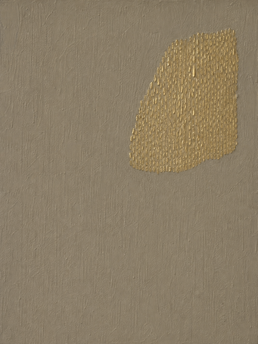
The Minimalist Gold Accent Taupe Textured Canvas Wall Art pairs a warm, plaster-like taupe surface with a leaf-shaped cluster of raised gold brushwork, placed slightly off-center. It reads calm from across the room and sculptural up close, which makes it well suited to modern, wabi-inspired, and soft neutral interiors that want a focal point without visual noise.
Quick read
Restrained, tactile, and quietly luminous — a neutral canvas that earns its wall through texture, not color.
Product reference
At first glance, this piece reads as a soft, sand-toned rectangle with a single luminous shape floating in the upper right. Step closer and it changes: the taupe field is troweled and brushed into a plaster-like surface, and the gold shape resolves into hundreds of small, raised brushstrokes stacked into a loose leaf silhouette. It's quiet from across the room and sculptural up close, which is the whole point.
What the artwork actually is
The Minimalist Gold Accent Taupe Textured Canvas Wall Art is a hand-painted abstract canvas built around two ideas: a warm, hand-textured neutral ground and a single off-center cluster of metallic gold strokes. There's no secondary motif, no framing device, no competing color. The composition works because of restraint — one gesture, one glow, a lot of breathing room.
Stylistically, it sits in a wabi-inspired, soft-modern lane. Think troweled plaster walls, boucle, oak, ceramics with visible thumbprints. It's abstract, but it isn't cold or graphic.
How it reads in a room
In daylight, the taupe stays matte and grounded while the gold flickers gently as you move past it. Under warm lamplight in the evening, the metallic strokes pick up more shine and the piece feels richer, almost candlelit. That shift is a big part of its appeal — it doesn't look the same at 10 a.m. and 9 p.m.
Because the color palette is so tight, it behaves more like a textured neutral than a traditional statement piece. It adds warmth and a focal point without introducing a new color story, which is useful in rooms already working with walnut, camel, cream, or warm white.
Who it's really for
This canvas suits people who like calm rooms but don't want blank walls. If your interior leans contemporary wabi, minimalist, Japandi-adjacent, or soft modern, it slots in easily. If your space is high-contrast, colorful, or maximalist, it will likely feel too understated — that's a fit issue, not a quality one.
It also rewards a bit of empty wall around it. Crowding it with other frames flattens the effect; the asymmetry of the gold shape needs room to breathe.
Placement that works
- Above a low sofa: Center it on the main wall and let the negative space on the left of the composition mirror the openness of the room.
- Over a dresser or console: Works especially well beside a window, where side light catches the raised gold.
- Entry or foyer wall: Hang it where people pass at an angle — the metallic strokes read best in motion.
- Home office: A calmer alternative to graphic prints behind a desk, especially on video calls.
Honest comparisons
Compared to a framed print of a similar composition, the hand-painted texture is the real difference. Prints can replicate the color but not the physical relief of the gold strokes or the plaster-like ground. Compared to gold leaf abstracts, this piece is warmer and less shiny — the gold is brushed, not sheeted, so it glows rather than reflects.
And compared to larger multi-color abstracts, it's deliberately quieter. It's a supporting-actor piece that happens to hold a focal wall, not a loud centerpiece.
A quick styling scene
Picture a living room with a low camel linen sofa, a walnut coffee table, and a chunky ivory rug. The wall behind is a warm off-white. Hang this canvas centered above the sofa, add one ceramic vase on the table, and skip the second art piece. The room reads finished, warm, and intentional — without a single bright color added.
Product details
- Type: Hand-painted canvas, studio-original from Mipiece
- Style: Abstract, minimalist, wabi-inspired, organic modern
- Palette: Warm taupe ground with metallic gold accent
- Texture: Hand-troweled matte field with raised 3D gold brushwork
- Composition: Asymmetric, off-center focal cluster with generous negative space
- Best rooms: Living room, bedroom, foyer, home office
- Pairs with: Walnut and oak wood, camel and taupe upholstery, cream boucle, ceramic accents
- Framing: Sold as a finished canvas; works framed or unframed depending on your interior direction
If your room is asking for warmth and a single point of interest without another loud color, the Minimalist Gold Accent Taupe Textured Canvas Wall Art is the piece worth trying on your wall.