
A Quiet Diptych in White: Inside the Textured Grid by Fir Gallery
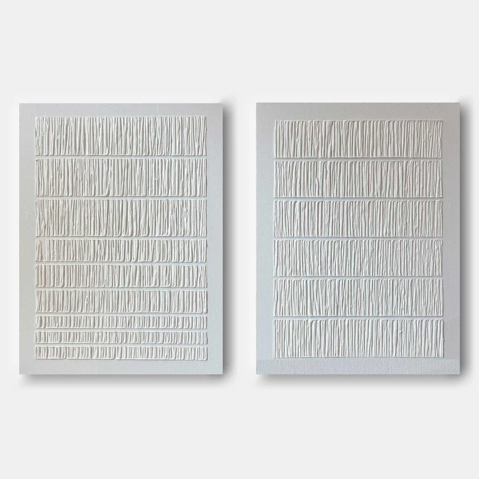
The Minimalist Textured White Quiet Grid is a hand-painted diptych that trades color for relief. Two panels of warm white-on-white ridges sit side by side, organized into horizontal bands of tightly grouped vertical strokes. It reads as quiet, tactile, and architectural — a piece that fills a wall without crowding it, suited to minimalist, Japandi, and wabi-inspired rooms.
Quick read
Texture instead of color, rhythm instead of subject — a diptych that holds the wall without raising its voice.
Product reference
Piece: Minimalist Textured White Quiet Grid - Wall Art by Fir Gallery
Format: Hand-painted
Size family: large
View the productAt first glance, the Minimalist Textured White Quiet Grid doesn't look like a painting so much as a surface. Two panels hang as a diptych, each one carrying tight rows of raised vertical marks pressed into a warm white ground. There's no imagery, no color shift, no obvious focal point — just a steady rhythm of ridges that catches light along its edges and lets shadow pool in the grooves.
That restraint is the whole point. The piece works as textured 3D wall art, where the composition lives in relief rather than pigment. You read it the way you'd read a woven textile or a quietly tooled plaster wall: with your eyes, but almost with your hands.
How It Reads in a Room
The diptych format gives the work horizontal reach, which is useful above wide furniture. The internal banding repeats that horizontal logic, so the piece tends to settle a wall rather than energize it. In daylight, the ridges look soft and almost uniform. Under lamplight or a low evening angle, the shadows sharpen and the texture starts to feel more sculptural — the same artwork, but a different mood after dark.
It behaves as a calm focal point rather than a loud one. You notice it, but it doesn't compete with a sofa, a bed frame, or a bookshelf next to it. That makes it a strong choice when the rest of the room is already doing visual work — wood grain, linen weave, stone, ceramics — and you want the wall to support that material conversation instead of breaking it.
Who It Suits
This is wall art for people who lean minimalist, Japandi, or contemporary wabi-inspired. If your palette already runs through warm whites, oatmeal, light oak, and unpainted plaster, the diptych slips in without negotiation. If you're drawn to color-forward abstract canvases or graphic black-and-white prints, this won't scratch that itch — and it isn't trying to.
A common assumption is that white-on-white wall art disappears against a white wall. In practice, the opposite tends to happen: because there's no color contrast competing for attention, the eye locks onto the texture and the shadow lines. It reads as presence, not absence.
How It Compares to Nearby Options
Against a single large canvas, the diptych gives you more horizontal coverage and a built-in sense of pacing — the gap between panels acts as a breath. Against a gallery wall, it's far simpler to live with; nothing to rearrange, nothing to balance. And against a printed neutral canvas set, the hand-painted relief is the real difference. Prints can imitate the look, but they can't throw the same shadows.
One Real-World Scenario
Picture a living room with a long, low linen sofa in warm white, a light oak coffee table, and a limewash wall behind it. A framed photograph would feel too literal here; a colorful abstract would fight the upholstery. The textured diptych, centered above the sofa, mirrors the horizontal line of the seating and adds tactile interest without introducing a new color story. In the morning it looks soft and matte. By evening, with a nearby floor lamp, the ridges cast fine shadows that make the whole wall feel hand-finished.
Product Details
- Format: Two-panel diptych, hung side by side
- Technique: Hand-painted with raised white-on-white relief texture
- Size category: Large — scaled for sofas, headboards, and full feature walls
- Palette: Warm white over a pale grey ground; shadow tones appear naturally in the deepest grooves
- Surface: 3D textured, low-relief ridges arranged in horizontal bands of vertical marks
- Style direction: Minimalist, wabi-sabi, abstract, linear
- Best rooms: Living room above a long sofa, bedroom behind a headboard, home office facing the desk
- Pairs well with: Light oak, warm white linen, limewash or bare plaster walls
If you want presence without pattern, take a closer look at the Minimalist Textured White Quiet Grid - Wall Art by Fir Gallery.