

The Quiet Drama of Modern Botanical Floral Bloom
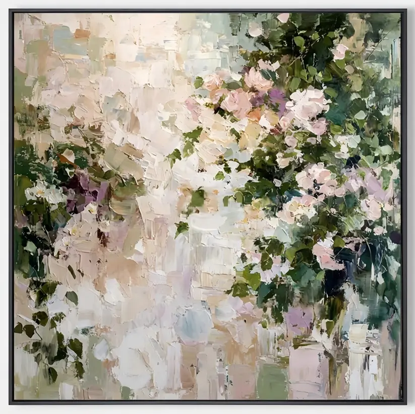
Modern Botanical Floral Bloom is a hand-painted canvas that reads as both floral and abstract. Thick knife-work builds blush and lavender blooms through layered greens on the right, while the left side dissolves into ivory and taupe patches. It works as a calm focal point over sofas, headboards, and dining walls in soft modern, French country, and wabi-inspired interiors.
Quick read
A floral painting that behaves like a quiet piece of architecture — half bloom, half breath.
Product reference
At first glance, Modern Botanical Floral Bloom reads like a garden caught mid-thought. The right side is dense — blush and lavender blossoms pushing through layered greens, built up with a palette knife until the paint sits in visible ridges. The left side loosens into ivory and soft taupe, broken into loose geometric patches that feel almost architectural. It's a floral painting, but not a decorative one in the traditional sense.
The tension between those two halves is what makes the piece work. Instead of a full canvas of flowers, you get a bloom cluster balanced against negative space, with color thinning gradually into near-white. That gives the artwork breathing room and lets it sit in a room without crowding it.
How It Reads on the Wall
This is a textured canvas, so light matters. In daylight, the impasto ridges catch shadows and the greens deepen. Under lamplight, the ivory field warms and the pinks turn quieter, closer to a dusted rose. The effect shifts through the day, which is part of why hand-painted impasto flowers tend to age well in a home — they don't flatten into a single mood.
Visually, it leans expressive and tactile rather than graphic. If you're comparing it to a clean botanical print or a bold abstract, this piece sits somewhere between the two: organic subject matter, but painted with the loose, built-up surface of an abstract work.
Who It's For
The palette — blush, lavender, sage, ivory, warm taupe — pairs naturally with warm white linen, light oak, and soft green upholstery. It suits rooms that already lean soft modern, French country, or wabi-inspired, where texture and muted color do most of the talking.
Buyers who want something high-contrast or strictly minimal may find it too painterly. But if your space has warm neutrals, natural wood, and a little tonal variety already, it slides in without needing the room to change around it.
Placement That Actually Works
Above a low, linear sofa, the pale left side can align with a neutral wall while the bloom anchors the seating area — a common layout for living rooms where you want a focal point that doesn't shout. In a dining room, hang it on the wall facing the table so the texture becomes something to look at across a meal, especially paired with warm wood tones.
Over a headboard, it works best when the bedding leans soft and muted; the pinks and greens read calm in that context rather than sweet. In a foyer, it greets guests without dominating a narrow wall, which is harder to pull off than it sounds.
A Quick Styling Scenario
Picture a living room with an oatmeal linen sofa, a light oak coffee table, and a woven rug in warm cream. The wall behind the sofa is bare and slightly cool. Center this painting so the ivory half sits toward the lamp side and the bloom cluster falls above the seating. Add a low ceramic vase and one softly draped throw. The room stops feeling unfinished — not because the piece is loud, but because it gives the eye somewhere to land.
Product Details
- Type: Hand-painted canvas wall art, impasto technique
- Style: Abstract floral, organic modern
- Palette: Blush pink, lavender, sage and deep green, ivory, warm taupe
- Texture: Heavy palette-knife work with visible ridges; tactile, built-up surface
- Best rooms: Living room, dining room, bedroom, home office, foyer
- Pairs with: Warm white linen, light oak wood, sage green upholstery
- Interior directions: Soft modern, French country, contemporary wabi-inspired
- Placement notes: Works above a low sofa, dining wall, headboard, or console; align the pale left side with a neutral wall when possible
Realistic Expectations
Because it's hand-painted, no two versions of a knife-built floral read exactly alike — small variations in ridge direction and edge softness are part of the medium. The piece is quieter in person than a saturated print, and the greens are cooler and more layered than a single-tone botanical. If you're expecting a bright, uniform bouquet, this isn't that. If you want a floral canvas with the depth of an abstract painting, it delivers.
For a closer look at the full color rhythm and texture, see Modern Botanical Floral Bloom.