
The White Canvas That Actually Changes a Room: Quiet Interval by Fir Gallery
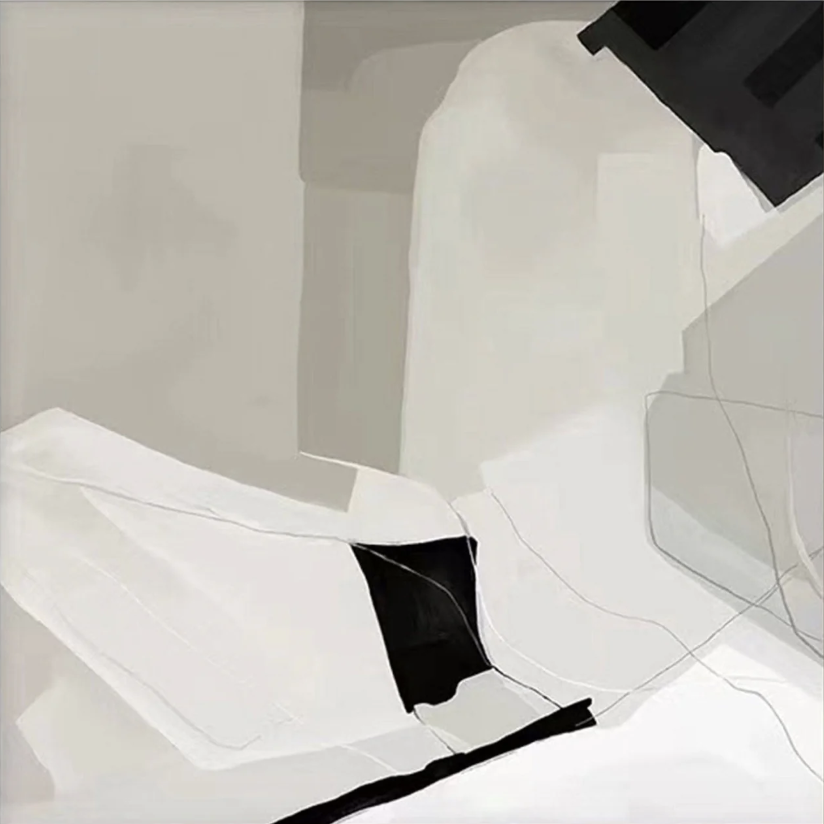
Quiet Interval by Fir Gallery is a large-format hand-painted abstract wall art piece built almost entirely from white and cool grey, interrupted by two deliberate black elements. The composition feels compressed at the center and open at the edges, giving it a quality that reads differently depending on where you stand. It suits living rooms, home offices, and foyers where the goal is visual weight without color noise.
Quick read
A hand-painted monochrome abstract that brings architectural tension to neutral interiors — without asking a single thing from the furniture around it.
Product reference
Piece: Monochrome Abstract Quiet Interval - Wall Art by Fir Gallery
Format: Hand-painted
Size family: large
View the productAt first glance, Quiet Interval reads almost entirely white. That's intentional — and it's the first thing worth understanding about the piece. Large pale forms overlap across a cool grey ground, held together by two hard black voids: one planted firmly in the upper right corner, one breaking open the lower centre. The rest of the composition breathes. Thin grey lines trail away from the central mass without landing anywhere specific. The effect is somewhere between architectural drawing and meditative abstraction.
What the Composition Actually Does
There's a push-pull built into this piece that isn't obvious in thumbnails. The white volumes press together near the middle, creating a sense of compression, then release toward the edges where the ground opens up. In person — or even at full resolution — the surface reads flat in some areas and spatially deep in others. The black elements don't soften that contrast. They anchor it. Without them, the piece would drift. With them, it holds.
That balance is what separates Quiet Interval from the more generic monochrome prints in this category. A lot of large-format black and white art leans either too graphic or too soft. This one sits in the space between — structured enough to feel intentional, open enough to stay calm.
How It Reads in a Room
Above a low linen sofa, the pale mass fills the wall without crowding it. The work doesn't compete with upholstery — it absorbs it. Warm white walls and light oak shelving sit comfortably in the same frame. Matte black fixtures echo the two black anchors in the composition, which is the kind of quiet visual payoff that makes a room feel considered rather than decorated.
In a home office positioned on the wall directly facing your desk, the high contrast and stillness give you something to rest your eyes on without losing focus. It doesn't distract. It holds. That's harder to find than it sounds in large-format art.
For a foyer — particularly at the end of a long hallway — the elongated horizontal forms draw the eye forward in a way that makes narrow spaces feel more resolved. The monochrome palette holds well in both natural and artificial light, which matters in entry spaces that don't always get consistent light throughout the day.
Who This Piece Is For
Buyers working in minimalist, Japandi, or soft modern interiors will find the most natural fit here. The palette is genuinely neutral — not warm-leaning, not cool-dramatic — which means it doesn't force a color decision on the room around it. If your space already has warm wood tones, concrete or plaster surfaces, or a restrained material palette, this piece adds visual mass without adding visual noise.
It's less suited to rooms that already have strong color or pattern. The composition is quiet by design, and it won't fight for attention in a way that resolves in its favor against busy surroundings.
One Realistic Expectation
Because the piece is so heavily weighted toward white and light grey, its presence shifts noticeably with light conditions. In direct natural light it feels airy and almost architectural. Under warmer lamp light in the evening, the grey gradations deepen slightly and the black voids read with more weight. Neither version is wrong — but it's worth knowing the piece isn't static. That's actually part of what makes it interesting over time.
Product Details
- Type: Hand-painted wall art on canvas
- Size category: Large format
- Color palette: White, cool grey, deep black
- Surface: Layered paint with flat and textured passages
- Best placement: Above a low sofa, on a desk-facing office wall, or at a hallway end wall
- Interior fit: Minimalist, Japandi, soft modern
- Furniture pairings: Warm white linen, light oak, matte black metal
- Framing: See product page for current framed and unframed options
If you're working with a neutral interior and want a large wall piece that earns its place without competing for attention, Monochrome Abstract Quiet Interval - Wall Art by Fir Gallery is worth a serious look.