
Quiet Tension: Inside the Monochrome Abstract Still Interval Diptych
Monochrome Abstract Still Interval is a two-panel hand-painted work that pairs angular geometry with looser organic shapes across a textured, plaster-like ground. It reads as graphic but grounded, holding presence above a sofa, console, or desk without crowding the room.
Quick read
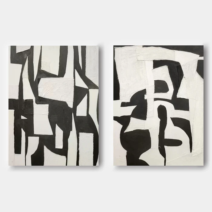
Structure on the left, release on the right — held together by a single quiet palette.
Product reference
Piece: Monochrome Abstract Still Interval - Wall Art by Fir Gallery
Format: Hand-painted
Size family: large
View the productMonochrome Abstract Still Interval is a two-panel, hand-painted black-and-white work that behaves more like architecture than decoration. The left panel leans angular — hard-edged black planes cutting across an off-white ground with a kind of drafting-room restraint. The right panel loosens, letting curves move through the geometry. Seen together, the pair has rhythm: structure on one side, breath on the other.
The surface matters here. Both panels are built up in layers, closer to plaster than to flat paint, which gives the diptych a tactile weight you notice in person but rarely see in a thumbnail. In daylight, the texture catches shadow and adds depth. Under lamplight, the off-white warms slightly and the blacks settle into something softer than ink.
How It Reads in a Room
This is a graphic piece, but it isn't loud. The black shapes carry visual mass, while generous negative space keeps the eye moving instead of locking onto one point. That balance is what lets it function as a focal piece without dominating a seating area or pulling attention away from a dining table.
Think of it as a wall anchor with restraint. It sets a tone — modern, considered, slightly raw — without demanding the room organize itself around it.
Who It Suits
The diptych fits comfortably inside a few interior directions:
- Minimalist interiors where the texture adds the warmth a clean room often needs.
- Japandi spaces built around light oak, linen, and warm white plaster walls.
- Industrial or loft-leaning rooms with matte black metal, concrete, or exposed brick.
If your palette already leans toward warm neutrals and natural materials, this piece slots in without effort. If your room is highly colorful or pattern-heavy, the diptych can still work, but expect it to act as a visual reset rather than a complement.
Placement and Real-World Use
Above a long, low sofa, the two panels hung side by side hold the wall the way a single oversized canvas would, but with more rhythm. In a home office, mounted on the wall facing the desk, the contrast gives you something to look up at — present without becoming a distraction during a long workday. Above a minimal sideboard in a dining room, it reads as composed and grown-up, especially paired with dark wood chairs and a simple rectangular table.
A quick scenario: a warm-white living room, light oak floors, a low charcoal sofa, a single matte black floor lamp. Hang the two panels centered above the sofa with a small gap between them — maybe two to three inches. The wall stops feeling empty, but the room still breathes.
Honest Expectations
A few things worth knowing before you commit. Because it's hand-painted, brushwork, edge variation, and surface texture will differ slightly from the listing photos — that's part of why it doesn't look like a print. The palette is genuinely black and off-white, not warm cream or gray-beige, so it will sharpen a room rather than soften it. And as a diptych, spacing between the two panels affects how it reads: too far apart and the composition loosens; too close and the shapes start to crowd.
Compared with a single large monochrome canvas, the diptych format gives you more flexibility on wide walls and a stronger sense of movement across the composition. Compared with framed prints in the same palette, the hand-built surface here carries a weight that flat reproductions don't replicate.
Product Details
- Format: Two-panel diptych, sold as a pair
- Technique: Hand-painted on canvas, layered surface with plaster-like texture
- Palette: Black and off-white, high contrast, no secondary colors
- Style direction: Abstract, geometric, wabi-sabi-leaning, 3D textured
- Scale: Available in large sizing suited to feature walls and above-sofa placement
- Best rooms: Living room, home office, dining room
- Pairs well with: Matte black metal fixtures, light oak wood, warm white plaster walls, concrete surfaces
For wide modern walls that need presence without noise, see the Monochrome Abstract Still Interval - Wall Art by Fir Gallery.