
Quiet Tension: Reading the Monochrome Textured Abstract Still Interval Diptych
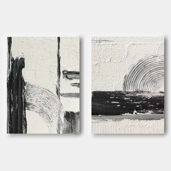
Two panels work in conversation: one weighted with vertical black strokes and built-up plaster passes, the other opened by a wide horizontal band and a soft grey arc. The off-white ground feels like a real surface, not a backdrop. As a pair, the piece carries a living room feature wall or a bedroom facing wall without overwhelming the room around it.
Quick read
Black sweeps, plaster ridges, a quiet arc — composed but never decorative.
Product reference
Piece: Monochrome Textured Abstract Still Interval - Wall Art by Fir Gallery
Format: Hand-painted
Size family: large
View the productThe first thing you notice isn't the black — it's the surface. The off-white ground on both panels has been scraped, ridged, and built up in visible passes, so the canvas reads more like a worked wall than a printed image. Against that, the black moves with intention: long vertical sweeps on the left panel, a wide horizontal band on the right, and a soft grey arc that quietly ties the two together.
This is a hand-painted monochrome textured abstract diptych, designed to be hung as a pair. It's graphic enough to anchor a wall, but the palette and material feel keep it from pulling focus the way a louder abstract would.
How It Reads in a Room
At first glance, the pair feels architectural rather than expressive. The left panel gathers tension — dense vertical marks, layered plaster-like buildup, the arc nearly buried inside the composition. The right panel releases that tension into open cream space, with the arc resolving cleanly above a long horizontal band of black.
That contrast is what makes it work above furniture. The horizontal weight on the right echoes a sofa line or a credenza, while the vertical pull on the left keeps the eye moving upward. In daylight, the texture casts micro-shadows that shift through the day. Under warm lamplight in the evening, the piece softens and reads more like sculpted plaster than painting.
Who It's For
This diptych suits buyers who lean minimalist, Japandi, or wabi-inspired contemporary. If your room already includes light oak, warm white linen, matte black metal, or natural stone, the palette will fall in without friction. It's also a good fit for people who've tried photographic black-and-white prints and found them too flat — the texture here gives the monochrome real depth.
It's less ideal for high-color, maximalist rooms or spaces with busy patterned wallpaper. The piece needs a bit of breathing room on the wall to do its work.
Realistic Expectations
A few honest notes worth setting:
- Because it's hand-painted, the texture, ridge height, and stroke edges will vary slightly from the listing photos. That's part of the material character, not a flaw.
- It reads as a quiet focal point, not a dramatic statement piece. If you want something that announces itself across the room, this isn't that piece.
- The diptych works best when both panels are hung close together — usually two to four inches apart — so the arc motif and horizontal rhythm stay connected.
How It Compares
Next to a flat printed black-and-white canvas, this piece feels considerably more dimensional — closer to a relief than a print. Compared to heavier wabi-sabi plaster works with dense impasto across the entire surface, it's more restrained, with more negative space and a clearer compositional logic. And against a single large abstract canvas, the two-panel format gives more flexibility for narrow walls or asymmetrical layouts.
A Quick Styling Scenario
Picture a living room with a long, low linen sofa in warm white, a light oak coffee table, and a matte black floor lamp. The diptych hangs centered above the sofa, panels spaced a few inches apart. The horizontal black band on the right panel sits roughly parallel to the back of the sofa, grounding the composition. A small ceramic vessel on the side table picks up the off-white tone. Nothing competes; everything settles.
Product Details
- Format: Two-panel diptych, hand-painted on canvas
- Size: Large — sized for feature walls above sofas, beds, or credenzas
- Palette: Off-white ground, deep black, soft grey arc
- Finish: Built-up plaster-like texture with visible ridges, scrapes, and stroke passes
- Style direction: Minimalist, wabi-inspired, contemporary abstract
- Best rooms: Living room feature wall, bedroom wall opposite the headboard, home office behind or beside a desk
- Pairs well with: Light oak, warm white linen, matte black metal, natural stone
For buyers comparing textured neutrals, the full piece and current size options are available on the Monochrome Textured Abstract Still Interval - Wall Art by Fir Gallery page.