
Quiet Weight: The Still Tide Diptych as a White-on-White Statement
Monochrome Textured Abstract Still Tide is a two-panel, hand-painted plaster wall art piece from Fir Gallery. Its all-white surface is worked into diagonal ridged arcs that catch light and shadow, giving the diptych enough material weight to anchor a sofa, headboard, or desk wall without introducing new color.
Quick read
Built, not applied — a tactile diptych that lets light do the work color usually does.
Product reference
Piece: Monochrome Textured Abstract Still Tide - Wall Art by Fir Gallery
Format: Hand-painted
Size family: large
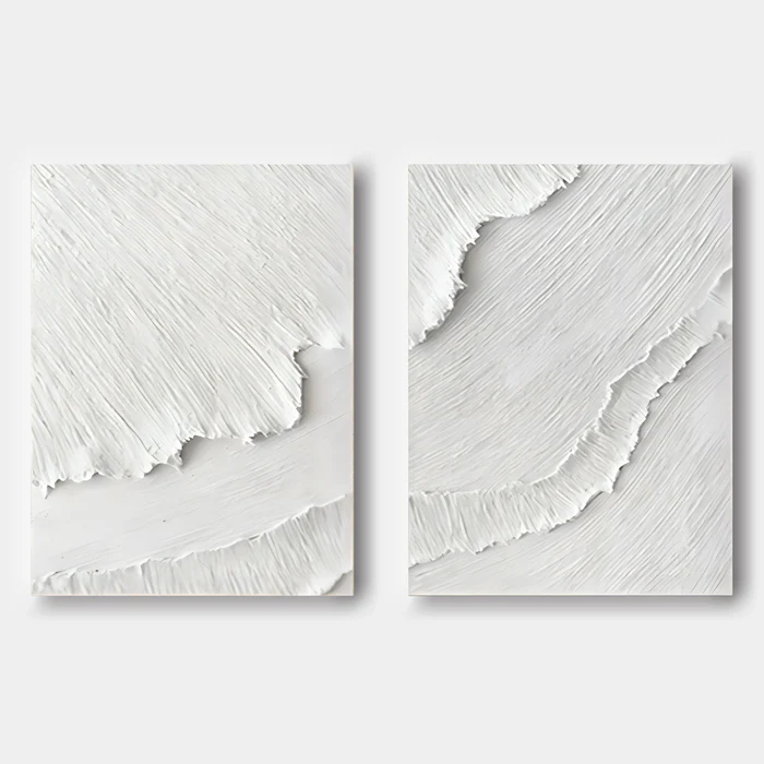
View the productTwo panels of heavily worked white plaster, set side by side, each pulled into long diagonal arcs of ridged texture. That's the first read of Monochrome Textured Abstract Still Tide — a hand-painted diptych that uses relief instead of color to do the heavy lifting. The crests look compressed, almost torn, before easing into smoother passages near the edges. There's no contrasting pigment anywhere, just shadow falling into the grooves the artist carved while the material was still soft.
It reads as built rather than painted. That distinction matters, because it changes how the piece behaves on a wall.
What the piece actually looks like in a room
From across a living room, Still Tide registers as a soft, horizontal movement — two white shapes echoing each other, separated by a narrow gap. Step closer and the surface opens up: striations, ridges, faint tonal shifts where the relief catches overhead light. In daylight it feels airy and architectural. Under warm lamplight, the shadows deepen and the texture takes on more weight, almost sculptural.
The left panel holds more compression near the top. The right opens wider and lets the arc breathe. They're clearly a pair, but they aren't identical, which keeps the diptych from feeling mechanical.
Who this diptych suits
This is wall art for people who want presence without color. If your room already leans into warm whites, light oak, linen, and plaster-toned walls — the vocabulary of Japandi, Soft Modern, or quiet minimalist interiors — Still Tide slips into that palette and adds dimension instead of disrupting it.
It's less suited to high-contrast, graphic, or saturated rooms. Drop it into a space with bold color blocking or heavy pattern and the texture gets lost. The piece needs a calm backdrop to do what it does best.
How it behaves above furniture
Above a low, wide sofa, the diptych spans the seating zone with enough weight to feel intentional rather than decorative. Centered on a plain feature wall, it becomes the room's quiet focal point — the kind of artwork guests notice on the second look, not the first.
Over a king headboard, symmetry does most of the work. The tonal softness keeps the bedroom restful, and the textured surface gives the wall something to hold without competing with bedding or lighting. In a home office, hanging it on the wall facing your desk gives your eyes somewhere quiet to rest between tasks. Flanking a window with the two panels split is another option if your wall layout calls for it.
Realistic expectations and common misreads
Because it's all white, some buyers assume it will read as subtle or recede into the wall. It doesn't. The relief is pronounced enough that the piece carries real visual weight, especially at a larger scale. Treat it as a statement piece, not background decor.
The other common misread: expecting print-like uniformity. This is hand-painted plaster, so small variations in ridge depth, arc curvature, and surface rhythm are part of the work. That's what separates it from a flat printed canvas or a mass-produced textured panel.
How it compares to nearby options
Compared to a single large textured canvas, the diptych format gives you a built-in sense of rhythm — two panels reading against each other across a small gap. Compared to a flat minimalist print, the relief introduces shadow play that shifts throughout the day. And against heavily pigmented abstract art, Still Tide stays quieter and more architectural, which is usually what people are after when they choose monochrome work in the first place.
Product details
- Format: Two-panel diptych, sold as a pair
- Technique: Hand-painted 3D plaster relief on canvas
- Palette: All-white, monochrome — no contrasting color
- Texture: Pronounced ridged striations in sweeping diagonal arcs; smoother passages near the edges
- Scale: Available in larger sizes suited to wide sofas, king headboards, and feature walls
- Best room fit: Living room, bedroom, home office
- Interior direction: Japandi, Soft Modern, Minimalist, Wabi-Sabi-leaning interiors
- Pairs well with: Warm white linen upholstery, light oak furniture, soft plaster-toned walls
For a room that already speaks in neutrals, this is a way to add depth without shifting the palette — explore the full piece here: Monochrome Textured Abstract Still Tide - Wall Art by Fir Gallery.