

Quiet Rows: A Textured Neutral Abstract That Reads Like Woven Stone
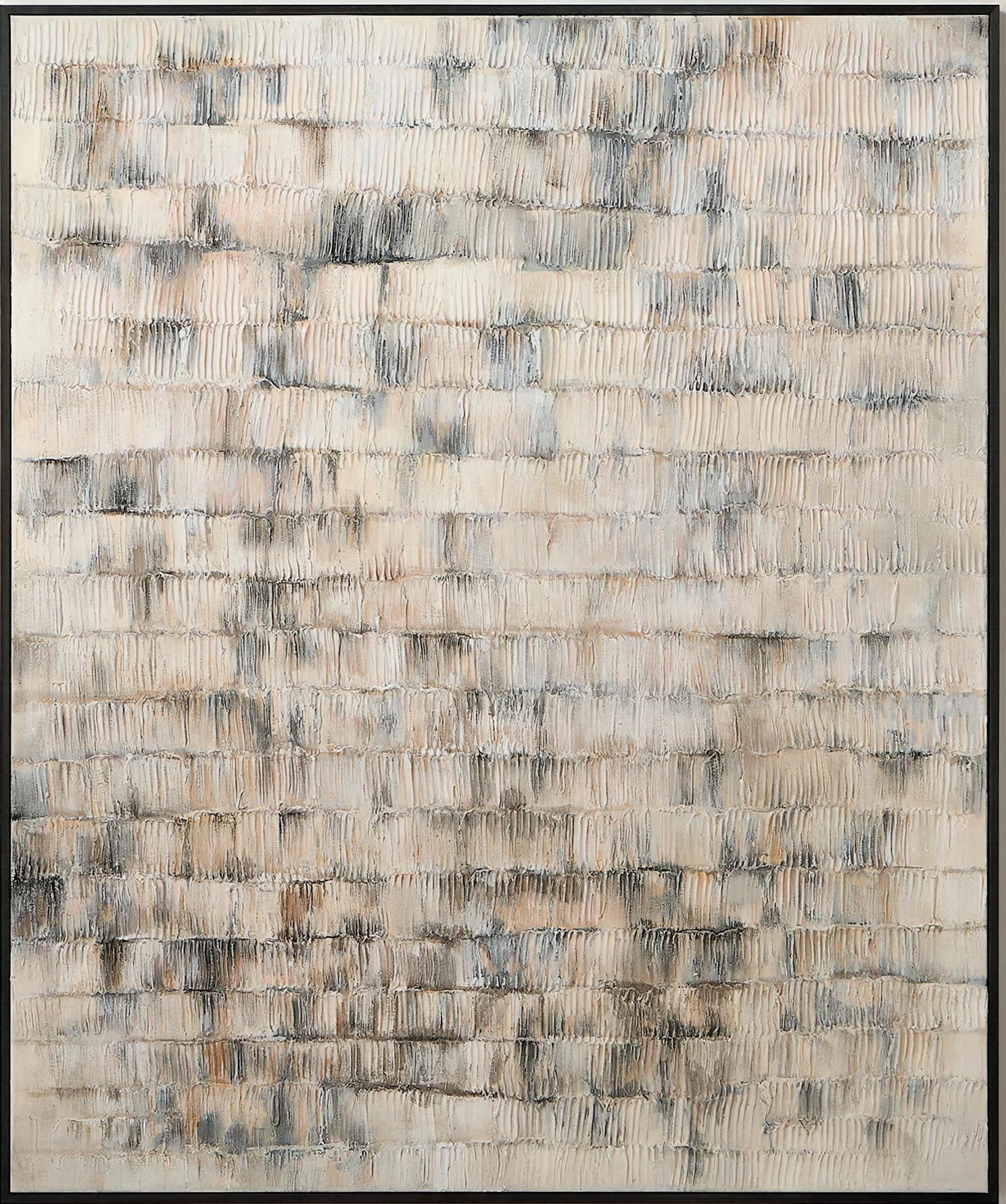
Textured Neutral Abstract Quiet Rows is a hand-painted canvas layered with narrow vertical ridges in ivory, bone, and soft grey, with faint charcoal and ochre settled between the rows. It reads as a continuous textured field rather than a single image, making it a calm, grounded choice for minimalist, Japandi, and soft modern rooms.
Quick read
Quiet, tactile, and evenly weighted — closer to woven linen than brushed paint.
Product reference
Quiet Rows is a hand-painted neutral abstract that leads with texture rather than image. Narrow vertical ridges run across the canvas in steady horizontal bands, built from ivory, bone, and soft grey, with faint charcoal and warm ochre pooling unevenly between the rows. From a few steps back it looks almost like woven linen or lightly carved stone. Up close, the plaster-like surface takes over, and each ridge catches light at a slightly different angle.
There is no single focal point. The composition spreads tension evenly across the surface, which is why it tends to calm a wall instead of commanding it.
What makes this piece visually distinct
Most neutral abstracts rely on wash, drift, or a soft gradient. This one is built. The rhythm is structural — rows stacked like courses of brick, but softened by hand so nothing feels mechanical. The palette stays in a tight range of warm neutrals, so the eye reads texture first, color second.
That matters in a room. A piece like this doesn't shift the color story of your space. It adds a tactile layer, the way a bouclé chair or a raw plaster wall would.
How it feels in a room
Quiet Rows reads as settled rather than decorative. In daylight, the ridges throw subtle shadows and the ivory stays bright. Under lamplight, the ochre and charcoal pockets deepen, and the surface starts to feel more like aged stone. It's one of those pieces that looks slightly different at 9 a.m. than it does at 9 p.m., which is part of what keeps it interesting over time.
Because the composition is a continuous field, it holds its own at larger scales without feeling heavy. Smaller formats work too, but you lose some of the woven effect from across the room.
Who it suits
This is a strong fit for minimalist, Japandi, and soft modern interiors — rooms built around light oak, white oak, warm white walls, linen upholstery, and matte ceramics. It also plays well in wabi-sabi leaning spaces where imperfection and tactility are the point.
It's less suited to high-contrast, graphic, or maximalist rooms. If your space already has bold art, patterned textiles, or saturated color, Quiet Rows can read as too quiet. Think of it as a supporting anchor for calm rooms, not a statement piece for busy ones.
Realistic expectations
A few things worth knowing before you commit:
- This is hand-painted, so ridge spacing, depth, and the darker pockets vary slightly from the reference image.
- It's a texture-driven neutral — don't expect a dramatic focal point or strong color movement.
- Photos flatten it. In person, the dimensional surface is a bigger part of the experience than color.
- It pairs best with warm whites and greige walls. Against cool bright white, the ivory can look slightly warmer than expected.
A quick styling scenario
Picture a living room with a low, linear sofa in soft taupe, a light oak coffee table, and a warm white wall behind it. Quiet Rows sits centered above the sofa, roughly two-thirds the width of the seating. A ceramic table lamp casts light across the ridges in the evening. The room doesn't change dramatically — it just feels more complete, the way adding a textured rug underfoot would.
In a bedroom, the same piece sits behind a headboard with linen bedding and wood nightstands, and the vertical ridges echo the pleats of the drapery. In a home office, hung on the wall facing the desk, it offers a steady, non-distracting visual field during long work sessions.
Product details
- Type: Hand-painted textured canvas wall art
- Style: Abstract, 3D textured, minimalist, wabi-sabi
- Palette: Ivory, bone, soft grey, with faint charcoal and warm ochre accents
- Surface: Raised, plaster-like ridges in horizontal rows; matte finish
- Best rooms: Living room above a sofa, bedroom behind a headboard, home office facing a desk, foyer, dining room
- Pairs with: Light oak and white oak furniture, warm white or greige walls, linen and bouclé upholstery
- Reads as: Calm, tactile, grounded — a supporting anchor rather than a loud focal point
For a neutral abstract that works harder through texture than color, take a closer look at Textured Neutral Abstract Quiet Rows.