
Still Interval: A Quiet Diptych That Holds the Room Without Raising Its Voice
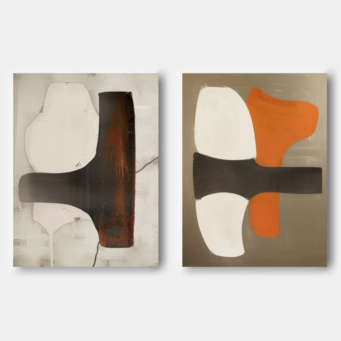
Still Interval by Fir Gallery is a large hand-painted diptych built on a shared structural language: a dark horizontal band cutting through soft, organic cream forms. One panel reads weathered and layered, the other graphic and resolved. Together they bring quiet weight to living rooms, home offices, and dining walls without overwhelming the space.
Quick read
Two panels, one structural rhythm — worn texture on the left, graphic clarity on the right.
Product reference
Piece: Neutral Abstract Diptych Still Interval - Wall Art by Fir Gallery
Format: Hand-painted
Size family: large
View the productAt first glance, Still Interval reads as a single idea told twice. Two canvases share the same bones — a dark horizontal bar bisecting the field, soft cream forms gathering above and below — but each panel resolves the structure differently. The left side feels worn and layered, with rust and charcoal bleeding through a muted off-white ground. The right side is cleaner and more graphic: flat khaki, crisp white shapes, and a single burnt orange form that holds its own without pulling focus.
That pairing is the whole point. You're not looking at a mirrored set. You're looking at a conversation between texture and clarity, weathering and resolution.
What This Diptych Actually Does to a Room
Hung as a pair, the work brings horizontal rhythm to a wall. The dark bands run roughly parallel, which means the eye travels sideways before it settles — useful above long furniture like a low sofa or a credenza, where vertical art often feels stranded. The cream forms keep the composition breathing, so even at a large scale the diptych doesn't feel heavy.
In daylight, the left panel's surface comes forward; you start noticing the bleed of rust under the off-white, the way the charcoal feels almost printed onto the canvas. Under lamplight, the right panel's burnt orange warms up and pulls the room toward it. It's a piece that shifts personality depending on the hour, which is part of why it suits living rooms and home offices rather than purely decorative corners.
Who It's For
This is wall art for people who lean toward soft modern, mid-century, or transitional interiors and want something with presence but not noise. If your room already runs warm — taupe upholstery, oak wood, matte black hardware — the diptych slots in naturally. If your space is cooler or more minimal, the burnt orange will read as the accent that ties the room together.
It's less suited to maximal, highly saturated rooms where it would compete with pattern, or to very small walls where the two panels can't breathe.
Common Misreads
A few things worth clarifying before you commit. This isn't a matched set in the symmetrical sense — the two panels are intentionally uneven in surface quality, and that's the design. Buyers expecting clean repetition will find the left panel's weathering surprising. Second, the orange is warm and earthy, not bright. It behaves more like terracotta than a true orange, which is why it sits comfortably next to charcoal and cream.
How It Compares
Against a single large abstract canvas, a diptych gives you flexibility — you can widen or narrow the gap between panels to suit your wall. Against a gallery wall of smaller framed prints, this set reads quieter and more architectural; there's less visual chatter. And against pure minimalist line art, Still Interval brings more painted texture and tonal depth, which makes it feel less graphic and more grounded.
A Real Styling Scenario
Picture a living room with a long oatmeal sofa, a light oak coffee table, and matte black floor lamps. The diptych hangs above the sofa with about four to six inches between panels. The horizontal bars echo the sofa line. The burnt orange picks up a throw or a ceramic on the shelf nearby. Nothing matches exactly — it's the kind of room that reads collected rather than coordinated.
Product Details
- Format: Two-panel diptych, hand-painted on canvas
- Size: Large scale, intended for wide walls and statement placements
- Palette: Cream, off-white, charcoal, rust, khaki, burnt orange
- Surface: Visible brushwork and layered texture, especially on the left panel; cleaner, flatter finish on the right
- Best rooms: Living room above a low sofa, home office on a desk-facing wall, dining room flanking a window or above a sideboard
- Pairs well with: Warm taupe upholstery, light oak wood, matte black metal accents
- Style fit: Soft Modern, Mid-Century Modern, Transitional
If you want a wall that feels considered rather than decorated, the Neutral Abstract Diptych Still Interval - Wall Art by Fir Gallery is worth a closer look.