
Still Interval: A Quiet Diptych That Reshapes a Long Wall
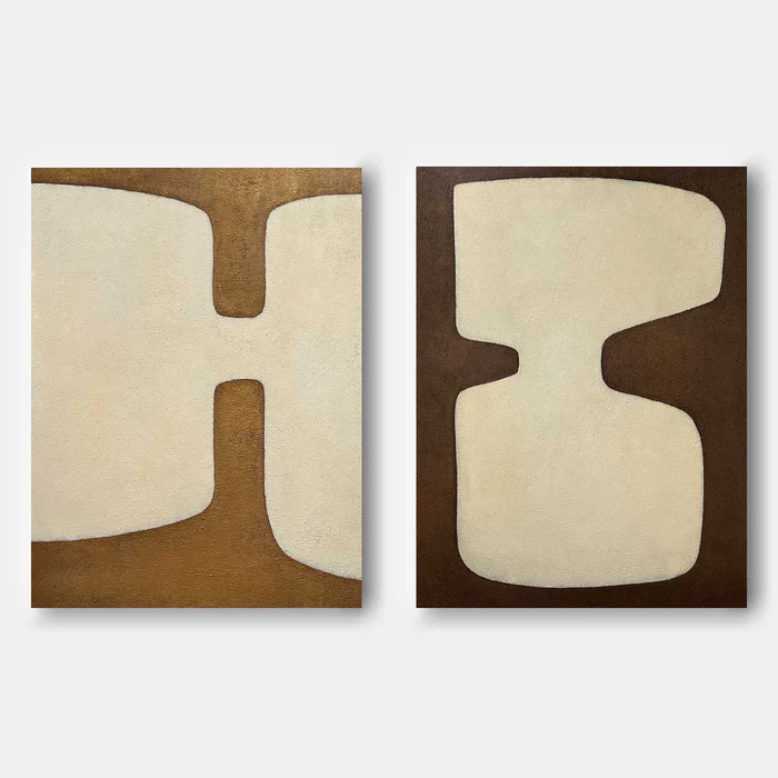
Still Interval is a large hand-painted diptych pairing cream organic forms with golden ochre and espresso brown grounds. The two panels read as one rhythm in two movements — graphic enough to anchor a room, textured enough to feel material rather than printed. It suits Japandi, soft modern, and minimalist interiors with light oak and warm neutrals.
Quick read
Two panels, one rhythm — cream forms holding still against warm brown ground.
Product reference
Piece: Neutral Abstract Diptych Still Interval - Wall Art by Fir Gallery
Format: Hand-painted
Size family: large
View the productStill Interval opens with two cream shapes resting against warm brown — golden ochre on the left, deeper espresso on the right. The forms are large, soft-edged, and almost architectural, broken only by narrow brown corridors that press inward at the center of each panel. That small compression is what gives the pair its tension. Without those inward cuts, the composition would feel purely decorative. With them, it reads as something more deliberate.
The left panel feels open and expansive. The right feels more contained, its indentations deeper, its silhouette heavier. Hung together, they move like a single phrase split across two beats.
What kind of wall art this actually is
This is a hand-painted neutral abstract diptych — two canvases meant to be read as a pair, not separated. The surface carries visible texture, so the cream areas hold light differently across the day. In morning sun the ochre panel warms noticeably; under lamplight, the espresso side deepens and the cream takes on a softer, paper-like quality. It behaves like a painting, not a print.
How it changes a room
The diptych format stretches horizontally, which is where most of its styling value lives. Above a long sofa, the two panels settle the seating area into a clean horizontal band. Above a sideboard or credenza in a dining room, the brown tones pick up timber grain and warm upholstery without competing with them. On a wide foyer wall, the forms read clearly from across the room, which is harder to pull off with a single small canvas.
The mood is calm but not passive. There is enough graphic weight in the silhouettes to act as a focal point, and enough texture and tonal warmth to keep the room from feeling cold or gallery-like.
Who it suits
Still Interval fits comfortably in Japandi, soft modern, minimalist, and wabi-sabi-leaning interiors. It pairs naturally with light oak, raw linen, soft taupe upholstery, and warm off-white walls. If your palette already leans cool gray, stark white, or high-contrast black-and-white, the warm brown ground will shift your room warmer — worth knowing before you commit.
It is a strong choice if you want one decisive piece doing the work of a gallery wall. It is less suited to buyers who want bright color, busy pattern, or a literal subject.
Realistic expectations
A few things worth setting straight:
- This is a diptych, so it needs real horizontal wall space plus a small, consistent gap between panels (typically 2 to 4 inches, depending on overall width).
- The texture is part of the work. Slight surface variation, brush movement, and tonal shifts are intentional, not flaws.
- Hand-painted color reads warmer in person than on a backlit screen. The browns are richer and the cream less bleached.
Compared with nearby options
Against a single large neutral canvas, the diptych gives you more rhythm and a stronger sense of composition across a wide wall. Against a four- or six-panel gallery arrangement, it is calmer and easier to live with long term. Against a framed print in similar tones, the hand-painted surface adds depth that flat prints cannot match — useful if the piece will sit in direct sightlines from a sofa or dining table.
A short styling scenario
Picture a living room with a long oatmeal linen sofa, a light oak coffee table, and warm white walls. A single canvas above the sofa would feel undersized; a busy gallery wall would compete with the sofa's clean line. The Still Interval pair, centered above the sofa with a few inches between panels, lands as one continuous horizontal — grounding the seating area without crowding it. Add a ceramic lamp in soft clay, a wool throw, and the room reads finished.
Product details
- Format: Two-panel diptych, sold as a pair
- Technique: Hand-painted on canvas
- Size tag: Large — designed for wide walls and long furniture
- Palette: Cream foreground forms on warm brown grounds; golden ochre (left) and espresso (right)
- Surface: Textured, matte finish with visible brushwork
- Style direction: Abstract, minimalist, wabi-sabi, Japandi-friendly
- Best placements: Above a long sofa, above a timber sideboard or credenza, on a wide foyer end wall
- Pairs well with: Light oak, raw linen, soft taupe, warm off-white walls
For wide walls that need composure rather than decoration, explore Neutral Abstract Diptych Still Interval - Wall Art by Fir Gallery.