

The Quiet Weight of Soft Shore: A Textured Neutral Diptych That Reads Like Built Sculpture
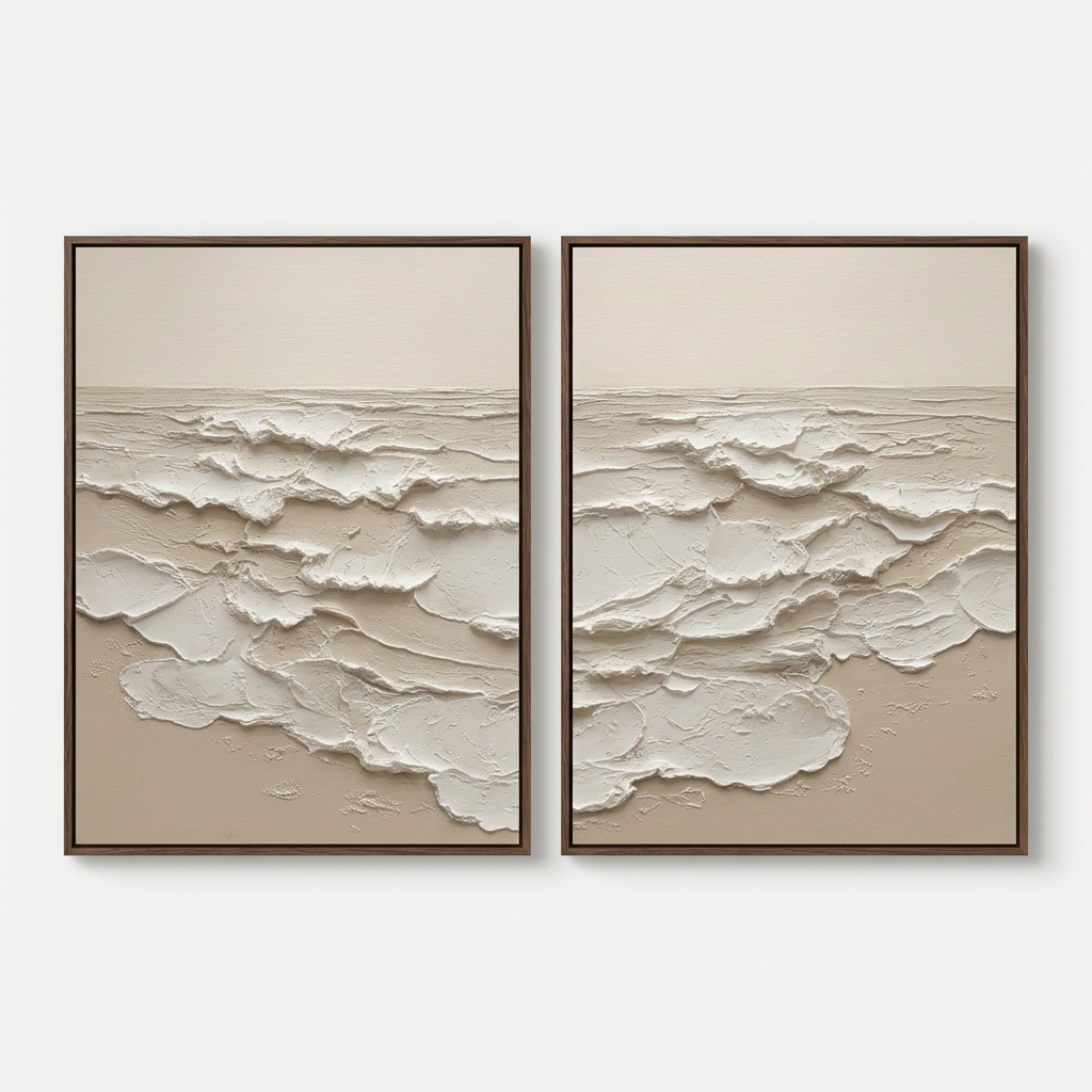
Neutral Abstract Ocean Soft Shore is a large hand-painted diptych that leans on texture rather than color. Layered white plaster forms rise against a warm beige ground, creating a sculptural, wabi-inspired seascape that grounds a room without adding visual noise. It suits soft modern, Japandi, and contemporary neutral interiors, and works especially well above a long sofa, a wide headboard, or a dining sideboard.
Quick read
Built rather than painted — a quiet, sculpted horizon in cream and sand.
Product reference
The first thing you notice about Soft Shore isn't the color — it's the surface. Two vertical panels sit side by side, each one carrying a heavy build of white plaster-like relief across the lower half, with a calm field of warm cream holding the space above it. The ridges catch light unevenly. In some passages the tan ground shows through where the material thins out. It reads less like a painting of the ocean and more like a piece of shoreline that was lifted onto canvas and framed.
That distinction matters. This is a textured neutral abstract, not a literal seascape. There are no crests, no horizon line drawn in, no blue. The layered white bands only suggest waves once your eye settles — and even then, the piece keeps its abstraction. It's the kind of wall art that stays interesting the longer you live with it, because the shadows shift with the time of day.
How the Piece Reads in a Room
Because the palette is restrained, Soft Shore behaves like a sculptural object more than a graphic focal point. In daylight, the relief casts soft, quiet shadows that give the pair depth. Under lamplight in the evening, those same shadows deepen and the piece takes on more weight. Rooms with warm white walls, light oak, or limed wood tend to pull the beige forward. Cooler rooms will let the white forms feel crisper and more architectural.
It's a calm piece, but not a shy one. The scale and the physical texture give it presence. Think of it as a grounding piece rather than a statement piece — something that anchors a wall without competing with the furniture beneath it.
Who It Suits
Soft Shore fits comfortably into three interior directions: soft modern, Japandi, and contemporary wabi-inspired spaces. If your room already leans into linen, raw wood, stoneware, and warm neutrals, this diptych extends that language. If your palette runs cool, high-contrast, or heavily patterned, the piece can still work — but it will read quieter than it does in a warm-toned room.
Buyers who tend to love this kind of work are usually choosing between a large single canvas and a paired format. The diptych gives you width without a single dominant image, which is often the better call above long sofas and king-size headboards.
A Realistic Styling Scenario
Picture a living room with a low, sand-colored sofa, a light oak coffee table, and a linen throw folded over one arm. The wall behind the sofa is warm white and mostly empty. Hanging both panels at consistent height with a two-to-three inch gap between them extends the horizontal line of the sofa and gives the whole seating area a settled feeling. No gallery wall clutter, no competing artwork — just one continuous, textured horizon across the back of the room.
The same logic works behind a bed. Mounted side by side over a linen headboard, the layered bands widen the bed visually and add a tactile quality that photos rarely capture well.
Common Misreads
A few things worth clearing up. This is not a print with a printed texture effect — the relief is real, built up by hand, with actual depth you can see from the side. It's also not a bright coastal piece. Anyone looking for blue water or beachy iconography will find Soft Shore too quiet. And while the two panels mirror each other, they are not identical, which is part of what keeps the pair feeling handmade rather than manufactured.
Product Details
- Format: Diptych — two vertical panels sold as a pair
- Medium: Hand-painted, heavy 3D plaster-style relief on canvas
- Palette: Warm cream white over sandy beige ground
- Style: Abstract, organic modern, wabi-sabi, minimalist
- Size: Available in large-scale dimensions suited to wide walls
- Framed options: Clean, low-profile framing that keeps focus on the surface
- Best rooms: Living room above a long sofa, bedroom behind the headboard, dining room above a sideboard
- Pairs well with: Warm white linen, light oak, soft taupe upholstery
How It Compares
Against a single large textured canvas, Soft Shore gives you more horizontal reach and a built-in rhythm between the two panels. Against a flat printed neutral abstract, it offers real depth and shadow play that a print can't replicate. And against a busier coastal piece, it trades narrative for material presence — which is usually the better choice in rooms where the furniture and textiles are already doing the storytelling.
For a closer look at sizing, framing, and full detail shots of the relief, see Neutral Abstract Ocean Soft Shore.