

Quiet Form: A Hand-Painted Diptych That Grounds a Room Without Raising Its Voice
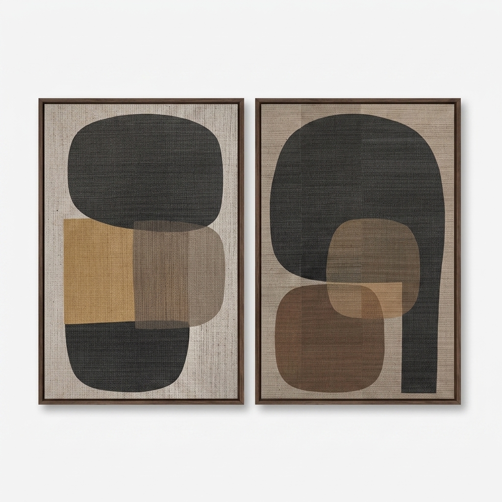
This two-panel abstract set pairs rounded dark forms with warm ochre and brown accents on a woven linen ground. It reads calm and grounded rather than loud, works best above a long sofa, dining table, or foyer end wall, and sits naturally alongside walnut, leather, and greige tones.
Quick read
Two panels, one quiet rhythm — geometry softened by texture and warm neutrals.
Product reference
The first thing you notice is the weight. Two vertical panels, each carrying a large rounded charcoal shape at the top, sit side by side on a woven linen ground. The forms feel heavy without being heavy-handed — more like river stones than hard geometry. Warm ochre, muted taupe, and deep brown push through the lower half of each canvas, layered so that overlapping edges create a softer third tone where they meet.
It's abstract, but it's not restless. The pair reads as a quiet conversation rather than a matched set, and that's what makes it work above a long piece of furniture.
What This Diptych Actually Is
This is a large hand-painted abstract diptych on canvas, framed and finished as a pair. The composition is geometric but organic — rounded rectangles, arches, and stacked shapes rather than hard-edged blocks. The palette stays inside a warm neutral range: charcoal, ochre, walnut brown, tan, and a greige linen background. The surface has real texture, so it reads more like a woven artwork than a flat print, even from across the room.
The left panel is quieter and more balanced. The right panel opens up — the dark form arches around a smaller brown rectangle with a tan inset, giving the pair a subtle sense of motion when you view them together.
How It Reads in a Room
Hung as a pair, the panels take up a substantial horizontal span, which is the whole point. Together they act as a single anchor rather than two separate artworks. In daylight, the linen texture is visible and the ochre warms up. Under lamplight, the charcoal shapes deepen and the piece leans more sculptural.
It feels grounded, not decorative. If your room already has a strong material story — walnut, oak, leather, wool, linen — this diptych folds in rather than fighting for attention. In a sparer, cooler room, it introduces warmth without turning the space rustic.
Who It Suits
The piece sits comfortably inside three interior directions:
- Japandi — the muted palette, negative space, and woven texture align naturally.
- Rustic modern — the earthy tones pick up aged leather, reclaimed wood, and warm plaster walls.
- Mid-century modern — the rounded geometry echoes the era's softer abstract vocabulary.
It's a good fit for buyers who want a statement piece that isn't graphic or high-contrast. If you're comparing this against black-and-white line art or bold color-field work, this one plays a slower, warmer role.
Common Assumptions Worth Adjusting
A few things people tend to misjudge with diptychs like this. It isn't a symmetrical pair — the two panels are meant to differ slightly, and forcing them into strict mirror alignment flattens the composition. It also isn't a minimalist piece in the stark sense; the texture and warm undertones give it more material presence than a clean, printed minimalist canvas. And while the palette is neutral, it's a warm neutral — it won't read well next to cool grays or blue-based whites.
A Real Styling Scenario
Picture a living room with a long, low sofa in warm greige linen, a walnut coffee table, and a jute rug. The wall behind the sofa is a soft off-white. The diptych goes up with a few inches of breathing room between the two panels, centered above the sofa. The charcoal forms echo the dark legs of the coffee table, the ochre picks up a throw pillow, and suddenly the whole seating area feels intentional rather than assembled.
The same logic works behind a dining table with cane or leather chairs, or on the end wall of a foyer flanked by a slim console and a round mirror.
Product Details
- Format: Two-panel diptych, sold as a pair
- Technique: Hand-painted on canvas
- Surface: Linen-textured ground with visible woven character
- Palette: Charcoal, ochre, walnut brown, tan, warm greige
- Size tag: Large — designed to span a full sofa or dining wall
- Frame: Finished and framed for direct hanging
- Best placement: Above a long sofa, behind the head of a dining table, or on a foyer end wall
- Pairs with: Walnut wood, aged leather, warm greige linen, jute, and warm white or greige walls
If you've been looking for a large abstract piece that adds warmth without adding noise, take a closer look at the Neutral Geometric Abstract Quiet Form.