

Quiet Weight: A Neutral Textured Diptych That Grounds a Room
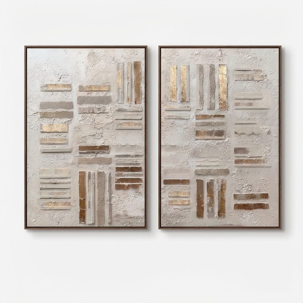
Still Intervals is a two-panel textured abstract built from off-white plaster and low-profile rectangular forms in sand, umber, and gold leaf. It reads as material before image — grounded, quiet, and architectural — and works best above a long sofa, across from a dining table, or at the end of a wide hallway where its horizontal rhythm can settle into the room.
Quick read
Built, layered, and settled — a diptych that reads as material first.
Product reference
Piece: Neutral Textured Abstract Still Intervals
Format: Hand-painted
Size family: large
View the productSeen straight on, Still Intervals reads more like a plastered wall fragment than a painting. Two tall panels sit side by side, each surfaced in rough off-white plaster, with rectangular bars — some chalky, some granular, some catching gold leaf — grouped in loose horizontal and vertical clusters. Nothing centers, nothing repeats exactly. The two panels share a language without mirroring each other, which is what keeps the pair feeling composed rather than matched.
What the piece actually is
This is a large hand-painted diptych in the neutral textured abstract family — closer in spirit to wabi-sabi and organic modern than to graphic or painterly abstraction. The palette moves between chalk white, warm sand, raw umber, and burnished gold. Some bars sit flush with the plaster, others project slightly, so the surface holds a real, low-relief three-dimensionality you can read across the room.
It's the kind of wall art where the material is the subject. The color story is quiet on purpose; the interest comes from surface, weight, and spacing.
How it changes a room
Hung as a pair, the diptych spans enough wall to anchor a seating area without crowding it. The horizontal rhythm of the bars lines up naturally with a low sectional or a linen bench, which is why it settles above a sofa so easily. In daylight, the gold leaf stays understated — more warm glint than shine. Under lamplight, the raised edges cast small shadows and the plaster ground gets softer, almost sculptural.
Emotionally, it reads calm and grounded. It won't fight a room with a lot going on, but it also won't disappear against a plain white wall — the texture does enough work to hold its own.
Who it suits
This piece fits homes leaning soft modern, transitional, or contemporary wabi-inspired. It pairs closely with light oak flooring, travertine or limestone surfaces, undyed linen upholstery, and warm off-white walls. If your palette runs cool gray, glossy black, or high-saturation color, the diptych will feel out of key.
It's a strong choice for buyers who tend to pick quiet, textural art over graphic or colorful statements — people furnishing a space they want to feel settled in, not one they want to impress with a single loud piece.
Realistic expectations
A few things worth knowing before you commit:
- The texture is real. Photos flatten it; in person, the relief and grit are more pronounced.
- Gold leaf reads warm and matte, not shiny. It behaves like a metal accent, not a reflective surface.
- Because each panel is hand-painted, no two prints of this work are identical down to the millimeter. That's the point, but it's worth naming.
- As a diptych, it needs breathing room. Crowding it between tall bookcases or under a low ceiling drop will flatten the effect.
How it compares to similar pieces
Against a single large textured canvas, the diptych format gives you more horizontal reach and a natural pause down the middle — useful above wide sofas or long consoles. Against a graphic black-and-white abstract, it trades contrast for depth; it's less of a focal point and more of an atmosphere. And against a smooth minimalist print, it offers something a flat print can't: actual surface.
A quick styling scenario
Picture a living room with a long, low linen sofa in oatmeal, a light oak coffee table, and a travertine lamp. The diptych goes up centered above the sofa, with roughly six to eight inches between the two panels. A ceramic vase with dried branches sits at one end of the console behind the sofa. Nothing else on the wall. The room reads collected, warm, and deliberately quiet — which is exactly what this piece is built to do.
Product details
- Format: Diptych — two vertically oriented panels sold as a pair
- Medium: Hand-painted, textured plaster on canvas with gold-leaf accents
- Palette: Chalk white, warm sand, raw umber, burnished gold
- Finish: Low-relief, matte, tactile surface with variable depth
- Size range: Available in large-scale options suited to sofa walls, dining walls, and wide foyers
- Best rooms: Living room above a long sofa, dining room facing the table or flanking a credenza, foyer at the end of a wide hallway or above a narrow console
- Pairs with: Light oak wood, undyed linen, warm travertine, soft plaster or limewashed walls
If you want wall art that behaves like part of the architecture rather than a picture on the wall, take a closer look at Neutral Textured Abstract Still Intervals.