
Quiet Weight: A Closer Look at a Neutral Textured Abstract
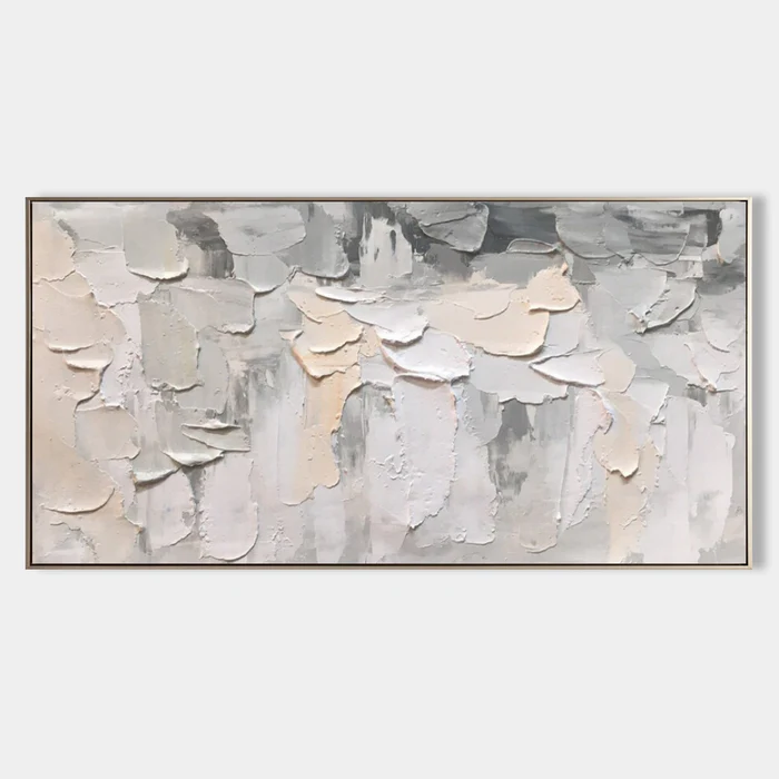
This horizontal piece reads as a sculptural surface rather than a painting. Overlapping slabs of cream, warm sand, and pale grey shift between raised edges and receding planes, giving the work a three-dimensional quality that changes with daylight and lamplight. It suits Japandi, Scandinavian, and soft modern interiors where material texture carries the room.
Quick read
A neutral abstract that earns its place through surface, not statement.
Product reference
Piece: Neutral Textured Abstract Still Layers - Wall Art by Fir Gallery
Format: Hand-painted
Size family: large
View the productAt first glance, this piece doesn't behave like a painting. It reads as a built surface — thick, irregular slabs of material stacked in overlapping tiers, with cream, warm sand, and pale grey shifting between raised edges and receding planes. The horizontal format moves across the wall in steady rhythm, with heavier accumulation along the upper band cooling into grey, and a lighter, more diffuse ground opening underneath.
It's a textured neutral abstract in the literal sense: the color story is quiet, but the surface does real work. Light catches the raised edges differently throughout the day, so the piece looks denser in morning light and softer under a warm lamp at night.
How It Reads in a Room
The mood is calm, grounded, and slightly sculptural. There's no bright accent pulling focus, no graphic line cutting across the field — just material weight and a horizontal pull. That makes it a strong anchor piece without turning into the loudest thing in the room.
Above a low sofa, the long format spreads in proportion with most standard seating, filling the wall without crowding it. Behind a headboard, the restrained palette keeps the bedroom feeling settled. On a home-office wall facing the desk, the tonal range is easy to live with for hours at a time — it holds attention without demanding it.
Who It's For
This is a piece for people who care about texture as much as color. If your room already leans into light oak, warm white linen, soft taupe upholstery, or paper-toned walls, the artwork slots in naturally. It's especially at home in Japandi, Scandinavian, and soft modern interiors where surface and material carry the design.
It's less suited to high-contrast, color-forward rooms. Drop it next to a saturated jewel-tone sofa or a heavily patterned rug, and the quiet palette can get overpowered. The piece wants neighbors that share its tonal range.
Realistic Expectations
A few things worth knowing before you commit:
- The texture is real, not printed. Expect visible ridges, irregular edges, and slight asymmetry — that's the point.
- Photos flatten it. In person, the relief reads more clearly, especially under directional light.
- It's a quiet focal piece. If you're looking for a bold, graphic statement, this isn't that category.
- The neutrals lean warm overall, with cool grey concentrated in the upper register.
How It Compares
Against a flat minimalist print, this piece feels heavier and more tactile — closer to a relief sculpture mounted on canvas. Against a fully monochrome plaster work, it has more compositional movement, with the upper-to-lower shift giving the eye somewhere to travel. Compared to a large color-field abstract, it trades chromatic drama for surface depth.
For buyers weighing framed art versus a hand-painted textured canvas, the tradeoff is straightforward: a print gives you precision and predictability; a hand-built surface like this gives you a one-of-a-kind object that changes with the light.
A Quick Styling Scene
Picture a living room with a low linen sofa in warm white, a light oak coffee table, and a pale wool rug. The wall behind the sofa is bare and feels slightly under-furnished. Hung centered, about eight to ten inches above the back cushions, this piece fills the visual gap, pulls the oak and linen tones together, and gives the seating area a clear center of gravity — all without adding a new color to the room.
Product Details
- Type: Hand-painted textured canvas, original surface work
- Style: Abstract, 3D textured, wabi-sabi, minimalist
- Palette: Cream, warm sand, pale grey, cool grey accents
- Format: Horizontal, large scale — suited to wide walls and above-furniture placement
- Finish: Sculptural plaster-style relief; matte, light-reactive surface
- Best rooms: Living room (above a low sofa or centered on a feature wall), bedroom (above the headboard or beside a reading chair), home office (facing the desk or above a credenza)
- Pairs with: Light oak wood, warm white linen, soft taupe textiles
- Best interior directions: Japandi, Scandinavian, soft modern
If you want a wall piece that quiets a room and still rewards a close look, take a closer look at Neutral Textured Abstract Still Layers - Wall Art by Fir Gallery.