

Textured Abstract Earth Divide: A Quiet Horizon in Plaster and Umber
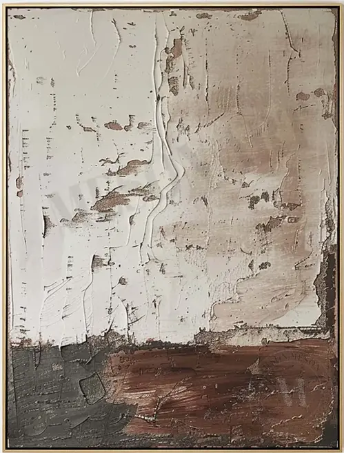
Textured Abstract Earth Divide is a hand-painted neutral abstract with a raised plaster surface on top and a dense earth-tone band below. The uneven horizon between the two zones gives it a calm, weathered presence that anchors warm, minimal rooms without overpowering them.
Quick read
A weathered horizon painted in plaster, umber, and shadow.
Product reference
The first thing you notice about Textured Abstract Earth Divide is the surface. The upper two-thirds of the canvas is a pale, cracked plaster field with real relief — ridges, fissures, and raised passages that shift under changing light. Below it, a band of deep umber and slate grey settles into charcoal at the corners, meeting the ivory in an uneven horizon line that runs across the piece like a weathered seam.
It reads as a hand-painted abstract, but the closer you look, the more it feels like a fragment of a wall — plaster worn through in places, pigment showing faint rose and copper undertones. That's the tension the composition holds: built-up surface above, grounded weight below.
How it reads in a room
This is a quiet piece with real physical presence. From across the room, it looks like a soft neutral abstract — calm, tonal, easy to live with. Up close, the texture takes over. In daylight, the ridges cast tiny shadows that keep the surface active. Under lamplight, those same ridges warm up and the umber band deepens, which is when the painting feels most grounded.
It behaves more like an architectural element than a decorative one. Think of it as a focal point that doesn't demand attention — closer to a plaster wall detail than a graphic statement.
Who it suits
The palette leans warm neutral, so it fits interiors moving in a wabi-inspired, Japandi, or rustic modern direction. It pairs naturally with raw oak, aged leather, and warm linen. Rooms with soft white or warm plaster walls give it the most room to breathe — painted accent walls tend to compete with the surface texture rather than support it.
If your space is already color-heavy or leans traditional and ornate, this piece may feel too restrained. It rewards rooms that already value quiet materials and honest finishes.
Placement that works
Above a low, linear sofa, the horizon line tends to echo the natural sightline of the room, which is why it settles so easily on a main living room wall. Behind a neutral upholstered headboard, it reads as a calm backdrop rather than a headline. In a home office, hanging it on the wall facing the desk gives your eye something textured to rest on without pulling focus from work.
A foyer or dining wall works too, especially above a low credenza or console where the lower earth band has something solid to sit above.
How it compares
Compared with flat printed abstracts, this one trades graphic punch for material depth — you're buying the surface as much as the image. Next to high-contrast black-and-white abstracts, it feels softer and more architectural. Against colorful expressive canvases, it stays firmly in the neutral, tonal lane.
One honest tradeoff: because so much of the appeal is in the texture, photos can only tell you so much. In person, the relief is what carries the piece.
Product details
- Type: Hand-painted textured canvas wall art
- Style: Abstract, 3D textured, wabi-inspired
- Palette: Ivory plaster, deep umber, slate grey, charcoal, with faint rose and copper undertones
- Surface: Heavy relief on the upper field; denser, smoother weight in the lower band
- Best rooms: Living room, bedroom, home office, foyer, dining room
- Pairs with: Raw oak, aged leather, warm linen, soft white or plaster walls
- Placement notes: Above a low sofa, behind a neutral headboard, facing a desk, or above a credenza
If the surface and the quiet horizon are what you're after, take a closer look at Textured Abstract Earth Divide.