

The Quiet Architecture of Textured Abstract Geometric Divide
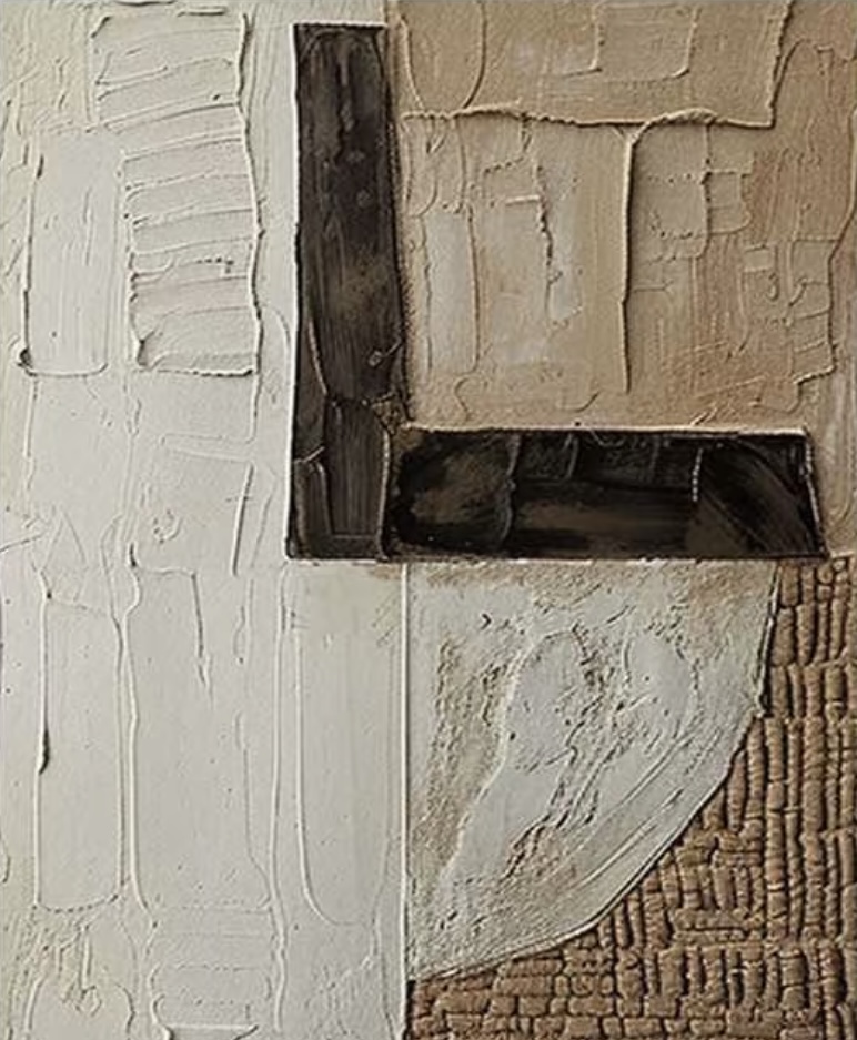
Textured Abstract Geometric Divide is a hand-painted abstract canvas that reads more like a small architectural surface than a traditional painting. Its ivory plaster, warm sand, and deep espresso zones are divided into clean quadrants, with heavy brushwork and raised material catching light through the day. It suits Japandi, wabi-inspired, and minimalist rooms where texture carries more weight than color.
Quick read
Cream plaster, sand, and dark umber divided into quiet, tactile quadrants.
Product reference
At first glance, Textured Abstract Geometric Divide looks less like a painting and more like a fragment of a wall that has been quietly composed. Four zones share the canvas: ribbed ivory plaster on the left, a sand-toned field of cracked, layered strokes in the upper right, a dark espresso bracket anchoring the center, and a pale curved shape drifting into a woven, textile-like band at the bottom. The palette stays in the cream, sand, and dark brown family, but the surface itself does most of the talking.
This is a hand-painted, 3D textured canvas rather than a print. The ridges are real, the built-up plaster catches light unevenly, and the dark bracket reads matte against the lighter fields around it. That physical quality is the reason the piece works in calm, material-forward interiors where a flat graphic print would feel too polite.
How It Reads in a Room
The mood is grounded and architectural. Because the composition is built on right angles and clear division, it brings a sense of order to a wall without turning cold. The warm neutrals keep it soft, and the raised texture keeps it interesting up close. From across the room it acts almost like a structural element, similar to a stone panel or a section of raw plaster wall. Step closer and it becomes tactile, with ridges, cracks, and woven passages that shift under daylight and lamplight.
It behaves as a focal point in restrained rooms and a quiet supporting piece in rooms that already have strong wood grain, stone, or linen presence. Either way, it is not a piece that competes for attention with color; it competes with surface.
Who It Suits
This one lands well with buyers leaning toward Japandi, contemporary wabi-inspired, and minimalist directions. If your room is built around light oak, warm white linen, and raw wood, the palette will feel almost pre-matched. It is less suited to high-contrast, saturated, or heavily patterned interiors, where its subtle tonal shifts can get lost.
A useful way to think about it: if you want a neutral abstract painting that adds weight and material rather than color, this is the direction. If you want a bold color statement, this is not the piece.
Realistic Expectations
Because it is hand-painted with real plaster-like buildup, small variations in ridge height, cracking, and edge texture are part of the character. Photos flatten some of that; in person, the shadows inside the ridges do a lot of the visual work. Under warm lamplight in the evening, the espresso bracket deepens and the cream field softens. In daylight, the sand quadrant shows more of its cracked layering.
One common misread: assuming a textured neutral piece will disappear against a white wall. It usually does the opposite. The shadows created by the raised surface actually give it more presence on plain drywall than a flat print of the same size would have.
Where It Works
Above a low sectional, it sits comfortably without pulling the eye away from the seating. Centered over a media console, it gives the wall a calm anchor that plays well with wood cabinetry. In a bedroom, it reads nicely above a wide dresser or slightly off-center behind a headboard, especially against warm wood tones. For a home office, place it on the wall facing the desk or beside a bookshelf or credenza, where its texture rewards a longer look without becoming distracting.
A quick scenario: a living room with a light oak media console, a linen sofa in warm white, and a jute rug. The piece goes above the console, slightly wider than the console itself, and suddenly the whole wall feels intentional. Nothing else in the room needs to change.
Compared With Nearby Options
Against a flat minimalist print, this piece feels heavier and more crafted. Against a bold abstract with strong color, it feels quieter and more architectural. Against a woven fiber wall hanging, it holds a similar tactile feel but reads more graphic and structured because of the geometric division.
Product Details
- Type: Hand-painted textured canvas wall art
- Style: Abstract, wabi-sabi, 3D textured
- Palette: Ivory cream, warm sand, deep espresso brown
- Surface: Mixed plaster-like buildup, ribbed brushwork, cracked layering, and a woven textile-inspired band
- Best rooms: Living room, bedroom, home office, dining room, foyer
- Pairs with: Light oak, raw wood, warm white linen, jute, stone
- Placement notes: Above a low sectional, over a media console, above a wide dresser, off-center behind a headboard, or facing a desk
For rooms that treat texture as its own kind of color, take a closer look at Textured Abstract Geometric Divide.