

Quiet Horizon: A Textured Abstract That Reads Like Weathered Plaster
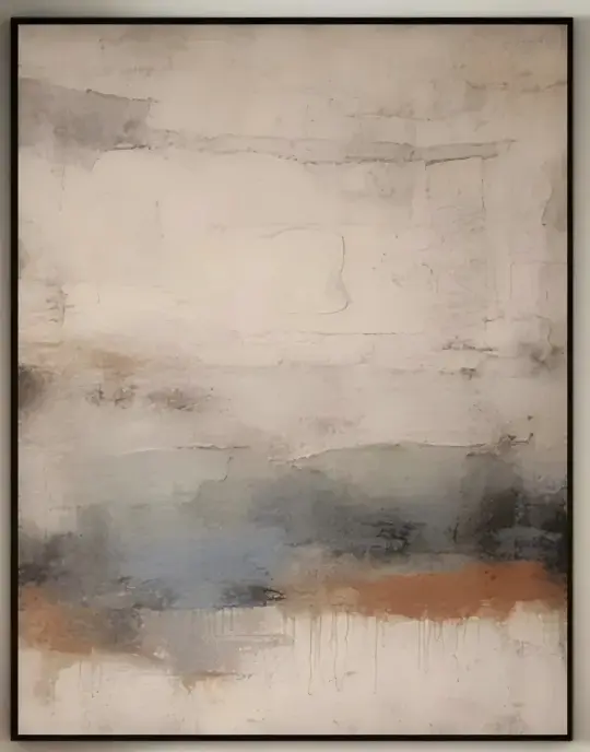
A hand-painted abstract landscape with a heavy, plaster-like surface and a low horizon of muted blue-grey, softened by a bleeding terracotta edge. It reads quiet rather than decorative, which is why it tends to work above sofas, headboards, and long consoles where you want presence without noise.
Quick read
A neutral abstract landscape that feels closer to weathered wall plaster than to a printed canvas.
Product reference
At first glance, Textured Abstract Landscape Quiet Horizon looks less like a painting and more like a section of weathered wall. A pale ivory field fills the top half in cracked, troweled passes, and a muted blue-grey band settles low across the canvas, edged by a soft terracotta line that bleeds gently downward. The surface has real depth to it — mineral, sedimentary, closer to plaster than to pigment on a smooth ground.
That texture is the whole point. The color palette is quiet, but the piece still holds a wall because the light catches every ridge and trowel mark differently through the day. In morning light it reads chalky and open; under lamplight it deepens, and the terracotta warms up noticeably.
What kind of wall art this actually is
This is a hand-painted, heavily textured abstract landscape on canvas. The composition sits in three loose registers — a pale upper field, a muted horizon band, and a warm base edge — separated by tonal shift instead of hard lines. It falls into the wabi-sabi and 3D textured corner of abstract art: grounded, neutral, and more architectural than expressive.
It behaves like a focal point without demanding to be one. That's a useful distinction when you're comparing it to bolder abstract canvases or high-contrast modern prints.
How it reads in a room
Placed above a low sofa, the earth tones settle into the seating area and pull the whole arrangement together, especially with linen or oatmeal upholstery. Over a headboard, the muted blues quiet the room down without turning it cold. On a dining room end wall — particularly opposite a wood table — the terracotta undertone picks up warm wood grain in a way that feels intentional rather than matchy.
It also holds up in a foyer or home office, where the horizontal format gives a long wall something to lean on without overloading it. The piece pairs comfortably with aged brass, unlacquered hardware, and mid-tone woods like white oak or walnut.
Who it suits, and who it doesn't
If your interior leans minimalist, Japandi, modern organic, or transitional with warm neutrals, this piece slots in naturally. It's a strong fit for rooms already working in stone, linen, plaster walls, or clay tones.
It's less suited to high-saturation, high-contrast rooms. Next to jewel tones, glossy lacquer, or graphic black-and-white art, its subtlety can get lost. Buyers sometimes assume a neutral abstract will feel safe or flat — this one doesn't, but only because the texture is doing the work. Viewed as a flat image online, it reads quieter than it does in person.
A quick styling scenario
Picture a living room with a low, sand-colored sofa, a jute rug, a walnut coffee table, and a floor lamp with a linen shade. The painting hangs centered above the sofa, roughly six to eight inches above the backrest. During the day it disappears politely into the wall; at night, once the lamp is on, the blue band deepens and the terracetta line glows a little warmer. That shift is what makes it feel like a real piece of art rather than a decorative fill.
Product details
- Type: Hand-painted canvas wall art, not a print
- Style: Abstract, wabi-sabi, 3D textured landscape
- Palette: Warm ivory, stone, muted blue-grey, soft terracotta
- Surface: Heavy plaster-like texture with cracked, troweled passes
- Format: Horizontal composition, best suited to wide walls
- Best placements: Above a sofa, headboard, console, dining banquette, or long foyer wall
- Pairs well with: Linen upholstery, aged brass, white oak, walnut, plaster or limewashed walls
Expect the finished piece to feel more tactile in person than it does on screen — the texture is what carries the room, and it's what separates it from flatter neutral abstracts in the same color family.
For a closer look at scale, surface, and available options, see Textured Abstract Landscape Quiet Horizon.