

Textured Abstract Quiet Interval: A Study in Neutral Weight
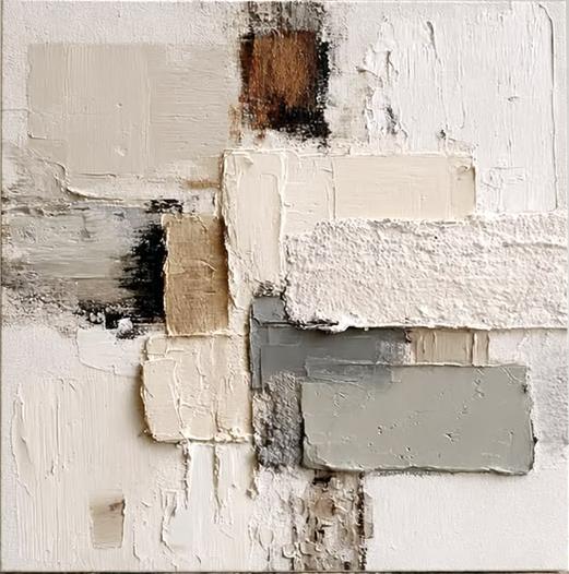
This piece works as a grounded, textural focal point in rooms built around soft neutrals. Rectangular fields of ivory, taupe, and grey sit in a loose grid, broken by one passage of rust brown and a horizontal streak of charcoal. The surface does the heavy lifting — ridges, scraped layers, and built-up plaster give it a dimensional presence that shifts throughout the day.
Quick read
Composed like a wall in soft light — quiet blocks, one warm interruption, and a surface you can almost feel from across the room.
Product reference
At first glance, Textured Abstract Quiet Interval reads less like a painting and more like a fragment of a weathered wall. Rectangular fields of ivory, warm taupe, and soft grey are stacked in a loose grid, their edges softened by plaster-like buildup. A single passage of rust brown near the top holds the eye, bleeding into charcoal before dissolving back into pale neutrals. Lower left, a short streak of grey and black cuts sideways through the composition — a small interruption that keeps the calm from tipping into flat.
It is a hand-painted textured canvas, and the surface does most of the talking. Ridges, scraped passages, and layered strokes catch light differently depending on the hour. In morning daylight, the composition feels airy and almost bleached. Under warm lamplight in the evening, the taupes deepen and the rust reads richer, closer to terracotta.
How It Reads in a Room
This is a quiet piece with real physical presence — a combination that is harder to find than it sounds. The palette recedes, but the texture pulls people in when they get close. That makes it a strong choice for a room where you want depth without noise: a living room with linen upholstery, a bedroom leaning into soft plaster walls, a home office where you need something to look at that will not compete with a screen.
It works well as a solo statement above a low sofa or a long dresser, where the loose grid can breathe. It is less suited to gallery wall arrangements — the composition is already doing the work of a small collection on its own.
Who It Suits
Buyers drawn to wabi-sabi interiors, warm minimalism, Belgian-influenced neutrals, or Japandi styling tend to gravitate toward this kind of textured abstract. If your rooms are built around light oak, bouclé, limewash paint, or unglazed ceramics, the palette will feel like it belongs. If your space runs high-contrast or heavily saturated, this piece will read as too subtle — that is a fair tradeoff to know going in.
Realistic Expectations
A few things worth being honest about. Because this is hand-painted, the texture is genuinely three-dimensional — you will see brush ridges and small plaster crests in raking light, not a printed imitation of texture. Color placement follows the reference closely, but small variations in ridge height and edge softness are part of the medium. Photographs tend to flatten the surface; in person, the piece has more depth and more shadow play than any image can fully capture.
A Quick Styling Scenario
Picture a living room with a long, low sofa in oatmeal linen, a pale oak coffee table, and a single ceramic lamp on a side console. The wall behind the sofa is empty and slightly too tall. Hung centered, about eight to ten inches above the sofa back, this piece fills the vertical space without crowding it. The rust passage picks up the warmth of the wood; the grey blocks quietly echo a wool throw. Nothing shouts. The room simply feels finished.
Product Details
- Type: Hand-painted textured canvas wall art
- Style: Abstract, wabi-sabi, 3D textured
- Palette: Ivory, warm taupe, soft grey, charcoal, and a single passage of rust brown
- Surface: Plaster-like buildup with ridges, scraped areas, and layered brushwork — dimensional and light-reactive
- Best rooms: Living room, bedroom, dining room, home office, foyer
- Pairs with: Light wood, linen and bouclé upholstery, plaster or limewash walls, unglazed stoneware
- Placement: Works best as a solo focal point above a sofa, dresser, console, or banquette
Because each canvas is worked by hand, expect subtle variation in ridge height and edge softness — part of what gives the piece its tactile quality.
For rooms leaning into soft neutrals and natural materials, take a closer look at Textured Abstract Quiet Interval.