

Quiet Tide: A Textured Wave That Moves Slowly Across the Wall
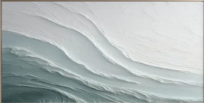
Quiet Tide is a hand-painted textured wave canvas built from thick, chalk-white plaster layers that drift into a muted sage-grey field. It works as a calm focal piece above a sofa, bed, or console, and pairs naturally with light oak, linen, and coastal or Scandinavian interiors.
Quick read
A slow, sculpted wave in white and sage — closer to weathered stone than seascape.
Product reference
The first thing you notice about Textured Abstract Wave Quiet Tide is that it doesn't behave like a painting. The surface is built up in thick, plaster-like layers, with ridges and grooves that catch light unevenly across the canvas. White moves diagonally from the upper edge into a soft sage-grey field below, and the boundary between the two is loose and organic — more like a tide line than a brushstroke.
It reads as sculptural before it reads as a seascape. That's the piece's defining move.
What the artwork actually looks like in a room
From across the room, the composition feels calm and horizontal. Ridges narrow and overlap near the center, then release into wider, quieter bands at the edges. The rhythm is geological rather than watery — layered, unhurried, closer to sediment than surf.
Because the texture is real, the piece changes throughout the day. In morning daylight, the grooves throw soft shadows and the whites look chalky. Under warm lamplight in the evening, the sage-grey deepens and the surface reads almost like weathered stone. That shift is part of what makes textured canvas wall art feel different from a printed piece — the light is doing half the work.
Who this piece is for
This is a good fit if you're building a room around neutrals and want a focal point that adds dimension without adding color noise. It suits Coastal, Scandinavian, and Minimalist directions especially well, and it plays comfortably with light oak, warm white linen, and soft sage upholstery.
It's less suited to maximalist or high-contrast rooms. If your walls already carry saturated art or bold pattern, Quiet Tide will feel muted next to them. It's designed to be the calm anchor, not the loudest voice.
Focal point or supporting piece?
Scale-wise, this works best as a primary wall piece. The horizontal movement wants room to stretch — above a low, linear sofa, behind an upholstered headboard, or on the end wall of a hallway where the eye lands at the end of a passage. Hung too small or crowded by other frames, the sculptural quality gets lost.
One common misread: buyers sometimes expect a literal ocean scene because of the name. It isn't that. The wave is abstracted into ridges and layered plaster, so it reads as texture and movement first, subject second.
A quick styling scenario
Picture a living room with a low oatmeal-linen sofa, a light oak coffee table, and a wool rug in soft ivory. Quiet Tide sits centered above the sofa, its diagonal ridges echoing the horizontal line of the seat back. A ceramic lamp on a side table throws warm light across the surface at night, pulling the sage tones forward. Nothing else on the wall. The room feels finished without feeling styled.
How it compares to nearby options
Against a flat printed abstract, Quiet Tide has more physical presence — you feel the surface before you read the image. Compared to darker, moodier textured pieces, it stays airy and light, which makes it easier to live with in bedrooms and smaller living rooms. And versus purely white plaster art, the sage-grey field gives it a sense of place, a quiet nod to coastal palettes without leaning into obvious beach imagery.
Product details
- Type: Hand-painted textured canvas wall art
- Finish: Thick plaster-style layering with visible ridges and grooves
- Palette: Chalk-white transitioning into muted sage-grey
- Style direction: Abstract, 3D textured, minimalist, seascape-inspired
- Best rooms: Living room (above a low sofa), bedroom (behind a neutral headboard), foyer (above a console or on a hallway end wall)
- Pairs with: Light oak, warm white linen, soft sage upholstery
- Reads as: Calm, sculptural, grounded — not decorative or busy
If a slow, textured wave sounds like the right note for your wall, take a closer look at Textured Abstract Wave Quiet Tide.