

The Textured Botanical Floral Bloom: A Diptych That Reads Like a Garden in Relief
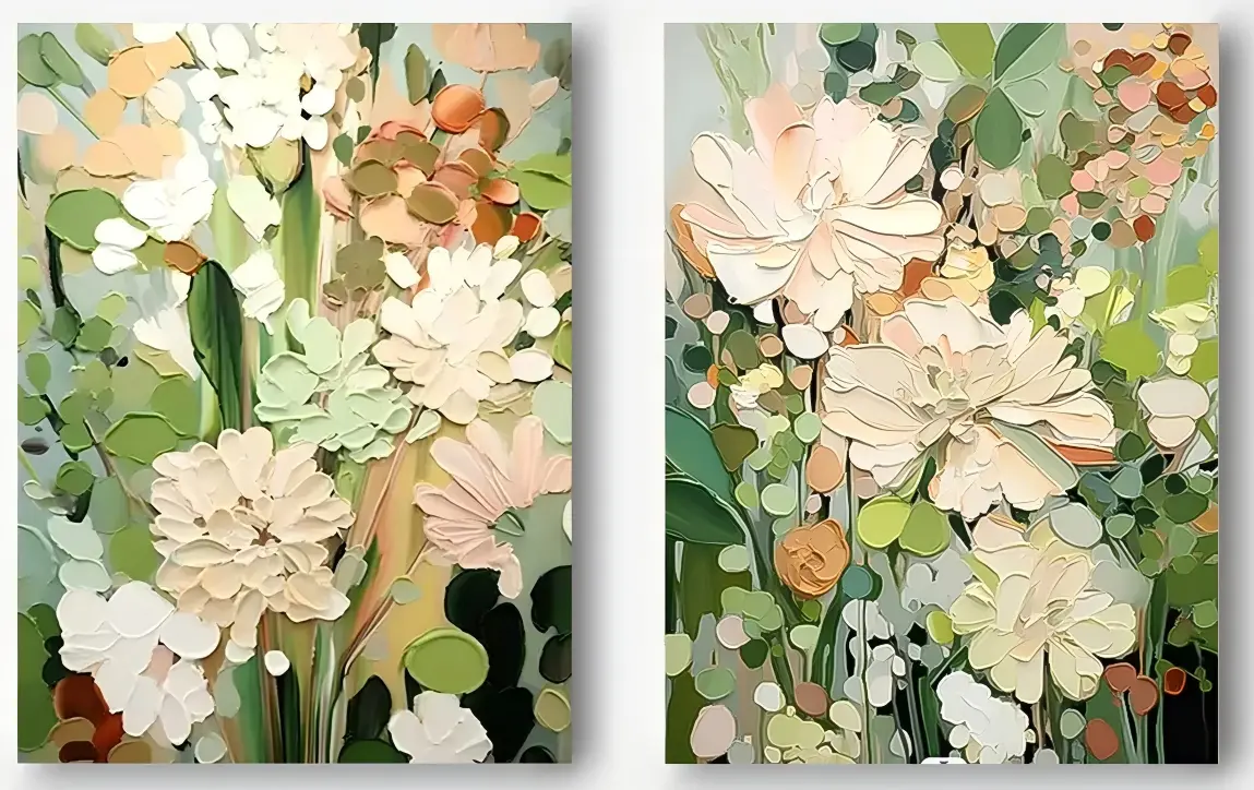
The Textured Botanical Floral Bloom is a hand-painted diptych built from sculpted strokes of paint, layering blush and cream blossoms against sage and olive greens. It reads as dense, tactile, and quietly warm, making it a strong fit for dining rooms, living rooms, and foyers that already lean toward soft modern, transitional, or French country interiors.
Quick read
Two panels, thick paint, and a garden that seems to press forward from the wall.
Product reference
The Textured Botanical Floral Bloom is a two-panel floral diptych that reads more like a low-relief garden than a traditional painting. Blush, cream, ochre, and ivory blossoms sit against sage and deep olive greens, and every petal is laid on in raised, palette-knife passes. From across the room you catch the overall bloom; up close, you see the ridges, edges, and shifts in stroke that give it its weight.
What You Notice First
Density. There isn't much open ground here — stems, leaves, and petals overlap, and the eye moves through the composition rather than around it. That controlled crowding is part of what makes the piece feel grounded on a wall instead of floating. The panel break in the middle keeps it from reading as one flat scene; you get two connected views that share a rhythm.
The second thing is the texture itself. This is hand-painted, dimensional canvas wall art, not a flat print of a textured surface. Under daylight the ridges cast small shadows and the greens look cooler. Under warm lamplight, the blush and ochre lift, and the whole piece reads softer and more intimate.
How It Behaves in a Room
This is a focal-point piece, but a calm one. It doesn't shout with high contrast or bold graphics — it holds attention through surface and layered color. In a dining room, hung on the wall facing the table, the greens and warm blossoms wear well through longer sittings; you keep finding new strokes. Above a low console or sofa in a living room, spacing the panels slightly apart preserves the diptych break and gives the pairing more presence than a single canvas of the same width.
Foyers with a bit of depth handle it nicely too. On a long entry wall at eye level near the doorway, it sets a first impression without crowding the space, and it pairs quietly with a bench, a runner, or a slim console.
Who It Suits
The palette leans into soft modern, transitional, and French country directions. It sits comfortably with light oak wood, warm white linen, and soft sage upholstery — rooms that are already layered, textural, and warm-neutral. If your interior runs high-contrast industrial, glossy minimalist, or heavily saturated maximalist, this piece may feel too gentle to anchor the wall.
It's a good pick for buyers who want a floral without the sweetness of vintage botanicals, and who care about surface — people comparing hand-painted work against flat giclée prints usually feel the difference immediately.
Realistic Expectations
A few things worth knowing before you commit:
- Because it's hand-painted, small stroke variations are part of the finish, not a flaw.
- The diptych format needs a wall wide enough to hold both panels with a small gap between them — plan the spacing before hanging.
- Texture reads best with some natural or directional light. On a shadowed wall it still works, but the ridges do more when light rakes across them.
- It's decorative and expressive, not a strictly botanical study — the blooms are stylized, not species-accurate.
A Quick Styling Scenario
Picture a dining room with a light oak table, linen-upholstered chairs in warm white, and a sage runner. The diptych goes on the main wall facing the table, centered, with a few inches between panels. A pair of low ceramic vessels sits on a sideboard below, and a linen pendant hangs overhead. The greens in the painting echo the runner, the blush picks up the wood tone, and the texture reads clearly under both morning light and evening lamps. Nothing competes; everything settles.
Product Details
- Format: Two-panel diptych, hand-painted on canvas
- Sizes: Multiple size options available; see the linked size guide on the product page
- Finish: Heavy palette-knife texture with raised ridges and visible stroke edges
- Palette: Blush, cream, ochre, and ivory blossoms against sage and deep olive greens
- Best rooms: Dining room, living room, foyer; also works in a bedroom or home office that leans soft and layered
- Pairs well with: Light oak wood, warm white linen, soft sage upholstery
- Placement notes: Space panels slightly apart to preserve the diptych break; hang at eye level for foyers and above furniture in dining and living rooms
If a sculpted, garden-dense floral fits the direction of your room, take a closer look at the Textured Botanical Floral Bloom.