

Quiet Fronds: A Textured Botanical That Reads Like Sculpted Calm
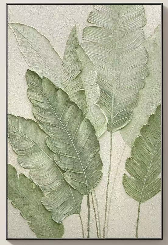
Quiet Fronds is a hand-painted, dimensional botanical wall art piece with raised plaster-like leaves in soft sage and celadon against a warm ivory ground. It reads as sculpted rather than painted, giving rooms tactile presence while keeping the palette neutral enough to sit inside Japandi, Scandinavian, coastal, and wabi-inspired interiors.
Quick read
Not a print of a plant, but a sculpted impression of one — leaves you can almost feel from across the room.
Product reference
Quiet Fronds doesn't behave like a typical botanical print. The leaves rise off the canvas in raised plaster, layered in loose vertical fans of sage and pale celadon against a warm ivory ground. From a few steps back it reads as a single calm gesture. Up close, you catch the ridges running down each blade, the way the color deepens from grey-green at the tips into a softer olive near the base, and the thin stems trailing into open space.
It's a hand-painted, dimensional piece — closer to low-relief sculpture than to canvas art. That's the reason to choose it, and also the reason it works in rooms where a flat print would feel too graphic.
What the piece actually does to a room
The texture is the whole story. Because the leaves are built up in plaster, they catch daylight differently through the day and shift again under warm lamplight in the evening. Morning light picks out the veining. A table lamp at night flattens the color and pushes the shadows longer. You end up with a piece that feels quietly active without ever being loud.
The palette stays in a narrow, muted range, so it settles into a room instead of taking it over. It leans organic-modern: architectural in silhouette, soft in color, grounded by the ivory background. Think of it as a textural neutral with a botanical shape.
Who this suits — and who it doesn't
Quiet Fronds fits the kind of home that already leans into natural materials: light oak, warm white linen, rattan, ceramic, jute. It's a natural match for Japandi and Scandinavian rooms, and it plays surprisingly well in coastal interiors that avoid literal beach imagery. Wabi-inspired spaces will read the raised plaster as part of the material language.
It's less at home in high-contrast, saturated, or heavily patterned rooms. If your walls are already carrying bold color or a busy gallery mix, this piece will get lost — its power depends on breathing room.
Focal point or supporting piece?
It can do both, and that's easy to misjudge. Hung alone above a low sofa or a console, it becomes the focal point of the wall because the relief carries so much visual weight on its own. Grouped with other artwork, it tends to lose its dimensionality and start reading as "just green." The honest recommendation: give it a wall of its own.
A quick styling scenario
Picture a living room with a low, linen-upholstered sofa in a warm off-white, a light oak coffee table, and a rattan armchair off to one side. Quiet Fronds hangs centered above the sofa, roughly eight to ten inches above the backrest. A ceramic table lamp sits to one side. During the day, the leaves feel airy and almost weightless. After sunset, the lamp throws a soft raking light across the surface and the texture takes over. Nothing else on the wall. That's the room this piece was built for.
In a foyer, it works above a narrow console at eye level, where guests catch the relief as they walk in. Above a headboard, it settles the room without competing with bedding.
Product details
- Type: Hand-painted dimensional canvas with raised plaster-like relief
- Palette: Sage green, pale celadon, muted olive, warm ivory ground
- Finish: Matte, tactile, with visible ridges mimicking leaf veining
- Style direction: Organic modern, 3D textured, botanical abstract
- Best rooms: Living room above a low sofa, foyer above a console, bedroom above a headboard, dining room end wall, home office
- Pairs with: Light oak, warm white linen, natural rattan, ceramic, jute
- Placement note: Works best on its own wall rather than in a gallery grouping, so the relief and shadow play stay legible
Realistic expectations
Because each piece is hand-painted, expect small variations in the plaster relief and brush direction — that's part of the material, not a flaw. Photos flatten the dimensionality; in person, the shadow depth is more pronounced than any image suggests. And while the greens are muted, they're still greens, so the piece will read cooler in a north-facing room and warmer under incandescent light.
If you're weighing this against a flat botanical print or a large photographic canvas, the tradeoff is clear: you're paying for texture and presence rather than image detail. That's the entire point.
See the full piece and available options here: Textured Botanical Leaves Quiet Fronds.