

Quiet Force: Reading the Textured Charcoal Diptych Divergence
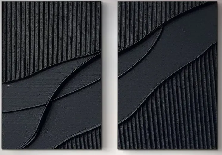
This diptych pairs dense vertical grooves with broad, smooth diagonal sweeps across two deep charcoal panels. The matte plaster relief catches light at different angles, giving the piece a shifting, sculptural presence that suits living rooms, dining rooms, and home offices leaning minimalist, industrial, or wabi-inspired.
Quick read
Surface and shadow do the work — color stays out of the way.
Product reference
At first glance, the Textured Charcoal Diptych Divergence looks almost like two sculpted slabs rather than paintings. Deep, matte black runs across both panels, broken by fine vertical ridges on one side and swept across by broad, smooth diagonal bands on the other. The gesture carries from the left panel to the right, as if a single movement were cut in half and spaced apart on the wall.
It's a quiet piece that doesn't stay quiet in use. Because the surface is plaster-like and heavily textured, the light does most of the talking. Morning sun skims the ridges and throws thin shadows; a lamp at night pulls out the curved transitions where ridged meets smooth. The image you see at noon is not the image you see at 9 p.m.
What this diptych actually is
This is a hand-painted, two-panel abstract canvas with 3D plaster relief, finished in a single deep charcoal tone. There's no color story to manage, no imagery to interpret — just rhythm, direction, and shadow. In the language most buyers use when searching, it sits at the crossover of textured black wall art, 3D plaster wall decor, and a monochrome abstract diptych.
The split between panels matters. Instead of reading as two separate works, the diagonal band bridges the gap visually, which is why the piece needs a little breathing room between panels but not a lot. Hang them too far apart and the gesture breaks.
How it feels in a room
In a living room, it holds a wall above a low sofa the way a sculptural object would — grounded, horizontal, slightly architectural. It doesn't shout for attention, but you notice it every time the light changes. On an end wall in a dining room facing the table, it works as a backdrop rather than a focal competitor; tableware, candles, and food stay the main event.
Home offices are where the piece quietly over-delivers. Mounted opposite a desk, it's dark enough to recede when you're focused and textured enough to reward a long look between tasks. It also behaves well on video calls — matte, non-reflective, no busy pattern pulling focus.
Who it suits, and who it doesn't
If your interiors lean minimalist, industrial, or contemporary wabi-inspired, this piece will feel at home. It pairs cleanly with matte black metal, dark walnut, and warm white linen, and it holds up against both soft white walls and deeper charcoal paint without needing surrounding color to prop it up.
It's less suited to rooms built around bright palettes, floral prints, or layered maximalism. In those spaces, the restraint can read as flatness rather than calm. Buyers expecting a glossy, photographic black painting should also recalibrate — this is a tactile, sculptural work, closer to relief than to print.
Compared with nearby options
Against a single large black canvas, the diptych format gives you more wall coverage and more visual rhythm without more color. Against a framed print, you lose the clean rectangular border but gain real surface depth — the kind that doesn't flatten out in photos or in person. If you've been weighing a framed abstract versus a hand-painted textured piece, this one leans fully into material presence over graphic clarity.
Product details
- Format: Two-panel diptych, hand-painted on canvas
- Finish: Matte, plaster-like 3D relief with vertical ridges and smooth diagonal bands
- Palette: Single deep charcoal black, monochrome throughout
- Style direction: Minimalist, industrial, contemporary wabi-inspired
- Best rooms: Living room above a low sofa, dining room end wall, home office opposite the desk, quiet bedroom walls
- Pairs well with: Matte black metal, dark walnut wood, warm white linen
- Hanging note: Keep a modest gap between panels so the diagonal gesture reads as continuous
For readers who want a sculptural, light-reactive anchor without introducing new color into a room, take a closer look at the Textured Charcoal Diptych Divergence.