

A Diptych That Reads Like Sediment: Inside Textured Diptych Flowing Ridges
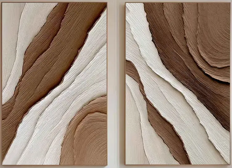
Textured Diptych Flowing Ridges is a hand-painted, 3D plaster-textured wall art pair that behaves like a quiet landscape across two panels. The palette stays in warm neutrals — cream, ivory, taupe, walnut, umber — and the surface catches light differently through the day. It suits contemporary, Japandi, and rustic-modern rooms where warm wood, linen, and boucle already do most of the talking.
Quick read
Sculptural in surface, restrained in color — a diptych built for rooms that lean warm and quiet.
Product reference
The first thing you notice about Textured Diptych Flowing Ridges isn't the color — it's the surface. Two panels sit side by side, each carved with parallel bands of plaster-like ridges that curve, drift, and tighten into arcs near the corners. The strokes are physical. Under a lamp or late-afternoon light, the ridges cast tiny shadows that shift as the day moves, giving a neutral palette more depth than a flat print could pull off.
Cream and ivory channels run against warm taupe, walnut, and umber. The left panel loosens into diagonal drifts; the right pulls into concentric arcs. Hung together, they read as one continuous landscape — something close to sediment layers seen from the side.
What kind of wall art this actually is
This is hand-painted textured canvas wall art, built as a diptych. Not a print, not a foil-embossed reproduction. The ridges are real plaster-like strokes carved into the surface, which is why the piece behaves more like a low-relief sculpture than a picture. That distinction matters when you compare it to standard neutral abstract canvases, which tend to stay visually flat even in warm palettes.
How it changes a room
The composition is dense but ordered. There isn't much negative space, so the piece brings visual weight without brightness or high contrast. In practice, that means it grounds a wall rather than energizing it. Rooms with warm walnut or light oak furniture, linen curtains, and boucle upholstery tend to absorb it easily — the diptych extends the material story rather than interrupting it.
In cooler, high-gloss, or heavily patterned interiors, the effect is different. The warm neutrals can feel isolated against gray-blue palettes or stark white minimalism, so it reads best in spaces already leaning earthy.
Where it sits well
- Living room: Above a low sectional or centered over a media console, where the combined width fills open wall space without crowding it.
- Dining room: Along the wall facing the table, or spanning above a sideboard — the ridged surface gives the eye something to settle on between courses.
- Home office: Across from the desk or behind seating, where a steady rhythm helps without pulling focus.
- Bedroom: Above a low headboard works, though the piece is grounded enough that it benefits from generous ceiling height.
Focal point or supporting piece?
It's a focal point, but a quiet one. The texture does the heavy lifting, not the color. If you want a wall that announces itself the moment you enter a room, a saturated abstract or a large figurative print will do that job better. If you want a piece that rewards a second look — one that reads differently in morning daylight than under warm evening lamps — this is closer to the mark.
Common assumptions worth adjusting
People sometimes assume neutral means safe or forgettable. With this diptych, the neutrality is the setup — the texture is the payoff. The other frequent misread: treating a diptych as two separate artworks. These panels are composed as one continuous piece, so hanging them with a consistent, narrow gap (roughly 2 to 4 inches) preserves the flow between them.
Product details
- Format: Two-panel diptych, sold as a linked pair
- Technique: Hand-painted, 3D plaster-textured canvas
- Palette: Cream, ivory, warm taupe, walnut, umber
- Surface: Deeply grooved parallel ridges; light-reactive throughout the day
- Style direction: Organic modern, contemporary wabi-inspired, Japandi, rustic modern
- Best pairings: Walnut or oak furniture, boucle upholstery, linen and wool textiles
- Recommended rooms: Living room, dining room, home office, bedroom
Sizes are offered in linked pair options so both panels scale together — worth measuring your wall width and subtracting a few inches for the gap between them before choosing.
A quick styling scenario
Picture a living room with a low oatmeal-toned sectional, a walnut coffee table, and a wool rug in soft ivory. The wall behind the sofa is bare and slightly too tall. A single canvas would float. A gallery wall would fight the calm. The diptych fills the horizontal span, echoes the wood, and adds surface interest that the linen and boucle can't provide on their own. The room reads finished without feeling styled.
For the full look and available sizes, see Textured Diptych Flowing Ridges.